The #1 Design & Digital Marketing Agency
We build iconic brands
Let our community of professional designers and digital marketing experts transform your business vision from concept to a smashing brand identity. Whether you want to start a logo design contest, get a website design and development, printed merchandise, or require digital marketing services, we offer a complete branding solution for your business. Start today, and see the magic unfold!
- Start a design contests
- Hire a dedicated designer
- Build an epic brand

Based on 1,000+ reviews from

As featured on


Most Popular Categories
Explore more design and service categories
How it Works
Zillion Designs is a crowdsourced freelance graphic design marketplace where thousands of designers sign up to work on building small business brands just like yours. Starting a graphic design contest is effortless and the process is seamless.
Step 1 Set a prize—depending on your budget, set an amount to award the winning designer.
Step 2 Work with designers—see 100K+ expert graphic designers submit unique design concepts.
Step 3 Select a winner—choose your favorite design and we send you the final files and copyrights.
Right from the start of a design contest to the end of it, you get exclusive and customized graphic designs just for your brand. It is fast, effective and you get amazing results.


Your Brand's Success Starts with a Logo Design
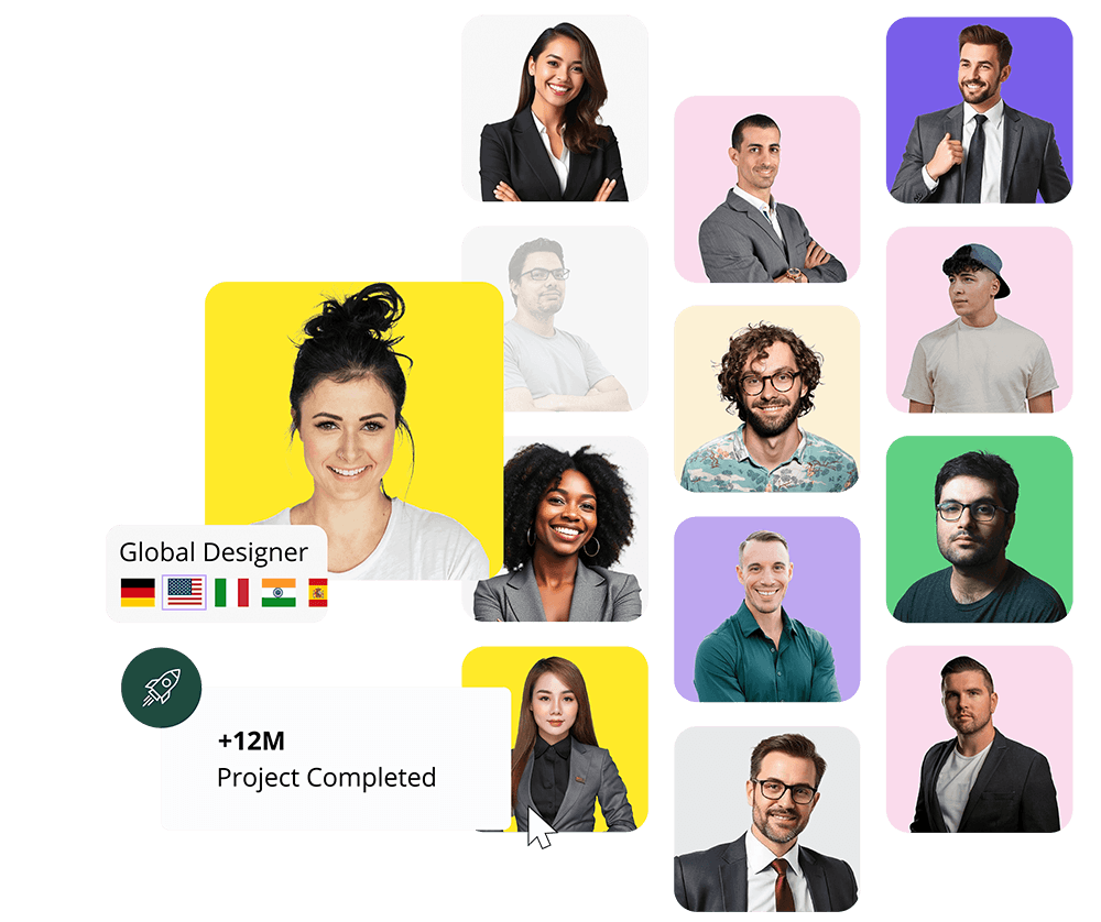
More than 100K+ Skilled Graphic Design Professionals at Your Fingertips


What You Get
When You Choose Us
We have been delighting customers since 2000 with complete branding solutions for small businesses and startups. The best digital marketing agency is now at your fingertips. Let us help your brand take flight and grow.
Start a Project
Customized solutions
Tailored graphic design and digital marketing services for all types of businesses including startups, small businesses, ecommerce, and medium sized enterprises. You can choose to start a logo design contest, hire a graphic designer or online marketing experts for custom branding solutions. We have a variety of options and services that fit every kind of requirement and budget.

Premium service
Our custom graphic designs are as unique as your brand because we believe your business deserves a gorgeous and inspiring brand identity. Our success lies in our network of global designers who will go the extra mile for clients just like you. When you hire Zillion Designs for a custom logo, website design, or any kind of project, you always get premium services however small or large your project may be.

Satisfaction guaranteed
Your satisfaction is our promise. As soon as you launch a contest, your dedicated account manager gets to work—inviting designers to participate in your contest; get quality design draft submissions within hours; get your feedback; and communicate to the designers of your requirements. You get the VIP treatment all the way, even after your project ends.

Trusted design marketplace
Zillion Designs is a trusted marketplace because we only work with verified graphic designers. We have a meticulous vetting process for approving designer signups and participation in logo design and other contests. Moreover, our custom graphic designers are certified professionals who are the best in their trade. With us as your branding partner, you are always assured of the quality of deliverables.
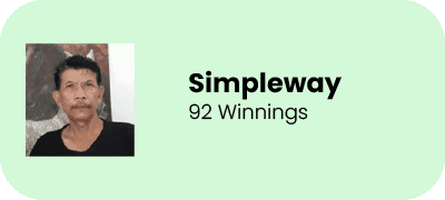
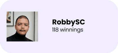
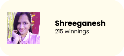
Our customers say it for us

"The entire team at zillion designs is highly professional. They communicated clearly at every stage of the design process. I always felt informed and confident that my project was in good hands."
- Tammy Bennett
"From the initial consultation, the team exhibited a deep understanding of my requirements, actively engaging in discussions to ensure that my vision was accurately translated into a tangible design."
- Robert W.
"I recently had the pleasure of working with ZillionDesigns for the design of my websites and company stationery, and I am beyond impressed with their service. From the very beginning, their team demonstrated a high level of professionalism, creativity, and friendliness that made the entire process seamless and enjoyable."
- Mahdi
"As a professional with a keen eye for exceptional branding and design, I've had the privilege of collaborating with the talented team at Zillion Designs. Their unwavering commitment to excellence and their ability to understand the unique needs of each client have consistently impressed me."
- Shirley C.
"Zillion Designs has solved our business's problem of creating an effective digital presence. As a writer or editing solutions, we needed an expert company to manage our online marketing that included SEO as well as social media PPC further. Zillion Designs has addressed this needs exceptionally well, ensuring that our brand's message is seen by the right people online. Its results are amazing and we've seen an increase in participation, higher search rankings and an increase in overall visibility. This has had a positive impact on our business."
- Catherine R.
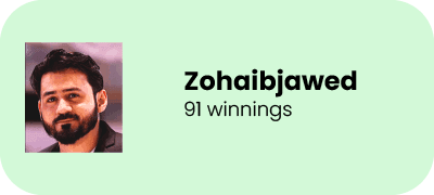
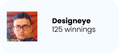
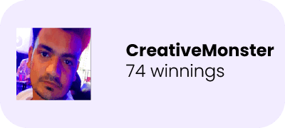
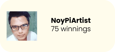
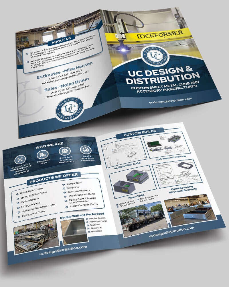
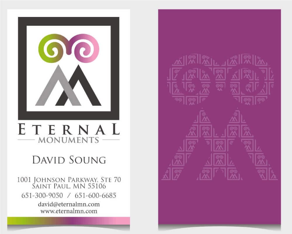
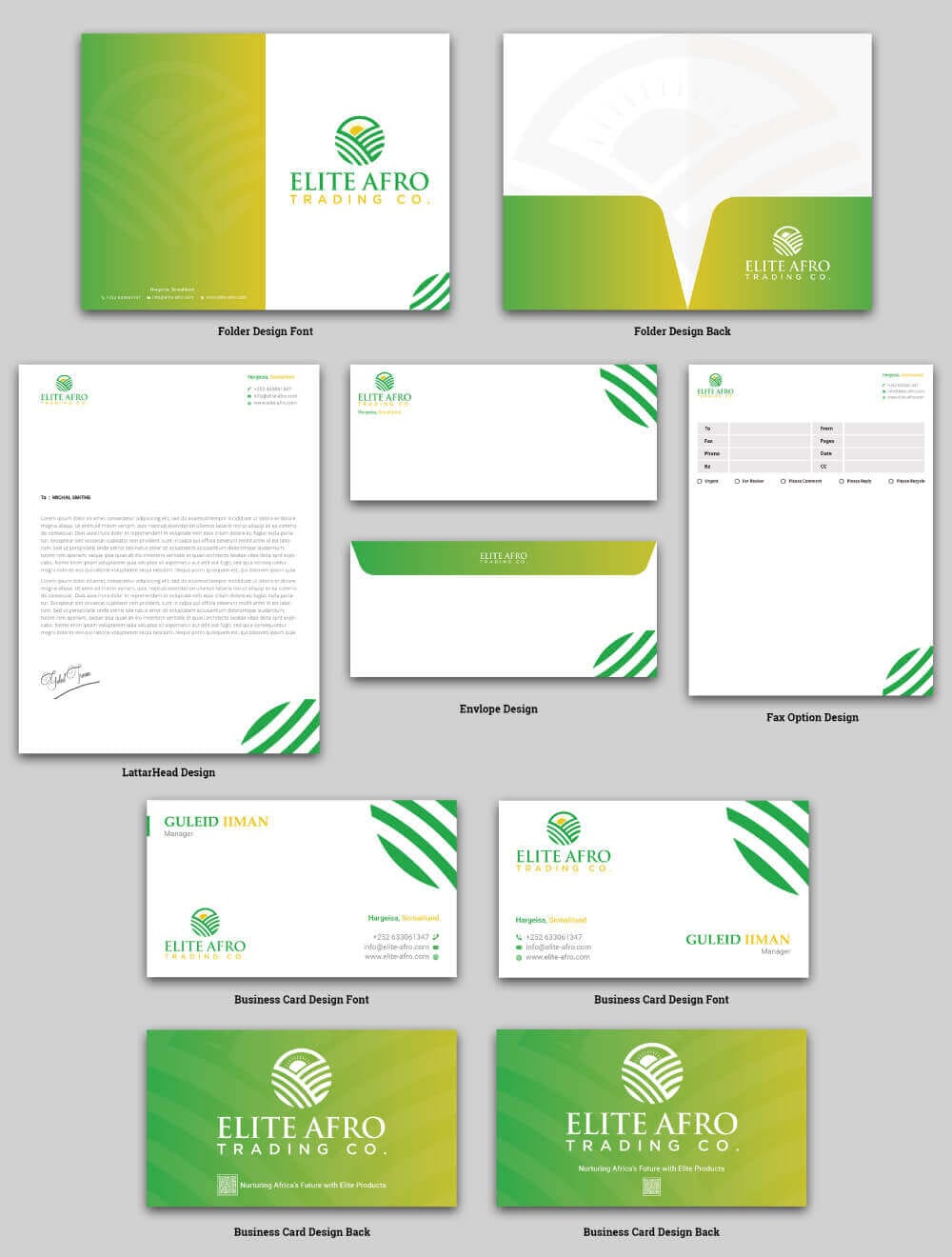
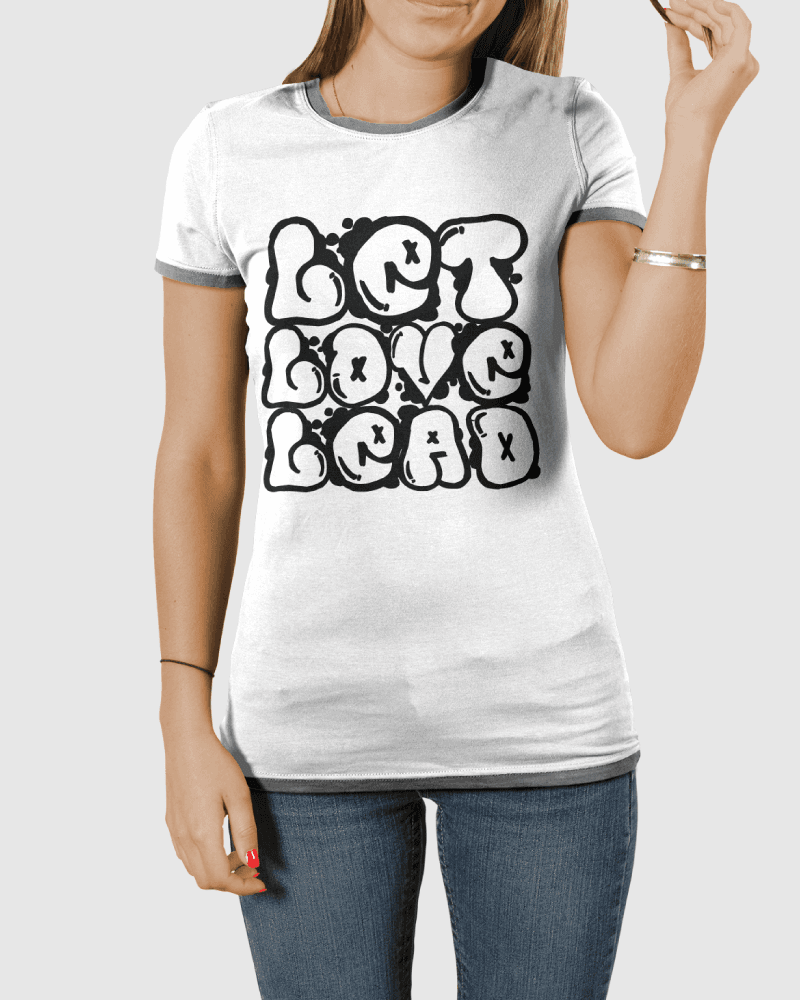
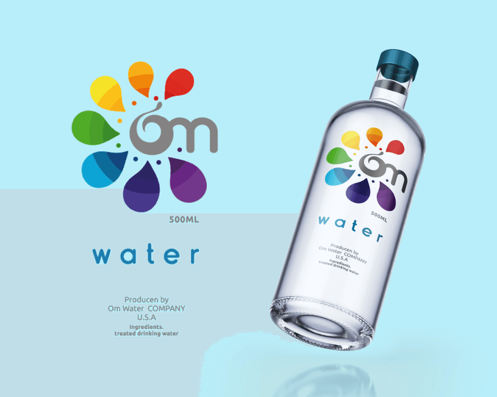
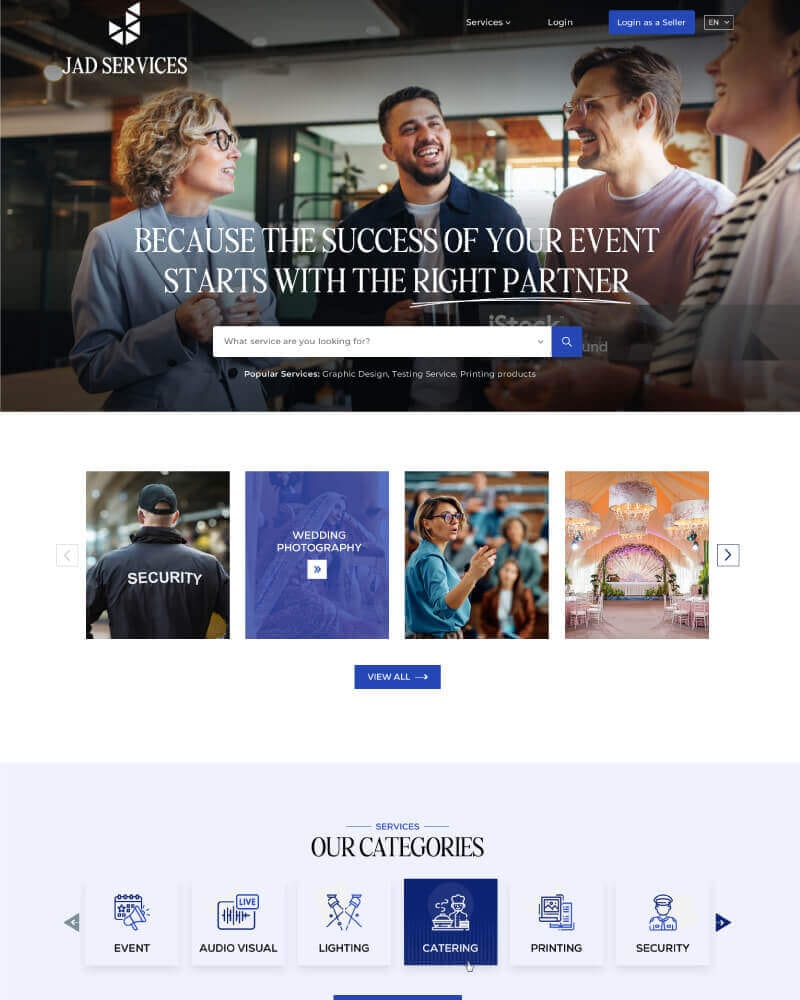
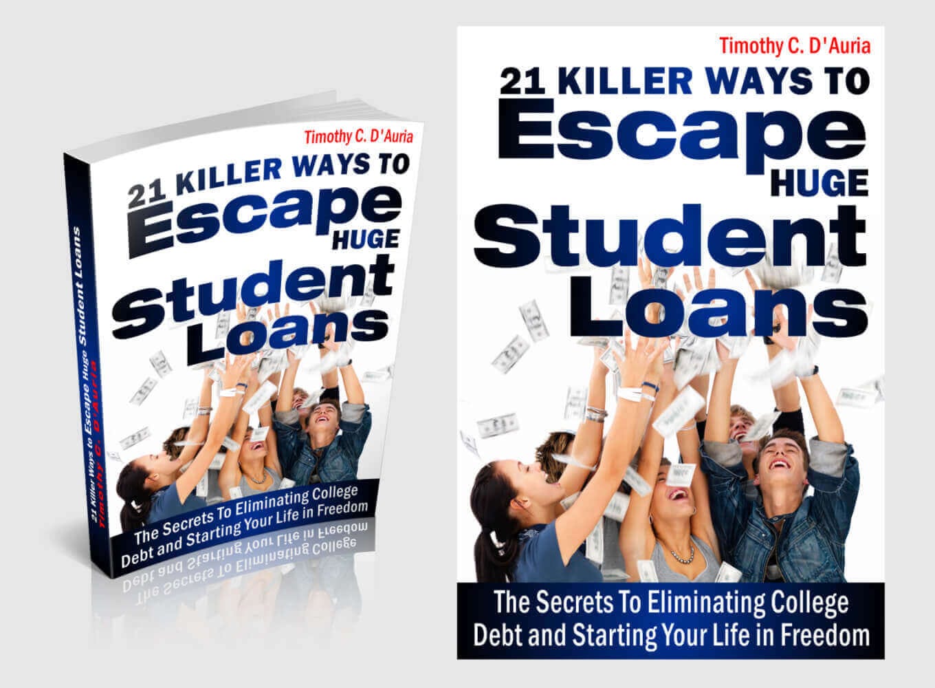
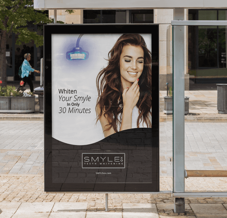
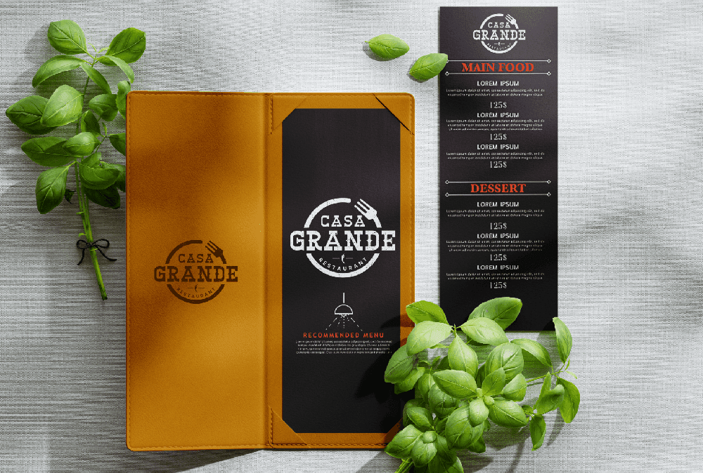
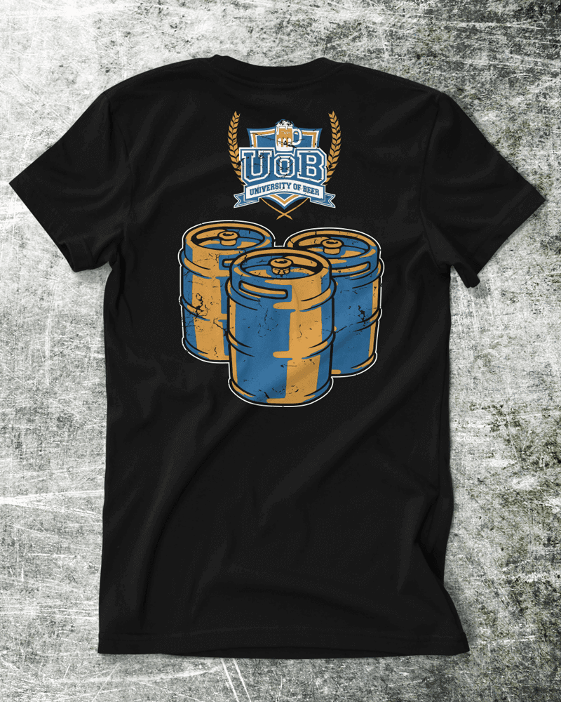
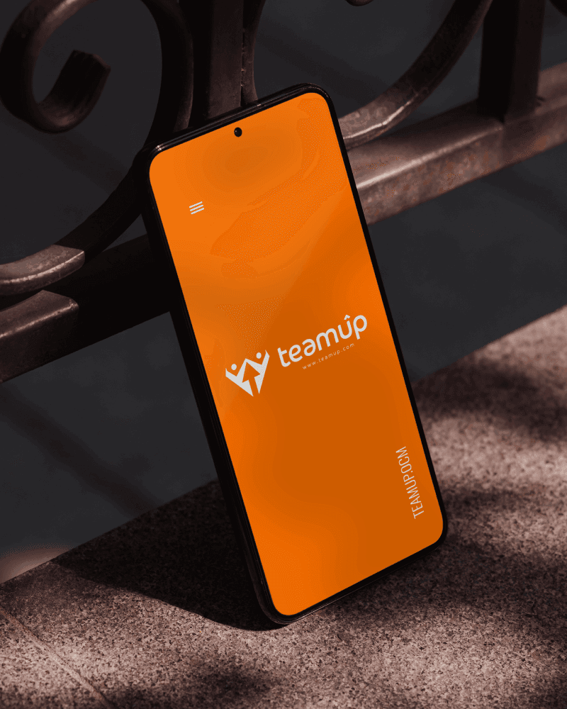
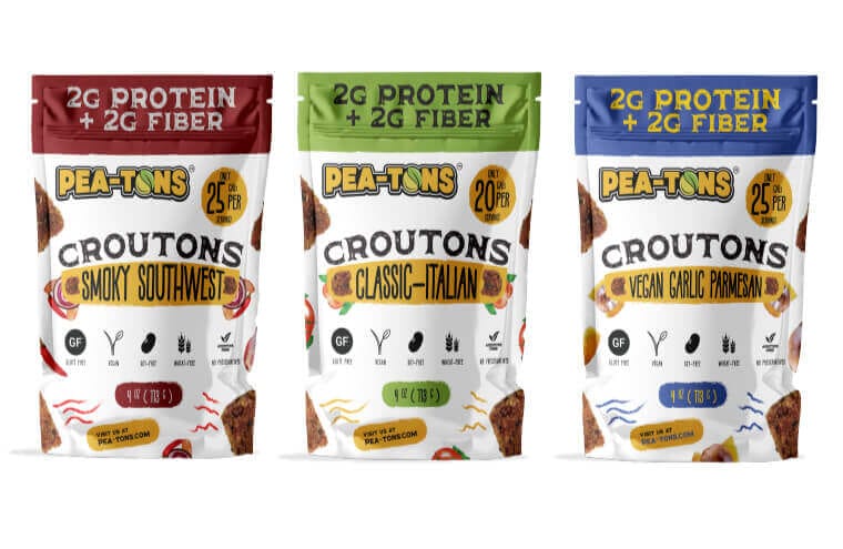
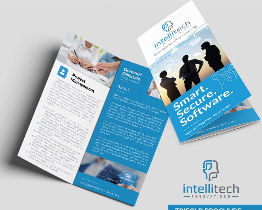
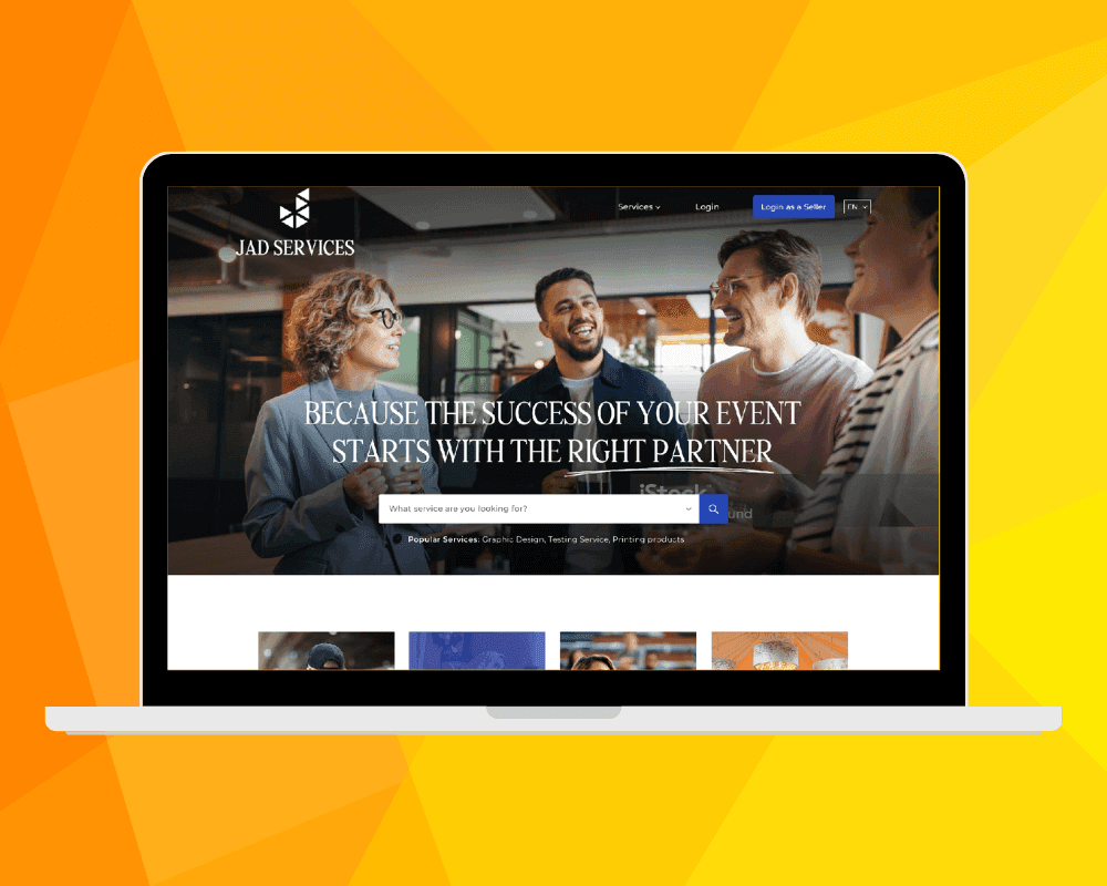
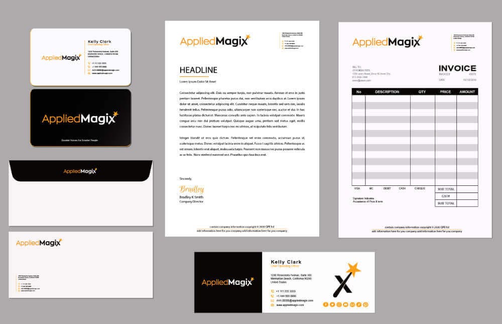
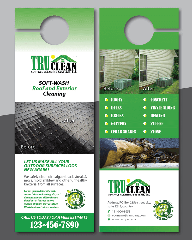
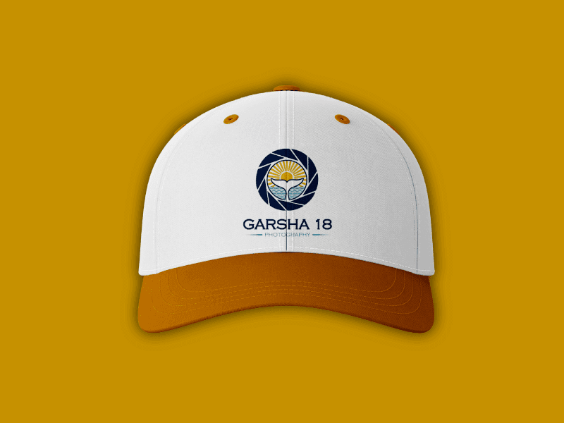
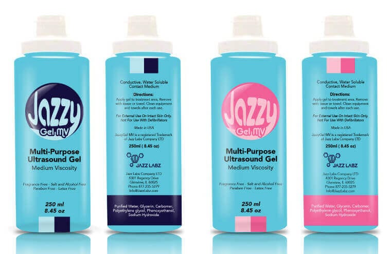
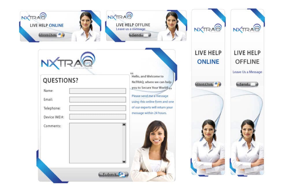
Made by our expert graphic designers
#For clients
Work with creative talents
Thousands of crowdsourced graphic designers are ready to submit tons of designs within hours. It’s the fastest way to get a logo design, stationery, website design, and more at affordable pricing.
Start Contest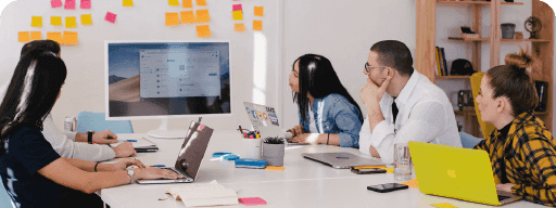
#For designer
Participate in design contests
The only trusted crowdsourcing platform that never fails to pay on time. All types of graphic designers are welcome--whether you are a logo designer, web designer, senior or junior designer.
Start Work
Frequently Asked Questions
We`re happy to answer your questions
A design contest is a competition in which graphic designers sign up and participate in it by submitting their design concepts. All designs are then reviewed by the contest holder; a winning design is selected, and an amount is awarded to the winner.
As soon as a project holder starts a logo design contest for example, our experts around the globe work on logo concepts immediately. With each logo design submission, you get more and more ideas for your brand identity.
The ease of providing feedback through star ratings, eliminations, and comments help graphic designers to shape your business logo design to the exact requirements. And when the logo contest ends, you get your design files in standard formats for all types of branding and printing.
At Zillion Designs we offer both design contests (crowdsourcing) and hiring a dedicated graphic designer (custom design).
When you hire a dedicated graphic designer, you have full control over the type of creative work and delivery. You can hire them for an hour (or several) depending on the length of your project. For example, it may take an hour to tweak a few presentation design slides versus say five hours to create a new presentation deck or packaging design.
Hiring a graphic designer makes sense for entrepreneurs and businesses that require graphic design experts to work one-on-one with flexible pricing.
Of course! Just browse through our website and you’ll find we offer all types of graphic design services—from logo design, brand identity to web design, web development, app design, marketing collateral, t-shirt design, and more.
If you can’t find the type you are looking for just contact us via email ( support@zilliondesigns.com), live chat, or phone ( +1-877-525-5646 ), and we’ll make it happen for you.
That’s right. We are more than just a logo design company. We offer the complete branding and digital marketing solution for businesses to launch and grow their brand confidently.
Our digital marketing agency services range from social media marketing, search engine optimization to paid marketing, content and more. We treat and serve each brand with a unique strategy and ensure you achieve your marketing goals--whether it is lead generation, conversion, fan following, or search engine ranking.