SALES / SUPPORT : +1-877-525-5646   |  


ZOTZinMusic & ZOTZinGuitarLessons Website

Music teaching.

Contest Holder vreny ?

Last Logged in : 594days23hrs ago

Concepts Submitted

43

Guaranteed Prize
600
Winner(s)

1

Web Design veildAll design entries can be viewed by other designers. Featured Featured Contest
tick_gray

Live Project

tick_gray

Deciding

tick_blue

Project Finalized


Project: ZOTZinMusic & ZOTZinGuitarLessons ...
Industry: Music Logo
Contest Launched: Jul 30, 2011
Selected: 1 winning design from 43 concepts
Winning Design by: sumit128
Close Date: Aug 07, 2011


ZOTZinMusic & ZOTZinGuitarLessons Website - Music


Awarded as a winner
Project Report    

Sort by:


#43

#26

#19

#18

#40

#39

#38

#37

#36

#35

#34


Creative Brief


ZOTZinMusic & ZOTZinGuitarLessons Website

Music teaching.

Music

www.zotzinmusic.com

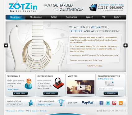
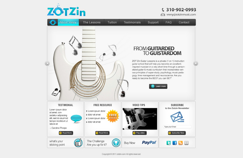
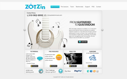
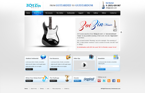
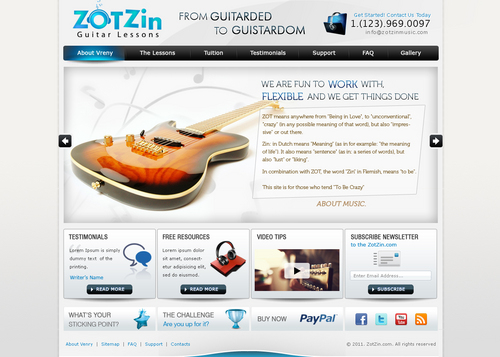
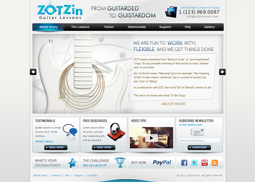
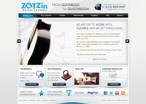
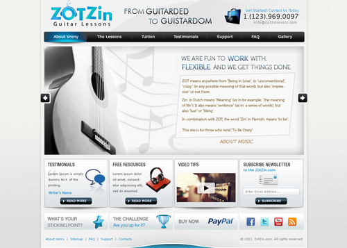
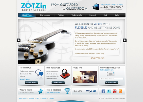
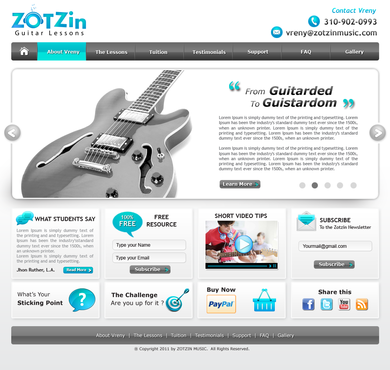
ZOT Zin Music is a company that will house 5 different businesses 1) ZOT Zin Online Music Lessons 2) ZOT Zin Publishing (for my 2 books) 3) ZOT Zin Recording 4) ZOT Zin Production 5) ZOT Zin Guitar Lessons. Each of these will have a separate website, I have all the domain names already registered. Each website will look and feel the same, only the website name will differ for each individual business. Here's some trivia that might be inspiring: ZOT (has many different meaning in Flemish and Dutch): it means anywhere from "Being in Love", to also meaning "unconventional", "crazy" (in any possible form and meaning of that word), but also "mentally unstable", "impressive", etc... Zin: different meanings as well... "Meaning" (as in for example "meaning of life", it also means "sentence" (as in sentences in a language), it also means "lust" (ohh yeahhh haha), "liking", "setting your mind to something", etc... In combination, the word "Zin" in Flemish means "to be"... so literally translated as whole, from Flemish... this would mean" "To Be Crazy". My main reason for this business name, when I brainstormed this because I needed one, was that it stands out and is memorable with the 2 Z's AND It was important to me that the words would be short enough so English speaking people would pronounce the words EXACTLY as they are pronounced in Flemish and Dutch... which is the case. Yaaaay. Message my company and my website wants to convey: 1) "Fun" is serious business fpr ZOT Zin Music. 2) ZOT Zin Music rocks your world. 3) We are creative and inventive 4) YOU are important to us (the bigger head/globe creates that impression strongly) 5) You can "belt" out with us without and be yourself and we help you find your voice. 6) We work focused and structured, but are not rigid. (the falling letters at the end of the logo, being support by the word "music")... we have a plan and direction, and vision, but easily adapt our approach to your needs. I think the design manages to evoke that pretty well... it looks playful but has some sense of balance and structure in it as well. 7) We are fun to work with, flexible and we get things done This post is for the creation of the guitar lessons website www.ZOTZinGuitarLessons.com "ZOT Zin Guitar Lessons" offers personalized private guitar instruction incorporating principles of super-study, psychology, music pedagogy, time management & neuroscience I like the idea of having the tagline/sales line... "From Guitarded to Guistardom" underneath the logo.

I LOVE everything about Apple and I also love their website. It has a cool feeling of space, design, and nice graphics. I want my site to have the same sophisticated, clean, fresh, clear, open feel like the Apple website. I want black text on white background. I want the whole website to be entirely visible without needing to scroll. I would dislike my website looking too much like a template or Wordpress template. I want it to look like it's custom designed. I want following links/navigation: 1) home I probably would provide the same info like this guy http://www.guitarlessonsla.net/faq.htm 2) About Vreny 3) The Lessons 4) Tuition 5) Testimonials 6) Support 7) FAQ 8) Gallery. Then there is info I want on every page. 1) Contact info. (as on http://www.guitarlessonsla.net/faq.htm) Following 7 things that I want on every page, I would like this info like on the Apple website, in cool little link boxes at the bottom of each page, that you click on and a new page then opens up from there. ( I have attached/uploaded a picture called "link boxes), which I took from the apple website to showcase what I mean. I want to have a cool, glossy, sophisticated graphic in every link box/button, just like on the apple website) 2) A box for a student testimonial on top of every page: 3) a Free Resources box: This would be a newsletter, in the form of a little content box showing up on every page with a link. (Which will lead to an info page) (as in http://markgoulston.com/resources/) 4) a box/button that says: "What’s Your Sticking Point?" 5) A 30 second Video Tips. box 6) a Social Networking box. This would be a box that holds links (as icons) where students can further connect to me on my Facbook, Twitter, Youtube etc page. 7) A “Buy Now” link/button or box with a link to PayPal on EVERY page (besides obviously the tuition page) so visitors can buy their lessons from any page). 8) Subscribe boxes: (which would be linked to different email campaigns ). 9) a box labeled "The Challenge" I like having all my contact info in the header, like here http://www.guitarlessonsla.net/index.html But I dislike headers that big... I want my header to take up little space on the page, like here http://www.apple.com/ (but maybe a tad bigger than this, as my logo will have to fit in the header)

Cutting-Edge

Unique/Creative

Clean/Simple

Professional

Trendy

Content Driven

Friendly

Academic

Exciting

Sophisticated

Inspirational

Progressive

Service Oriented

White

Blue Greenish color as in my logo

Silverish

below header

http://www.apple.com/

http://www.guitarlessonsla.net/index.html

http://markgoulston.com/

I want the site to have a glossy, sophisticated look, but every organized, structured and easy to navigate.

Related Contests


Website design for L.A. based music production house
$350
Prize Money
52
Concepts

Discussion


Comments

  • August 07, 2011 1:57 AM
    vreny vreny
      Project Holder
    #43 Totally blew me away and is utter design, marketing and sales perfection. This is EXACTLY the site that I envisioned, described in my brief, and was hoping for. CONGRATS Mr. Sumit128 with WINNING this project!!! I also wanted to thank all the other people who contributed here. Thank you for your amazing communication, and for your really really great designs you all sent me. I want you all to know that I deeply loved ALL your work. But I had a very strong idea of what I was looking for, and I was looking as much for a very functional marketing and sales site as I was looking for a beautiful design. I really enjoyed seeing what you all came up with. I send you and your families all much love and respect from me. I have the utmost reverence and respect for your talent and your great contributions. This has been an interesting ride. Thank you very much. Much love. Vreny Van Elslande.

    Like Icon 0   DislikeIcon 0
  • August 06, 2011 5:13 AM
    fenix fenix
     
    Its ok Bro....

    Like Icon 0   DislikeIcon 0
  • August 06, 2011 4:25 AM
    dinesh1201 dinesh1201
     
    @fenix: I respect you and your work. :) good luck. I take my words back.

    Like Icon 0   DislikeIcon 0
  • August 06, 2011 3:59 AM
    fenix fenix
     
    Dear Project Holder, Thank you for your reviews it really encourage us but we are here like a family... At last the decision is totally yours I just use the same image which is a stock photo n from that part my design looks very similar to sumit design's and if you can see the header part and the middle sections boxes these things are totally my own made.... if u have any updates for my design please let me know it will be my pleasure Thank you Fenix

    Like Icon 0   DislikeIcon 0
  • August 06, 2011 3:51 AM
    fenix fenix
     
    @dinesh1201... Sorry Friend bt this image does not belong to sumit and it is stock foto so anyone can use it hope u understand Thank you :)

    Like Icon 0   DislikeIcon 0
  • August 06, 2011 12:29 AM
    dinesh1201 dinesh1201
     
    this is now wrong, I've withdrawn my design that's okay, but fenix is using Sumit's image on the header, is this right?

    Like Icon 0   DislikeIcon 0
  • August 05, 2011 11:49 PM
    vreny vreny
      Project Holder
    ok.. this is tough... #26 is a VERY serious contender to win this contest because I am totally in love with the design and the colors. At the same time... I had Sumit spend so much time in updates, extra drafts, new approaches, etc... and there is no denying that Mr. Fenix 's #26 is very very much looking like Mr. Sumit's work. It would probably be totally unfair to Sumit if I just decided, after I had him do so much work, to go with someone else , whose work contains many the same design elements and ideas like Mr. Sumit. I always strive to be honest, genuine, and do the right thing with everybody. So... I dunno how you guys (Mr. Fenix and Mr. Sumit) think and feel about this situation??? Please advise?? What do you think?

    Like Icon 0   DislikeIcon 0
  • August 05, 2011 6:41 AM
    vreny vreny
      Project Holder
    #25 is getting really really close to being the one. That is my favorite design so far. It is very smart, and is made by a designer who shows that he also knows a lot about marketing... i.e. having a testimonial on the very top of the page, is a pretty darn smart move. #24... no colored background underneath text. This is a sales and educational website: I need to have everything conform to top marketing standard... which for example strongly advice against having distracting graphics or dark background underneath a text, as it strains on the eye and makes visitor turn away from your site sooner.

    Like Icon 0   DislikeIcon 0
  • August 04, 2011 10:05 PM
    vreny vreny
      Project Holder
    at #23. I have seen that guitar picture before. I don't want clip art or stuff that has been used before on my website. Thank you sir. Also: as stated in my brief: no white text on black background.

    Like Icon 0   DislikeIcon 0
  • August 03, 2011 11:05 PM
    vreny vreny
      Project Holder
    ok... I'll try to take my time and be as thorough as possible here My fav ones so far are #6 and #13 I had all the designs shown to all my students today, and pretty almost everyone chose those as the fav designs so far. IMPORTANT: one of THE main reasons why these are my favorites so far, is that (as I stated in my brief), I want my page to look very custom designed, not template-y, and Sumit took/created/used a guitar design that looks like something he designed to go with the feel/look/image I want to personify and convey through my site. Its a beautiful guitar picture, but it has an abstract feel to it... it is not just some guitar photo that he copied and pasted in there. His guitar is kind of abstract, and is integrated really well within the page design... not just looking like a photo he pasted on top. (which is a little bit how all other designs look like). Because the photo/graphic he used is a more abstract picture of a guitar... it also automatically as a result, makes the page, the site and the guitar more universal... as opposed to all the photos everybody used so far of Fender Strats, Gibsons, Parker Fly Guitars, acoustic classical guitars, etc... etc... IF you choose to use a guitar picture (and keep in mind: IT DOES NOT HAVE TO HAVE A GUITAR picture just because this is a site for a gutiar teaching business... be creative... inspired... unusual...)... don't use a photo... go for something more abstract that represents a guitar, without it looking like a guitar photo of a known.recognizable model. I want MORE UNIVERSAL... not locked and limited into a style, label, music stylistic image... etc... Sumit on #13... can you find a way to have the guitar back left side, have a text box to the right of that guitar... and somehow find a way to have my company logo and contact info, layered on top of right above the guitar or something... or maybe have the guitar a tiny bit smaller and move just a bit more to the left??? I want the guitar to not take up too much space. For example: I like #16.. but I think the guitar takes up a bit too much space. I want a text box on the right side of the guitar, with header title "From Guitarded to Guistardom". My business logo needs to be positioned left top. Keep in mind: this is a business/sales website... look at Apple, Amazon, Dubli.com, eBay, etc... The logo is ALWAYS top left of page. It is a trait that affects/improves sales. I was wrong asking to have my logo embedded into the design... you guys (#1, #2, #6, #15, etc.) were right. Please if you know things about sales/marketing etc that I don't know about... don't go with my idea I propose just because I am asking for something. If I ask to have my logo embedded into the design, and you KNOW that that is not as good an idea because visitors ALWAYS look top left page first... then you HAVE TO tell me I am wrong haha. I need your brains and knowledge to help me get the best possible site. I just learned that the logo always has to be at the very top left for top sales/business sites. So that being said (#15, #6, #2) : Is there a way you can maybe frame a line or something around the top of the page/design above the logo, so it looks more like the logo is embedded in the design... or fill up some of the space right of the logo or have something there so the logo looks more integrated into the page?? In the text box underneath, right to the guitar, with title: From Guitarded to Guistardom.. underneath that title, please paste following text (I am just curious how that would look like) "ZOT Zin Guitar Lessons is a private (1 on 1) instruction guitar school that will help you become an excellent, inspired musician in a very short time through a personalized guitar & music curriculum that incorporates various principles of super-study, psychology, music pedagogy, time management and neuroscience. Are you ready to become the BEST you can BE?" Later more info, updates, and ideas... got to get back to work quickly here haha.

    Like Icon 0   DislikeIcon 0
  • August 03, 2011 1:36 PM
    vreny vreny
      Project Holder
    #13 I love how you made the guitar a little smaller in size, I somehow also preferred having that guitar on the left side. Is it possible to have that guitar maybe a tiny bit smaller as a graphic than this, more to the left again, and somehow fit in my company name and contact info on the upper left corner of that design/info block maybe overlapping over the guitar if needed to, or over the guitar neck?? Also: the from "guitarded to guistardom" would be the header/title of a text box there where I introduce myself... so I would like to have that title up higher, with text underneath and a read more link. I like how you made the "home" button my icon... I somehow knew somebody was going to think of that haha. I will give more feedback to everybody's designs very soon... super crazy busy day today.

    Like Icon 0   DislikeIcon 0
  • August 02, 2011 4:30 PM
    mastermind mastermind
     
    Hello PH, Please check your private message..... Thanks

    Like Icon 0   DislikeIcon 0
  • August 02, 2011 4:22 PM
    vreny vreny
      Project Holder
    Hi Ria and Sumit, Thank you for your great designs. Things I would like to experiment with. 1) is there a way you can integrate my logo and contact info into the graphic where you have the guitar?? There more I look at the designs, the more I start feeling that I don't like having my company logo/name being so removed from the page/design. It looks like it is too distant, too removed, not well integrated into the design. 2) I want my logo embedded in the graphic, on the left side of the page, and I want my contact info underneath the logo. I want it to say: Contact Vreny, then underneath that a phone handset icon and my number, and underneath that an email icon and my email vreny@zotzinmusic.com 3) This would move up the whole page to where the row of links would be on the very top of the page. I would really like that. That is how it also is on the apple Website 4) for #6 and #2 , where it says "Lorem ipsum dolor..." right next to the guitar... replace that text with "From Guitarded to Guistardom" . I am just curious how that would look like. I will give more ideas and updates soon.

    Like Icon 0   DislikeIcon 0
  • August 02, 2011 12:42 AM
    vreny vreny
      Project Holder
    I am sorry for apparently not having been clear and a bit confusing in my brief. Mr Vinit just brought this to my attention in an email. This is for 1 (ONE) website only, that will serve as the same design for all my different businesses... all looking the same in terms of design, just with different text information added to each site for each business. The only difference is that one site is gonna say "ZOTZinMusic" and the other site is going to say "ZOTZinGuitarLessons", but both will look close to exactly the same. Sorry I did not make that clear in the brief. I DO NOT EXPECT YOU TO build me 2 different sites for this price money. lol. I am sorry if I gave that impression in my brief. I could never be THAT disrespectful towards you when after all I highly admire and respect your skill, love for design, talent, and time you put into all of this. Much love you all. Cheers Vreny.

    Like Icon 0   DislikeIcon 0
  • August 01, 2011 2:54 PM
    vreny vreny
      Project Holder
    #4 Thank you so super much for your fantastic work Thinkersdesigner. I love it, but as explained in my brief... this is not what I am going for. I am really going for white, silver-ish, sophisticated, open clean background/website. The mac Apple website is a really great/good inspiration. I also want my site to be very functional... not too much space used up by graphics, etc... Definitely of course no violins as this is a private guitar teaching business. Best Vreny.

    Like Icon 0   DislikeIcon 0
  • August 01, 2011 6:38 AM
    riaaki riaaki
     
    Hi Vreny please check your private message.

    Like Icon 0   DislikeIcon 0
  • August 01, 2011 2:31 AM
    vreny vreny
      Project Holder
    oh also... could you make the edges/borders of text boxes more refined/noticeable... so they stick out more from the background. (for example by adding a shadow or something at the lower edge of the box... or something) Thank you. Vreny.

    Like Icon 0   DislikeIcon 0
  • August 01, 2011 2:30 AM
    vreny vreny
      Project Holder
    Yaaaayyy... first draft in.. I was getting worried haha. Thank you super much Riaaki. I will give more comments soon.. need to spend some time with your design first, but I can already give following pointers. first off: I love the colors, I love how it does not look too "template-y" haha. That is awesome. 1) In the "challenge" box; underneath "The Challenge" could you please add the text: "Are you up for it?" 2) Can you add a box that says : "Video Tips" 3) Can you add a little graphic in all the link boxes, like on the apple site. 4) no pictures/graphics of kids on my site. The reason I am adamant about that is that my actual business logo already looks playful and fun.. and I want to make sure that I don't give the impression that I only teach kids... when as a matter of fact I specialize in teaching people starting 16 years old. 5) I want everything on the site to fulfill a well defined purpose... and use all the real estate/space on my site efficiently. I need to think about the guitar back ground you have here... I think I would prefer having a smaller header or artwork... where my company name logo is more part of the actual artwork. I think design wise this draft might be potentially confusing, creating the impression a bit that there are too headers. (the one with my company logo, and the guitar graphic, which creates the impression a bit of a header too). I need to think about this as I like the colors and feel of that graphic. Maybe replace the guitar with the company logo??? not sure? Will give more input and ideas and thoughts soon. Thank you super much. Best Vreny.

    Like Icon 0   DislikeIcon 0