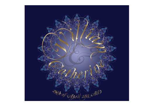
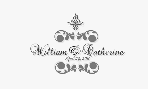
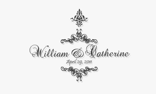
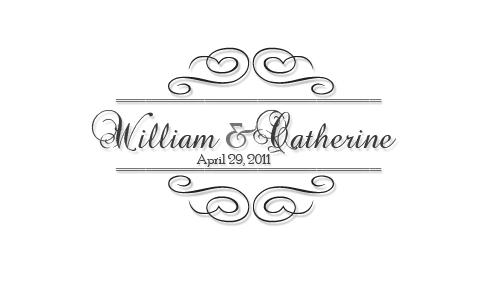
Wedding Monogram for Prince William and Kate Unofficial Contest
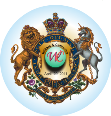
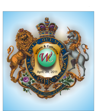
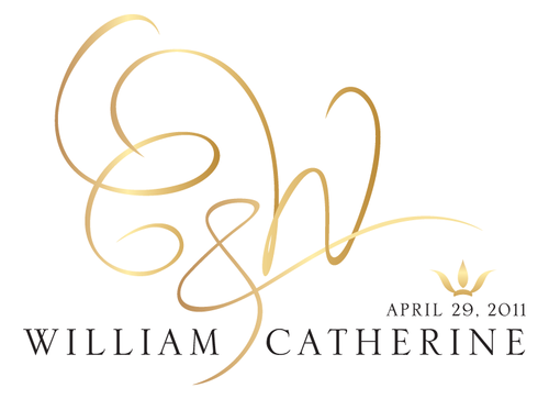
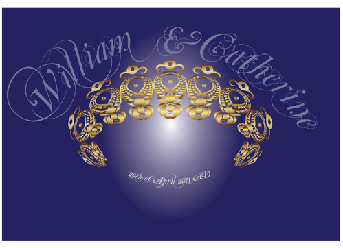
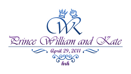
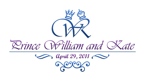
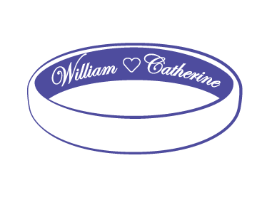
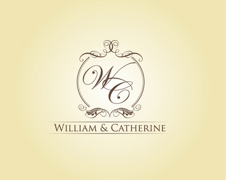
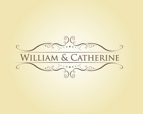
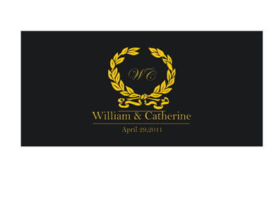
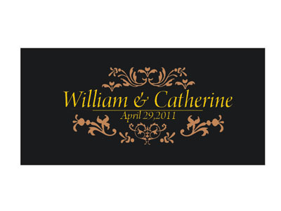
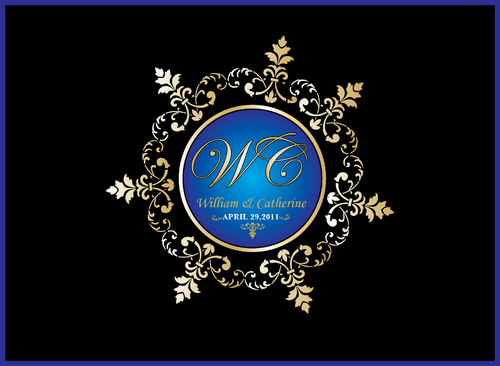
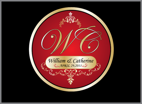
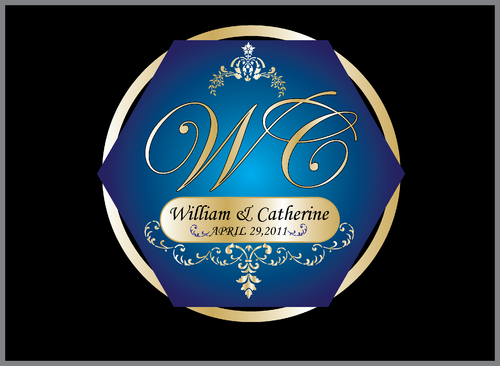
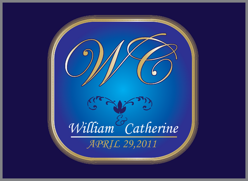
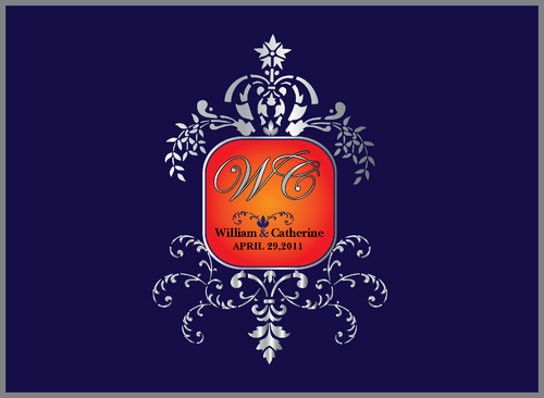
William & Catherine
|
Contest Holder
SiteAdmin
?
Last Logged in : 3days19hrs ago |
Concepts Submitted
464 |
Guaranteed Prize
500 |
Winner(s) | A Logo, Monogram, or Icon |
|
Live Project
Deciding
Project Finalized
0 day(s), 0 hrs remaining for Project Holder to select a winner


Creative Brief
Wedding Monogram for Prince William and Kate Unofficial Contest
William & Catherine
Yes
UNOFFICIAL CONTEST - JUST FOR FUN!!
Prince William and Kate Middleton are getting married!
We want you to design a beautiful, creative, regal wedding monogram for Prince William and Kate that highlights the magnitude of this event.
(A Monogram is a design consisting of two or more alphabetic letters combined, commonly one's initials or names, often printed on stationery, embroidered on clothing, etc.)
Brief History – The Royal Family of the UK is called the House of Windsor, and they have been ruling since 1917. Queen Elizabeth II has been the head of the royal family and ruling the UK since 1952. The last large, extravagant widely-celebrated royal wedding was on July 29, 1981, when Prince Charles and Diana got married.
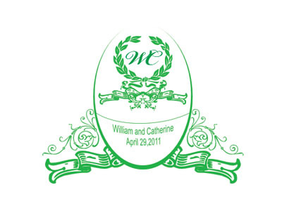
Prince William and Kate’s wedding will take place April 29, 2011.
This contest is just for fun! We do not know anyone in the royal family, and they probably have some royal monograms lying around somewhere they could use – but we think their century-old designs could use a breath of fresh air.
You can make the monogram simple or complex.
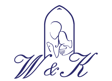
You can include the names “William and Catherine” or “Prince William” and “Kate” or "Catherine", or “W” and “K” – You can also include the initials "HRH" which stand for “His Royal Highness” or “Her Royal Highness” – titles used to address the royal family.
Wedding
Symbolic
![]()
Abstract Mark
![]()
Initials
![]()
Illustrative
![]()
Unique/Creative
Sophisticated
Modern
Fun
Serious
Illustrative
Masculine
Feminine
Youthful
Traditional monograms are 2-colors, but you should have fun with it!
not sure
For more information about the Royal Wedding, you can search Google, or click here:
http://www.princeofwales.gov.uk/newsandgallery/news/his_royal_highness_prince_william_of_wales_and_miss_catherin_77816924.html
http://www.theroyalweddingwilliamkate.com/
http://www.telegraph.co.uk/news/uknews/royal-wedding/
http://news.yahoo.com/royal-wedding
Comments