SALES / SUPPORT : +1-877-525-5646 |
Login
Live Project
Deciding
Project Finalized

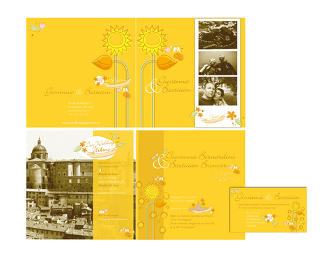
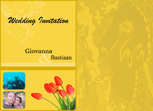
wedding invitation (invitation + save the date card)
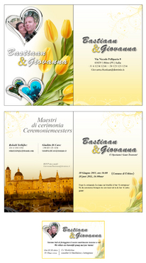
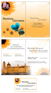
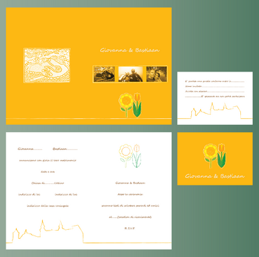
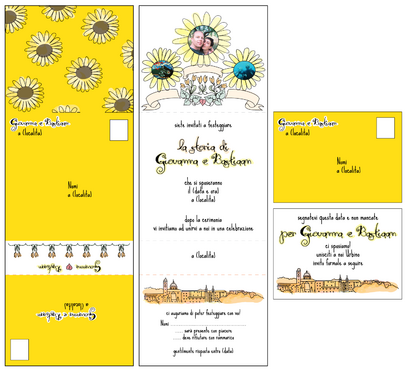
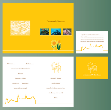
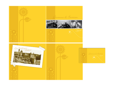
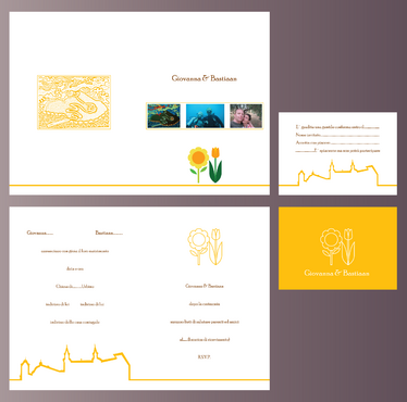
Giovanna&Bastiaan
We are getting married! We are looking for an original wedding invitation and ‘save the date’ card for our wedding. We see the ‘save the date’ card as a simplification of the more elaborated wedding invitation. We are a Italian-Dutch couple; the wedding ceremony and party will be in our beautiful town Urbino in Italy. The cards should express simple, young, fun and cheerful. This is also what the style of our wedding will be. Not too fancy.
Our guests, mostly friends and a few family members
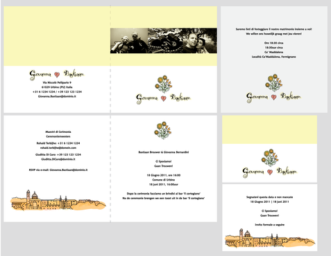
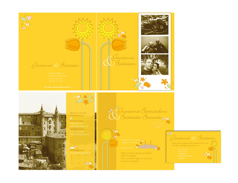
There are a few elements that we would like to see on the invitation, that is: 1.We’ve uploaded 3 photo’s that for us tell the story how we’ve met. We would like to see these three photos take a dominant place on the invitation. 2.We would like to express the Dutch part by means of a design of an orange tulip. And the Italian part by means of a design of a yellow sun flower. We like the style of ‘blond-amsterdam’ as an indication. http://www.blond-amsterdam.nl/#/nl/products/groups 3.We would like to express the city where we live and will getting married, Urbino, by a line that line that takes the outer shape of the palace of Urbino with its two distinct towers. http://www.laterrazzadelduca.com/citta.html We are looking for a wedding invitation that is a card that can be opened (front, inner part, back). The save the date card will just be a card with a back and a front. The exact details of our wedding card text and place we don’t know yet, we’ll fill that in later. For now you can use a standard text.

Comments
Project Holder
Project Holder
Project Holder
Project Holder
Project Holder
Project Holder
Project Holder
Project Holder
Project Holder
Project Holder
Project Holder
Project Holder