SALES / SUPPORT : +1-877-525-5646 |
Login
B2B site: 3 page templates, Well thought out requirements, brief and some wireframes
|
Contest Holder
TVD2011
?
Last Logged in : 3547days14hrs ago |
Concepts Submitted
111 |
Guaranteed Prize
555
|
Winner(s) | Web Design |
|
Live Project
Deciding
Project Finalized

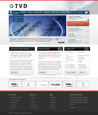
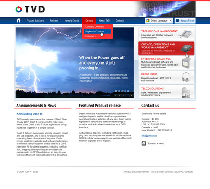
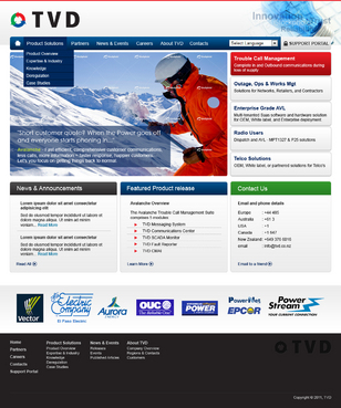
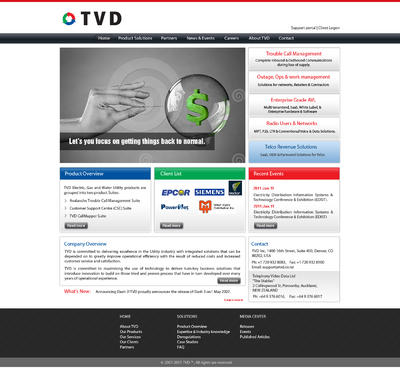
Website refresh! Software products and services.
B2B site: 3 page templates, Well thought out requirements, brief and some wireframes
Information Technology
www.tvd.co.nz
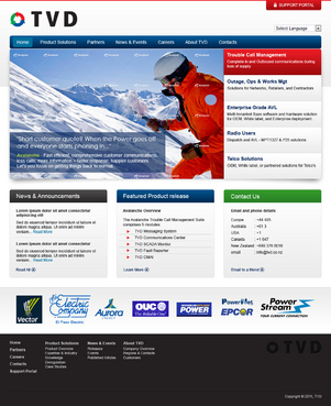
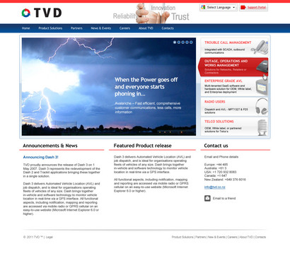
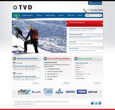
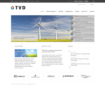
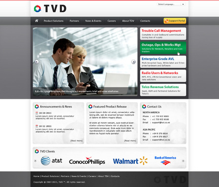
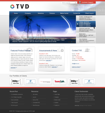
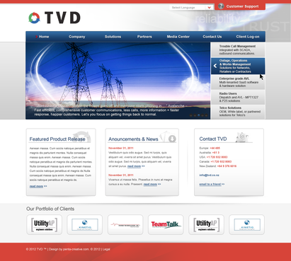
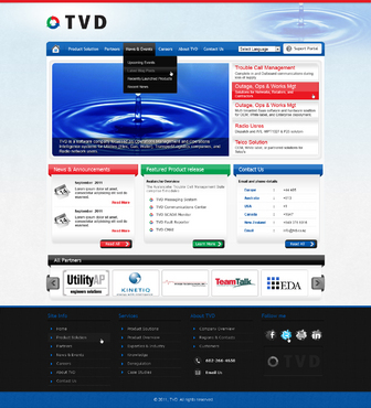
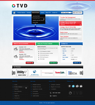
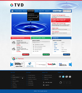
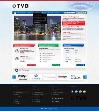
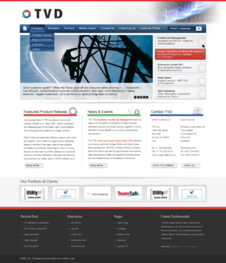
TVD is a software company focussed on Operations Management and Operations Intelligence systems for Utilities (Elec, Gas, Water), Transport/Logistics companies, and Radio network users. We have been in business for 10+ years and have clients all over the world. Our products are robust, credible, and meet the needs of these customers.
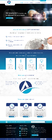
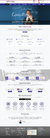
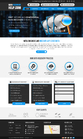
This is a B2B site. Needs to be clean and easy to navigate, information, screen shots, relevant graphics. Refer to the attached preliminary design brief.
Clean/Simple
Professional
Content Driven
Friendly
International
Sophisticated
Corporate
Modern
Progressive
Service Oriented
High Tech
Red banner
White
Blue
left side
www.powellinc.com
http://www.3cx.com
http://www.ge-energy.com/products_and_services/products/utility_operations_software/
CMS will be wordpress. 3 page Templates and associated graphics. 1. Home/Landing page 2. Inside Category and Product Pages 3. Miscellaneous pages, eg Contact Us, Careers, News & Events, etc. Refer to the attached Summary design brief which has example sites, UI ideas, Wireframes of suggested page layout. Copy will also be provided to the selected designer so they can see how the content will fit with design.


Comments
Project Holder
Project Holder
Project Holder
Project Holder
Project Holder
Project Holder
Project Holder
Project Holder
Project Holder
Project Holder
Project Holder
Project Holder
Project Holder
Project Holder
Project Holder
Project Holder