SALES / SUPPORT : +1-877-525-5646 |
Login
cloudvps.in
|
Contest Holder
funguru
?
Last Logged in : 3761days19hrs ago |
Concepts Submitted
130 |
Guaranteed Prize
200
|
Winner(s) | A Logo, Monogram, or Icon |
|
Live Project
Deciding
Project Finalized

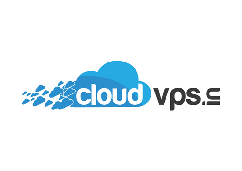
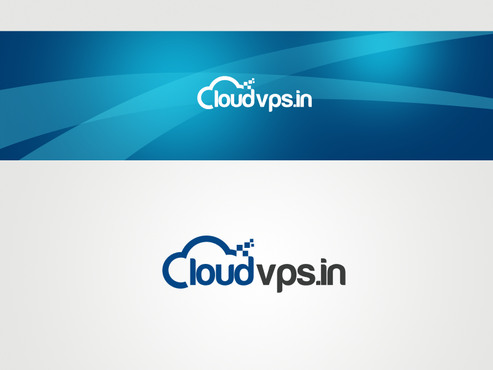
website logo for cloud vps
cloudvps.in
No
this is for my cloud hosting business, the website name is cloudvps.in.. since i do not have a .com, i would like .in to be neatly included in the logo design as this would be good for branding and recall. I like the logo of cloud spot . com and love the way they have used the "O" in spot as a favicon in the url. I also like zoho.com and campfirenow.com logos where a symbol is used with the domain name.
Internet Services
Logo Type
![]()
Abstract Mark
![]()
Web 2.0
![]()
Unique/Creative
Clean/Simple
not sure
The logo would be for the website, but would be used in business card, letter head etc. Please avoid the use of shadows.


Comments
Project Holder
Project Holder
Project Holder
Project Holder
Project Holder
Project Holder
Project Holder
Project Holder
Project Holder
Project Holder
Project Holder
Project Holder