SALES / SUPPORT : +1-877-525-5646 |
Login
A new look for an established website
|
Contest Holder
whetstone
?
Last Logged in : 3545days13hrs ago |
Concepts Submitted
16 |
Prize Money
350
|
Winner(s) | Web Design |
|
Live Project
Deciding
Project Finalized

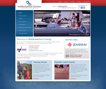
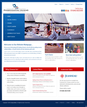
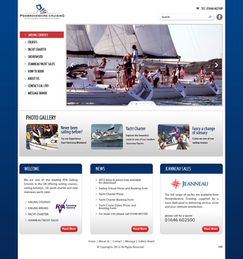
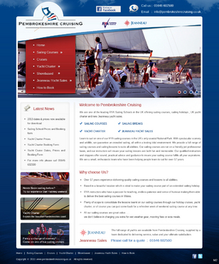
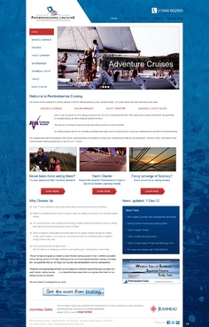
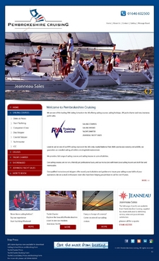
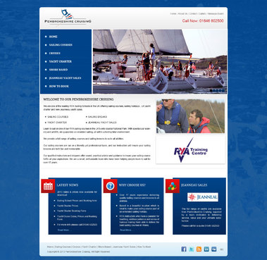
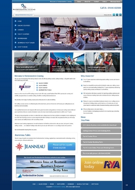
Website for Yacht hire/ sailing school business
A new look for an established website
Outdoors
pembrokeshirecruising.co.uk
The company has been in business for 18 years and operates out of a marina in soutth west Wales. Main activities are: 1) Sailing school, offering courses from beginner to expert both on the water and in the classroom 2) Sailboat charter/hire 3) Adventure Cruises on a skippered boat 4) New Yacht Sales
Easy to navigate site needed with the emphasis on easy user experience and navigation Needs to be clean, uncluttered yet attractive
Clean/Simple
Content Driven
Friendly
Exciting
Sophisticated
Modern
Progressive
Service Oriented
page outer background may be #004488
could be a gradient to #062858
main content area white
left side
Comments
Project Holder
Project Holder
Project Holder
Project Holder
Project Holder
Project Holder