SALES / SUPPORT : +1-877-525-5646 |
Login
STENDER
|
Contest Holder
stender
?
Last Logged in : 4065days15hrs ago |
Concepts Submitted
72 |
Guaranteed Prize
350
|
Winner(s) | Web Design |
|
Live Project
Deciding
Project Finalized

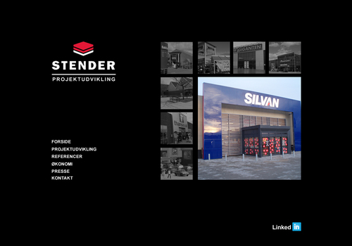
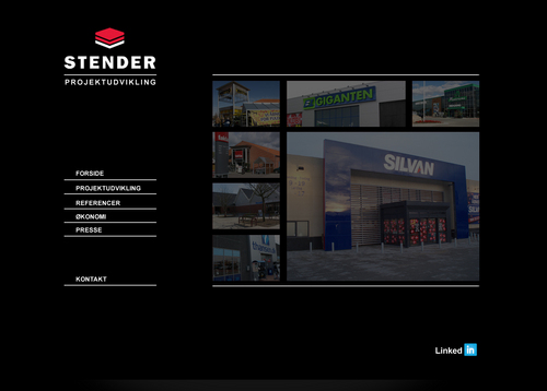
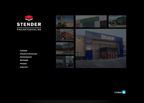
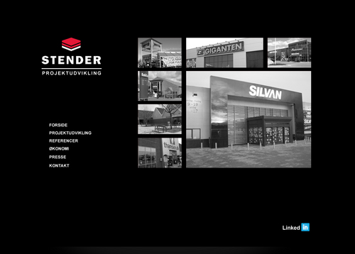
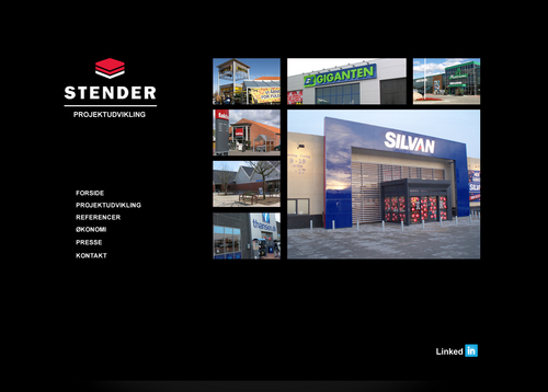
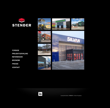
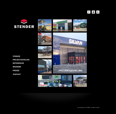
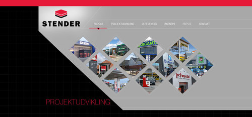
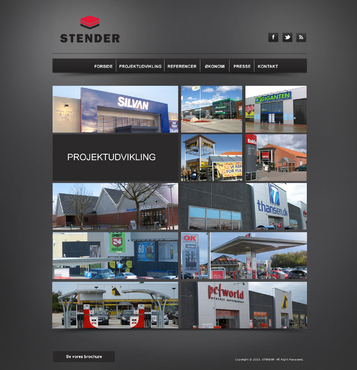
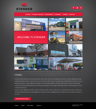
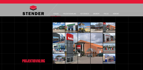
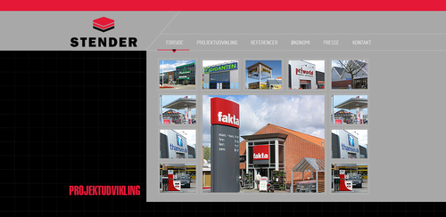
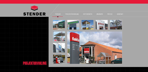
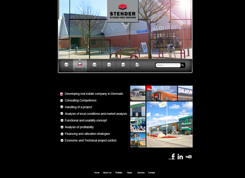
Web template for real estate developing company
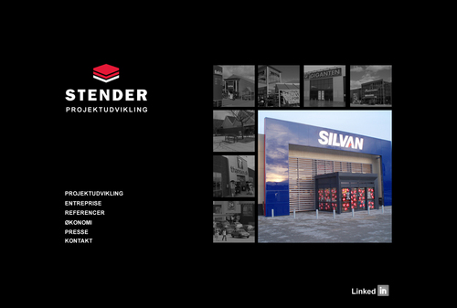
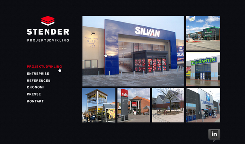
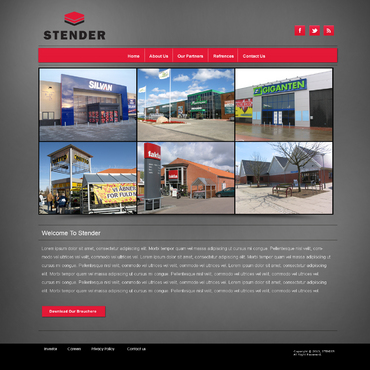
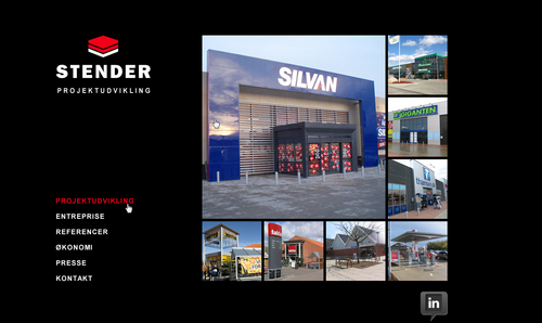
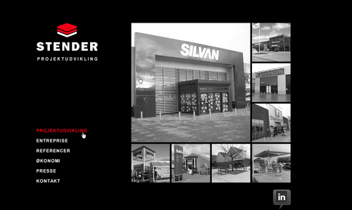
STENDER
Real Estate
www.carstenstender.dk
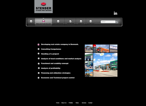
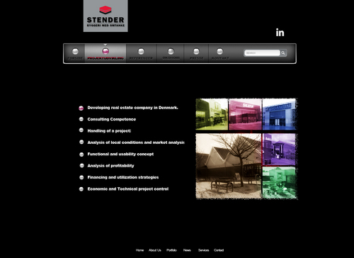
Developing real estate company in Denmark. Consulting Competence Handling of a project: Analysis of local conditions and market analysis Functional and usability concept Analysis of profitability Financing and utilization strategies Economic and Technical project control
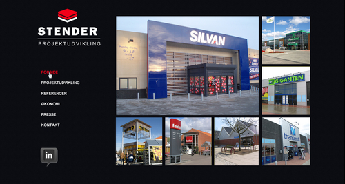
Like: Start up movement on the STENDER logo like a dynamic building assamply on a black/grey background. Dont like: To much information and pictures on the first front page.
Cutting-Edge
Clean/Simple
Professional
Trendy
Elegant
black background
grey backgrund
red logo
top
http://www.braatenpedersen.com/
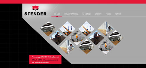
We want to have total remake on our website www.carstenstender.dk .


Comments
Project Holder
Project Holder
Project Holder
Project Holder
Project Holder
Project Holder
Project Holder
Project Holder
Project Holder
Project Holder
Project Holder