SALES / SUPPORT : +1-877-525-5646 |
Login
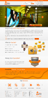
E Technologies eCommerce Template
|
Contest Holder
jenglhardt
?
Last Logged in : 916days6hrs ago |
Concepts Submitted
125 |
Guaranteed Prize
601
|
Winner(s) | Web Design |
|
Live Project
Deciding
Project Finalized

Web project update
E Technologies eCommerce Template
Advertising
www.etuptime.com
We are manufacturer's representatives and power quality solution integrators. Our products and solutions address every aspect of power quality, distribution, and monitoring.
Like: - Creative images/text - Simplicity - Sleek images/colors - Color Gradients - Corporate layout Dislike: - Clutter - Unnecessary Elements - Old-fashioned - Boring
Cutting-Edge
Clean/Simple
Professional
Corporate
High Tech
Orange
Blue
Gray/Silver
below header
http://store.apple.com
http://www.adobe.com/
http://www.zappos.com/
In order to match color scheme see our attached logo. We are going to need three things:A homepage for our store, a second-level page for our products to be displayed and a third page strictly used for information. Each main category will include a slideshow below the navigation, so make sure to leave plenty of room. Attempt to utilize a large amount of page width. The main inspiration for the template should come from Apple's online store.


Comments
Project Holder
Project Holder
Project Holder
Project Holder
Project Holder
Project Holder
Project Holder
Project Holder
Project Holder
Project Holder
Project Holder
Project Holder
Project Holder
Project Holder
Project Holder
Project Holder