SALES / SUPPORT : +1-877-525-5646 |
Login
A Driver's Guide to Avoiding This Serious Criminal Conviction
|
Contest Holder
lnichols
?
Last Logged in : 3506days20hrs ago |
Concepts Submitted
117 |
Guaranteed Prize
400
|
Winner(s) | Marketing collateral |
|
Live Project
Deciding
Project Finalized
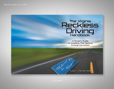
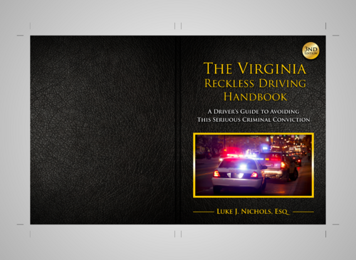
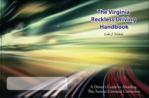
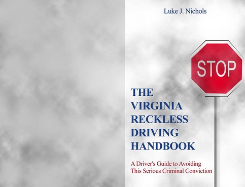
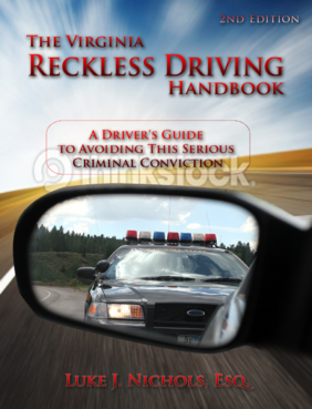
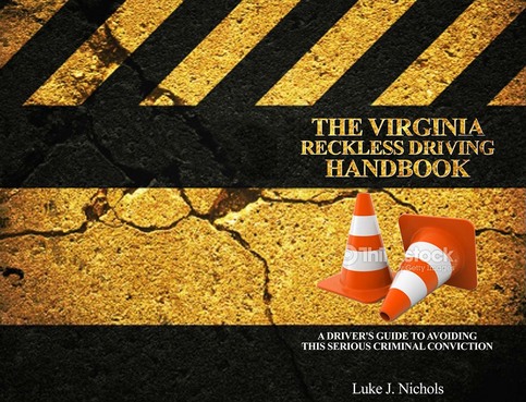
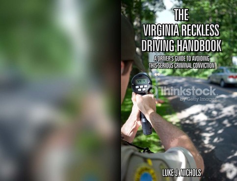
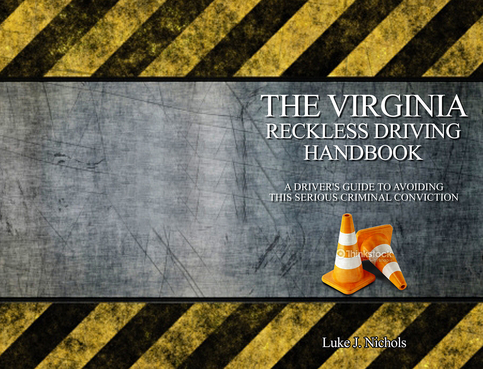
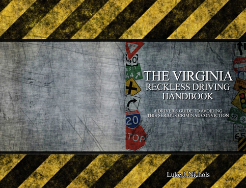
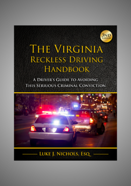
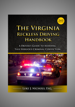
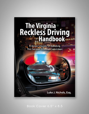
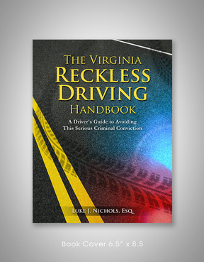
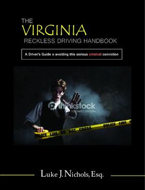
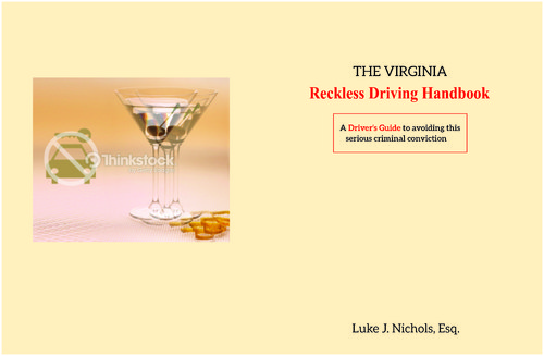
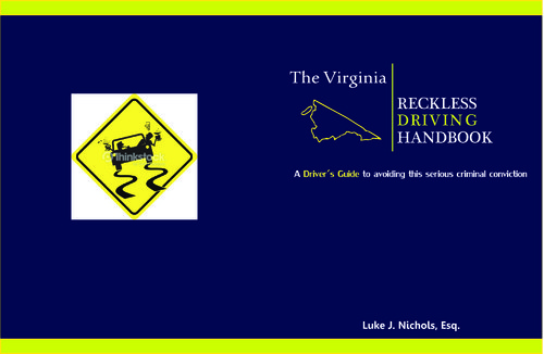
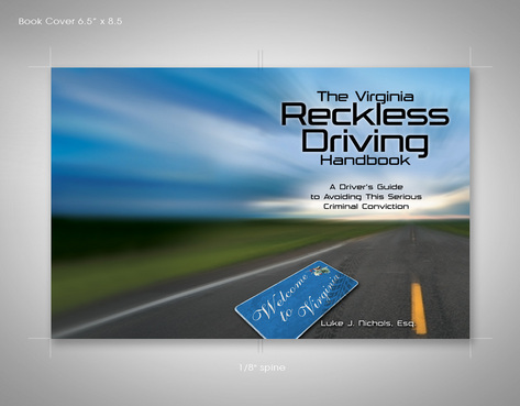
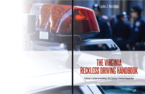
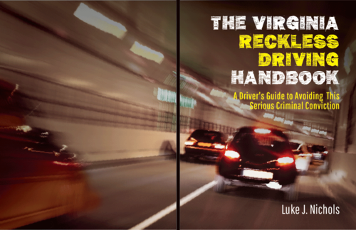
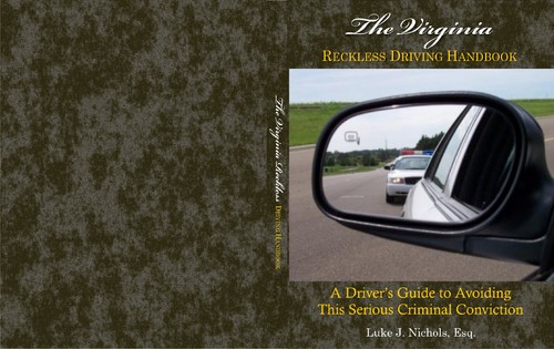
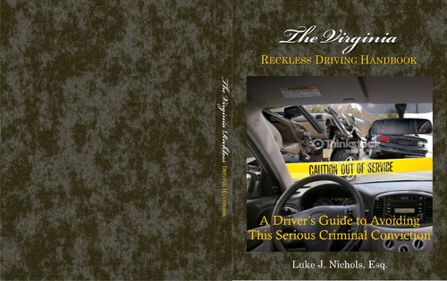
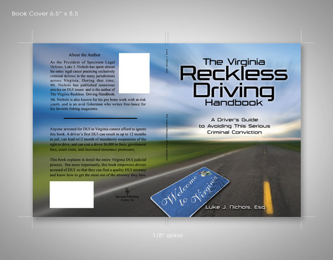
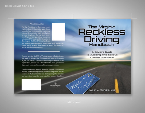
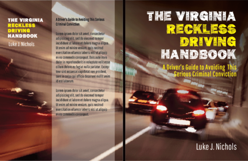
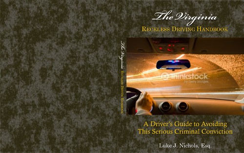
The Virginia Reckless Driving Handbook
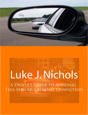
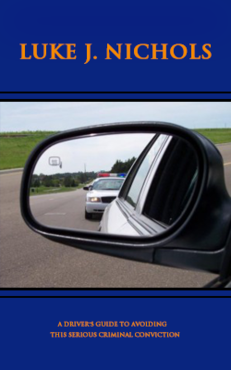
A Driver's Guide to Avoiding This Serious Criminal Conviction
Law
This book will be read by middle class, well educated people with pending reckless driving charges.
Dimensions are approximately 6.5" x 8.5" (half sheet). We would like the title, sub title and the author's name ( Luke J. Nichols) to appear on the front cover. No text on the spine (about 1/8" spine). The back page will have no text. but the design on the back cover should allow us to place a text layer on top of the back cover design - so the back cover design should not make it difficult to read the text. (See attached example from previous project)


Comments
Project Holder
Project Holder
Project Holder
Project Holder
Project Holder
Project Holder
Project Holder
Project Holder
Project Holder
Project Holder
Project Holder
Project Holder
Project Holder
Project Holder
Project Holder
Project Holder
Project Holder
Project Holder
Project Holder
Project Holder