SALES / SUPPORT : +1-877-525-5646 |
Login
Initial Website
|
Contest Holder
Telos
?
Last Logged in : 3725days13hrs ago |
Concepts Submitted
66 |
Guaranteed Prize
500
|
Winner(s) | Web Design |
|
Live Project
Deciding
Project Finalized

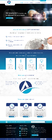
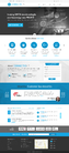
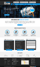
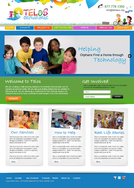
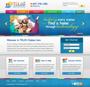
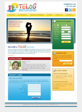
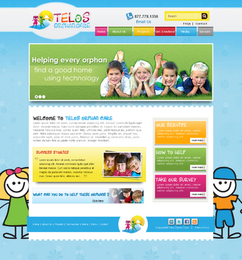
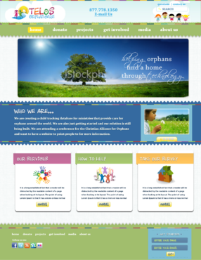
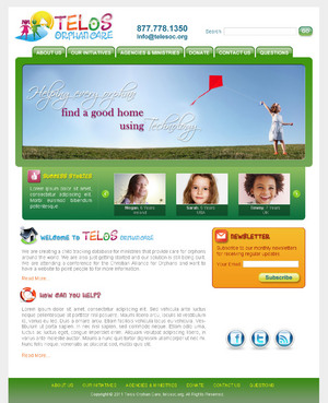
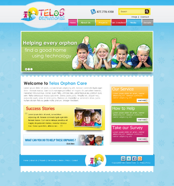
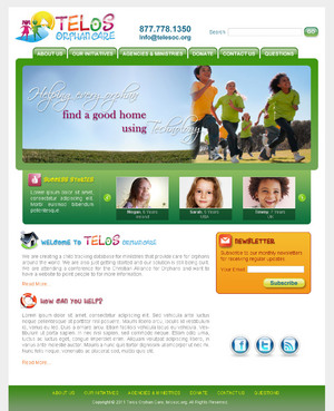
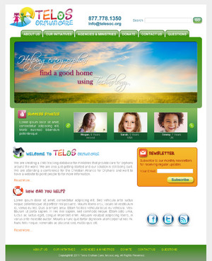
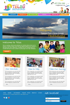
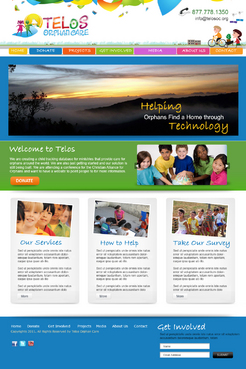
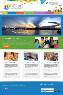
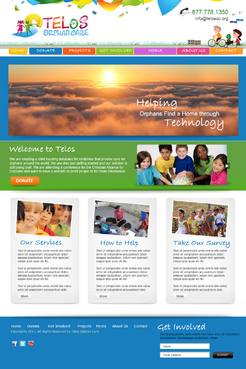
Telos Orphan Care
Initial Website
Information Technology
www.telosoc.org
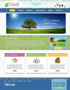
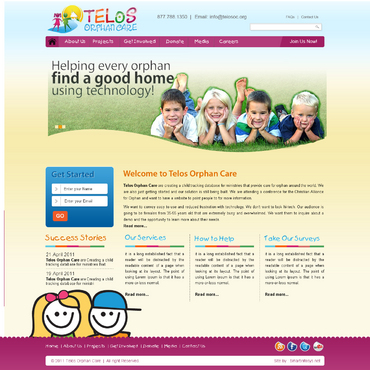
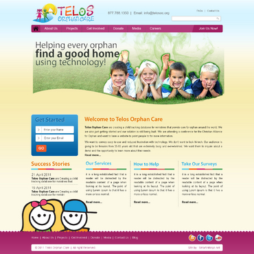
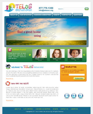
We are creating a child tracking database for ministries that provide care for orphans around the world. We are also just getting started and our solution is still being built. We are attending a conference for the Christian Alliance for Orphans and want to have a website to point people to for more information.
We want to convey easy to use and reduced frustration with technology. We don't want to look hi-tech. Our audience is going to be females from 35-55 years old that are extremely busy and overwhelmed. We want them to inquire about a demo and the opportunity to learn more about their needs.
Clean/Simple
Friendly
For Children
Family Oriented
Inspirational
Colorful
Service Oriented
Fun
Feminine
Teal
Blue
Yellow
top
http://www.greatworks.se/
http://www.nature.org/
http://www.kiva.org/
Our new logo has been uploaded.


Comments
Project Holder
Project Holder
Project Holder
Project Holder
Project Holder
Project Holder
Project Holder
Project Holder
Project Holder