SALES / SUPPORT : +1-877-525-5646 |
Login
Tod MacLaren Publishing Solutions, LLC
|
Contest Holder
minigmen08
?
Last Logged in : 4156days20hrs ago |
Concepts Submitted
321 |
Guaranteed Prize
200
|
Winner(s) | Business Cards and Stationery |
|
Live Project
Deciding
Project Finalized

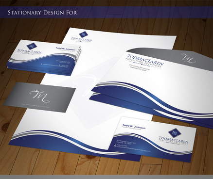
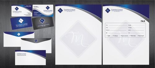
Stationery and Biz Cards for a Publishing Solutions Company
Tod MacLaren Publishing Solutions, LLC
I need double sided standard sized Business Card [3.5" x 2"]
Use same font as used in my logo
Modern
Professional
Simple
Todd W. Johnson
President/Managing Editor
212 Morning Grove Lane Valencia, PA 16059
724.471.6292
todd.johnson@todmaclarenpublishing.com
www.todmaclarenpublishing.com
Publishing


Comments
Project Holder
Project Holder
Project Holder
Project Holder
Project Holder
Project Holder
Project Holder
Project Holder
Project Holder
Project Holder
Project Holder
Project Holder
Project Holder
Project Holder