SALES / SUPPORT : +1-877-525-5646 |
Login
c2i solutions
|
Contest Holder
veruca27
?
Last Logged in : 4245days15hrs ago |
Concepts Submitted
68 |
Guaranteed Prize
350
|
Winner(s) | Web Design |
|
Live Project
Deciding
Project Finalized

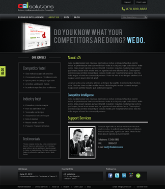
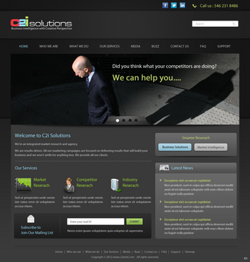
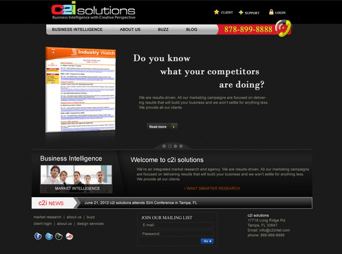
Sleek Website for Market Research Company-c2i solutions
c2i solutions
Information
www.c2iintel.com
c2i solutions is a market research and marketing company that provides industry and competitor intelligence for businesses. One product is "Industry Intel" which helps businesses identify trends and new markets within their industry. The other product is "Competitor Intel" which helps businesses keep up to date with their competitors in regards to product launches, tradeshows they are attending, who they are hiring, contracts they've one, etc. c2i solutions will assist businesses with strategic marketing campaigns using the information they've received through "Industry Intel" and "Competitor Intel" . These campaigns will assist them within their competitive markets. Campaigns include social media, email, and development of apps.
Crowded website with a lot of information, a lot of complicated navigation, websites that scroll down (want everything seen on one page), http://www.ad-ology.com/?gclid=CJCrqvG27rACFcyc7QodMlOsxQ (website has too much going on. very busy)
Cutting-Edge
Unique/Creative
Clean/Simple
Flashy
Professional
Sophisticated
Modern
Elegant
High Tech
Black
Silver
Grey
top
http://www.digimind.com/ (I like first screen of site, not the scrolling part)
http://www.bigeyecreative.com (I think how they say a lot with only a little. I DO NOT scrolling)
http://www.connotate.com/
Looking for a full screen website. MUST include social media icons (FB, Twitter, LinkedIn) and a Join our Mailing List Icon. We want the image of the product to really stand out and make a statement. PLEASE SEE ATTACHED MOCKUP for ideas of what we are looking for. We are open for any ideas and suggestions you have.
Comments
Project Holder
Project Holder
Project Holder
Project Holder
Project Holder
Project Holder
Project Holder
Project Holder
Project Holder
Project Holder
Project Holder