SALES / SUPPORT : +1-877-525-5646 |
Login
Web site for sharing/publishing of ship data
|
Contest Holder
oyvindmisje
?
Last Logged in : 4412days11hrs ago |
Concepts Submitted
91 |
Guaranteed Prize
460
|
Winner(s) | Web Design |
|
Live Project
Deciding
Project Finalized

Sea~Data Web
Web site for sharing/publishing of ship data
Shipping
http://www.seadataweb.com/
This is a web-site for sailors using mobile Internet for sharing data from ship sensors, logs, routes, charts, ...
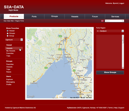
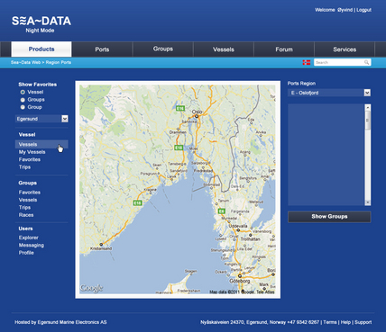
The design should give an impression of being at sea. There shall be a high contrast daylight background and a dark red nighttime background. Not too much images to download (mobile Internet!)
Clean/Simple
Nature
Marine blue
Light blue
White
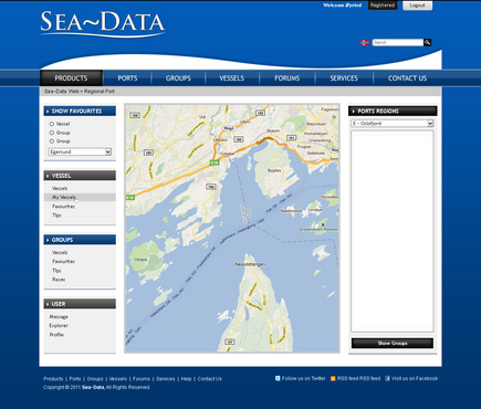
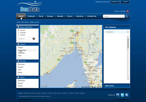
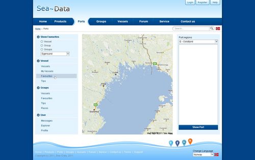
left side
http://www.google.no/
http://www.wikipedia.org/
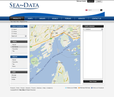
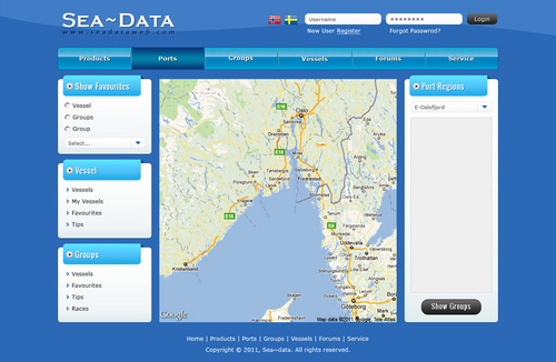
There shall be a top menu for the web-site users not logged in. The left menu is for logged in users. There are page menus/lists/buttons on the right side. The center area is used for editing of lists/data. There shall be a front page with links to country pages, introduction and mobile phone Internet pages.
Comments
Project Holder
Project Holder
Project Holder
Project Holder
Project Holder
Project Holder
Project Holder
Project Holder
Project Holder