SALES / SUPPORT : +1-877-525-5646 |
Login
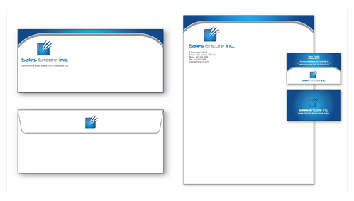
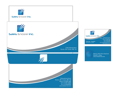
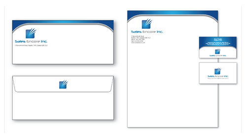
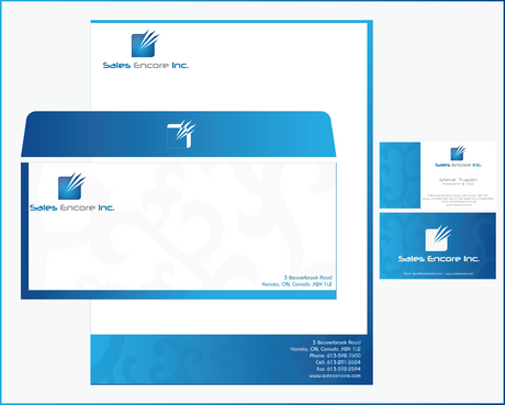
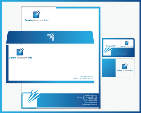
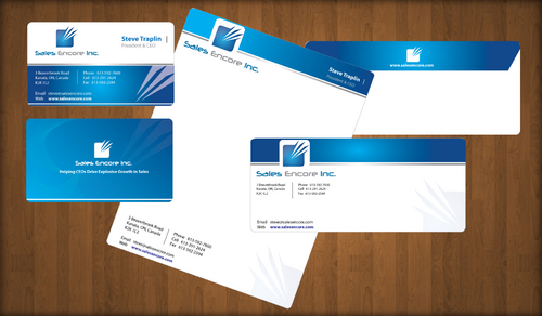
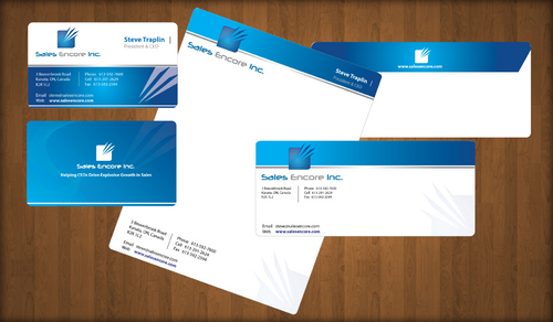
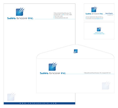
Business Card & Stationary
|
Contest Holder
straplin
?
Last Logged in : 4723days22hrs ago |
Concepts Submitted
30 |
Prize Money
200
|
Winner(s) | Business Cards and Stationery |
|
Live Project
Deciding
Project Finalized

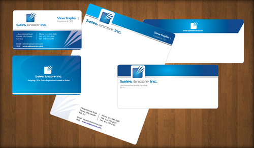
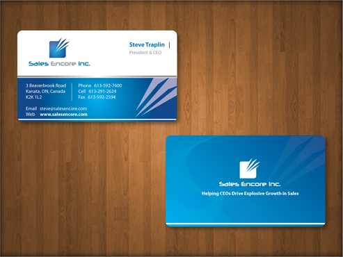
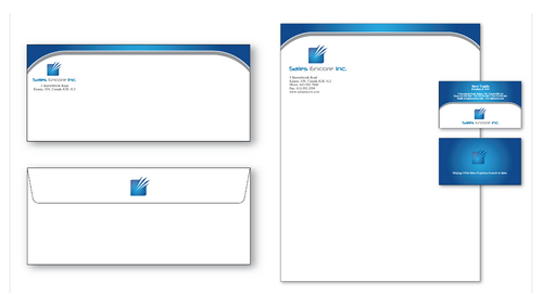
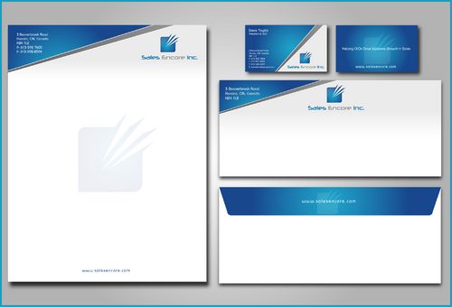
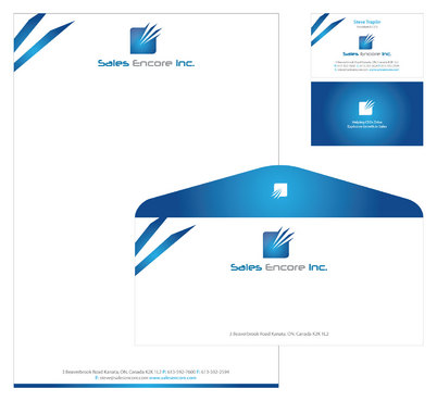
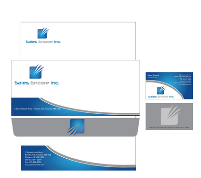
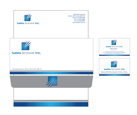
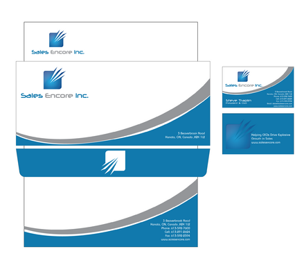
Sales Encore Inc.
Business Card & Stationary
I need double sided standard sized Business Card [3.5" x 2"]
Use standard fonts
Cutting-Edge
Corporate
Professional
Steve Traplin
President & CEO
3 Beaverbrook Road Kanata, ON, Canada K2K 1L2
613-592-7600
613-291-2624
613-592-2594
steve@salesencore.com
www.salesencore.com
needs to be top drawer, classy, printing costs not a key factor
Helping CEOs Drive Explosive Growth in Sales

Comments
Project Holder
Project Holder
Project Holder
Project Holder
Project Holder
Project Holder
Project Holder
Project Holder
Project Holder
Project Holder
Project Holder
Project Holder