SALES / SUPPORT : +1-877-525-5646 |
Login
|
Contest Holder
investorsavvy
?
Last Logged in : 4956days13hrs ago |
Concepts Submitted
33 |
Guaranteed Prize
90
|
Winner(s) | Business Cards and Stationery |
|
Live Project
Deciding
Project Finalized

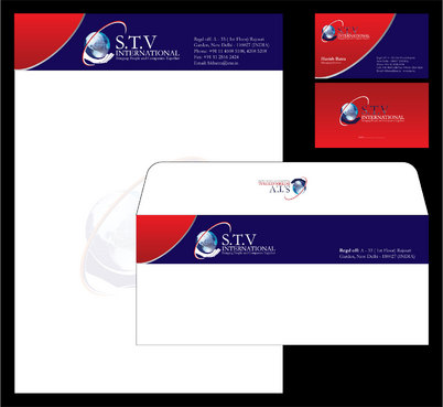
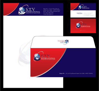
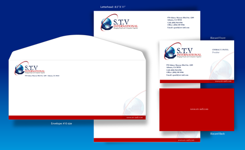
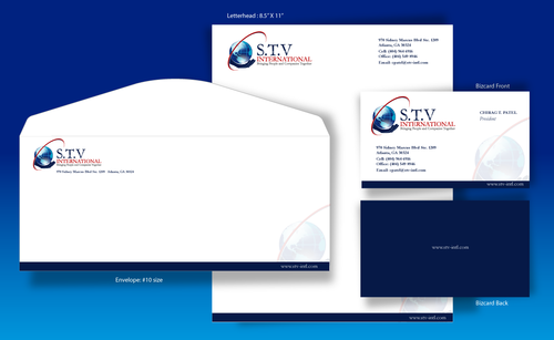
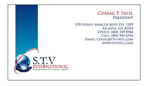
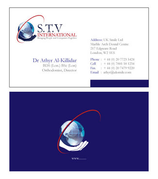
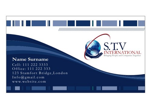
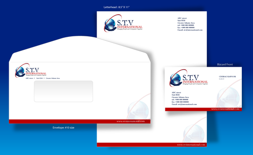
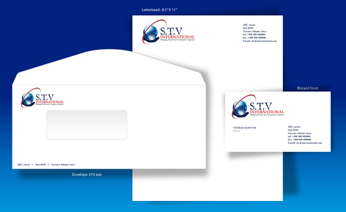
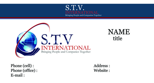
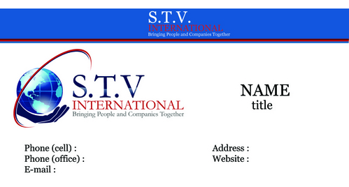
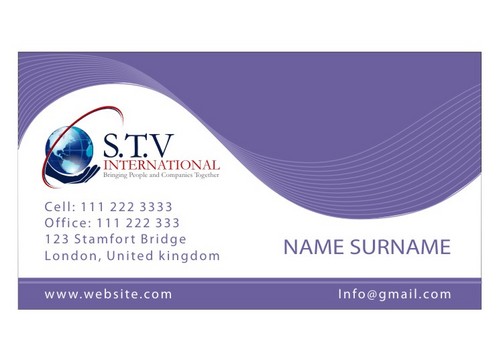
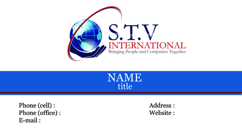
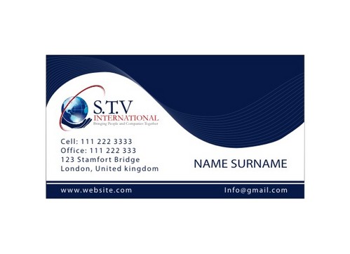
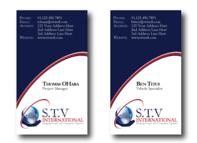
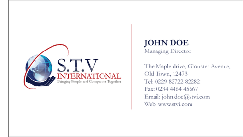
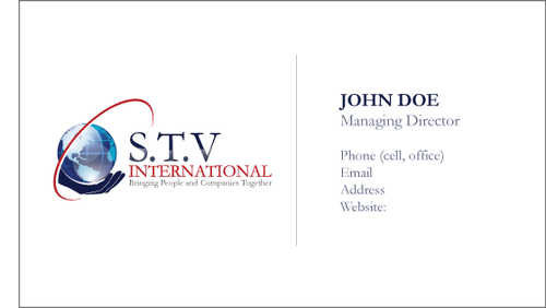
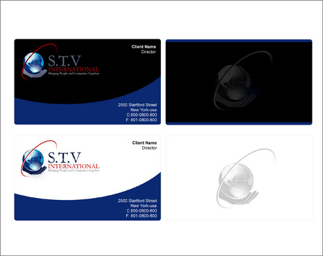
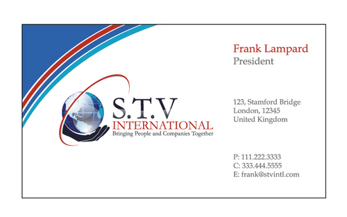
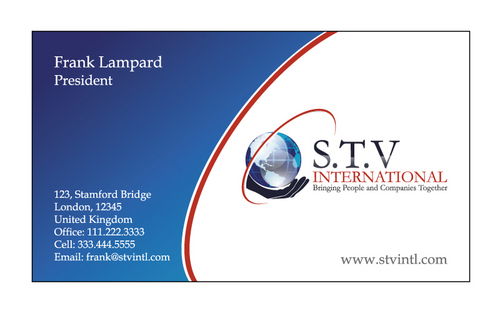
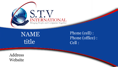
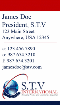
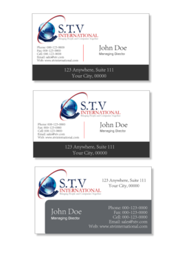
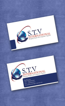
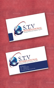
S.T.V International - Stationery Project
I need single sided standard sized Business Card [3.5" x 2"]
Use same font as used in my logo


Comments
Project Holder
Project Holder
Project Holder
Project Holder
Project Holder
Project Holder
Project Holder
Project Holder
Project Holder
Project Holder
Project Holder