SALES / SUPPORT : +1-877-525-5646 |
Login
Redesign contest of established dating brand
|
Contest Holder
Ziggy
?
Last Logged in : 3687days19hrs ago |
Concepts Submitted
62 |
Guaranteed Prize
1500
|
Winner(s) | Web Design |
|
Live Project
Deciding
Project Finalized
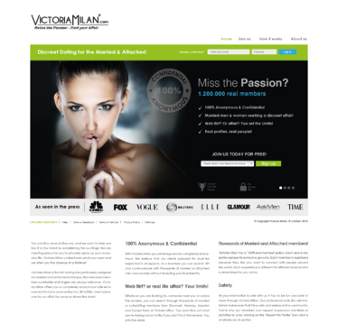
REDESIGN of LARGE ONLINE DATING .
Redesign contest of established dating brand
Social Media
www.victoriamilan.com
Victoria Milan is one of Europe's fastest growing online dating / Social media sites with more than 1,2 million members. We are currenlty expanding into new markets in Europe, South America and US. We are therefor always stribing to be the best we can be as a product with regards to DESIGN, FUNCTIONALITY and SERVICE. So do we currenlty have the best optimal design? Or can we improve with the help of YOU and YOUR skillz?
LIKES: - Creditibility (critical for dating sites) - Stylish / Hi-end (think D&G, Prada, Porche, Apple) - Feminin (the woman must feel "at home" and safe) - Flirt & Passion (emotion is key) - European (think Italy-style, not so much McDonalds)
Unique/Creative
Clean/Simple
Professional
Glamourous
Trendy
Exciting
Sophisticated
Modern
Elegant
Feminine
Black, grey and White (background / text / logo)
Green (buttons etc) & Blue (links, buttons, text etc)
Red (100% confidential & anonymous seal etc)
top
www.match.com (user home is stylish and simple)
www.badoo.com (modern & stylish)
www.gleeden.com
Pages to redesign: 1. HOME (landing page) 2. SIGN UP form/page 3. USER HOME (main page after lgging in) 4. PAYMENT/UPGRADE page


Comments
Project Holder
Project Holder