Live Project
Deciding
Project Finalized

Creative Brief
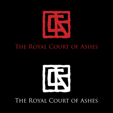
R C A
The Royal Court of Ashes
I want a logo/monogram that looks like it is a wax stamp from the 18th century. Or like the branding on an animal. I want it to be flat and rough. I don't want it to read as anything at first but an ancient symbol with the letters RCA creating the symbol.
Art
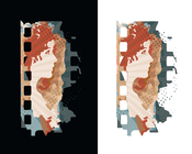
The audience is me. I am a painter and want to include this at the bottom of a series of paintings I'm doing about a fictitious court from 18th century England.
Great design. No bright colors. Something a gothic mad bishop would have burned into his flesh.
Related Contests