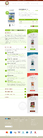
Quite Possibly Your Favorite Project
Website for Life Coach
|
Contest Holder
muleperry
?
Last Logged in : 4723days18hrs ago |
Concepts Submitted
43 |
Guaranteed Prize
375 |
Winner(s) | Web Design |
|
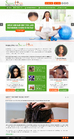
Live Project
Deciding
Project Finalized


Creative Brief
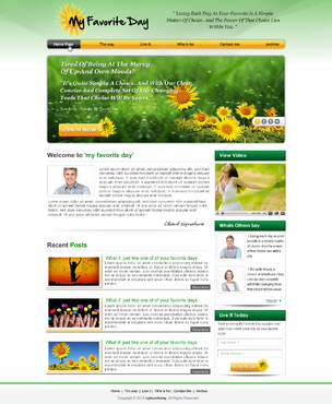
Quite Possibly Your Favorite Project
Website for Life Coach
Personal Care
www.myfavoriteday.com
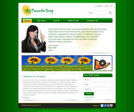
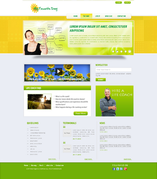
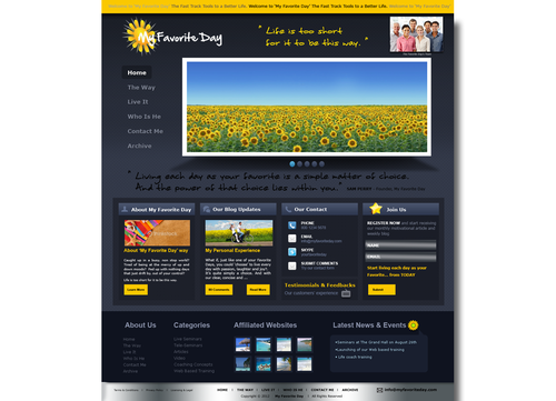
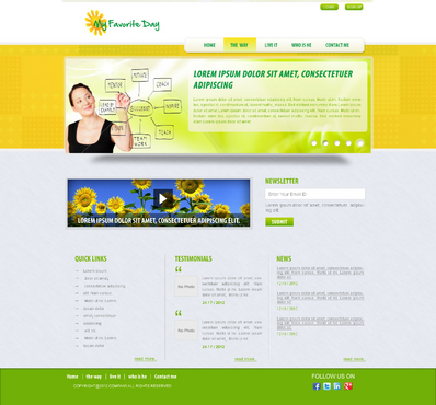
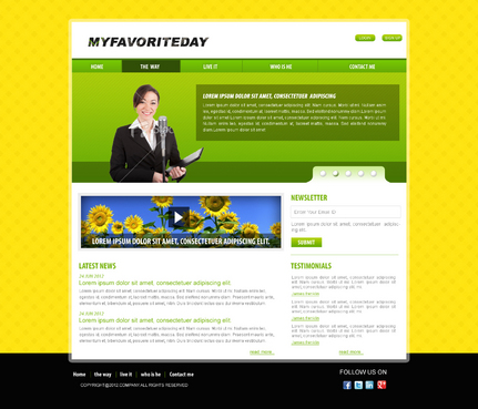
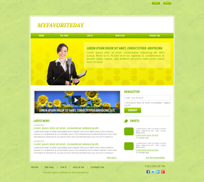
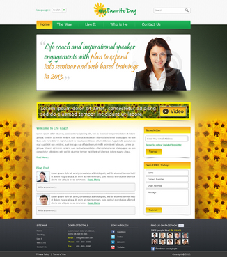
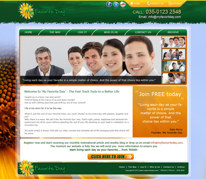
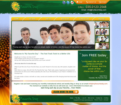
Website design for inspirational and motivational training company. Initial focus of the website is to promote trainer for life coach and inspirational speaker engagements with plan to expend into seminar and web based trainings in 2013.
General feel to be very upbeat, happy, feel good, simple and easy to navigate. !!When referring to the holding page of My favorite Day (which I think looks crap) please note the writing in the Logo of the name should be in Black!!
Friendly
Inspirational
Colorful
Yellow
Green
Black
left side
http://www.harveker.com/
http://www.drterry.com/
http://www.lisa-nichols.com/
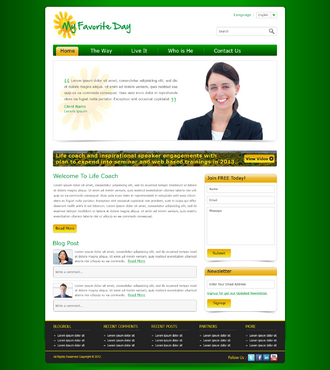
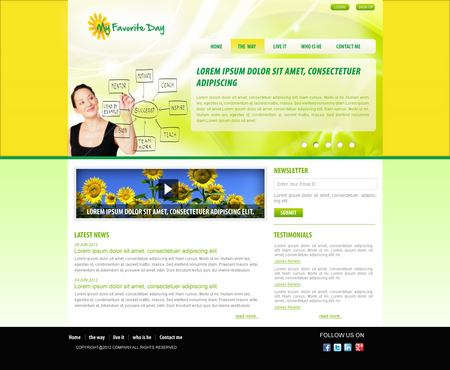
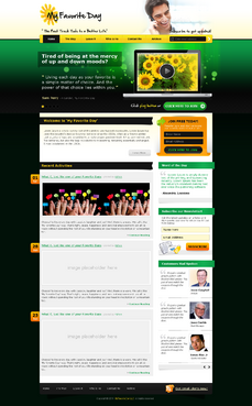
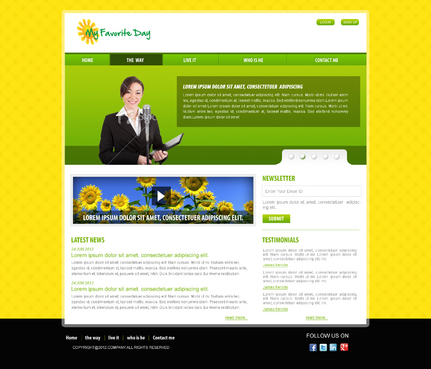
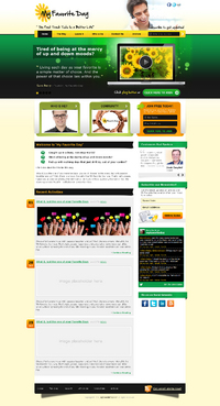
Home page to include areas for the following: Top banner showing logo, quote and small picture of face of company. Below this a thicker banner with sunflower field picture (in future to be a video link) and beside it text of an inspirational quote that will change on a regular basis. This to also include an opt in button where they can provide email address to be contacted or receive blogs and articles direct to their account. Links to other pages: home, the way, live it, who is he, contact me, archive Home page to also include a Short text intro to what my favourite day is all about with a picture of face of company again. Below this Space for most recent blog or article in full (to be changed on a regular basis) Opt in button at bottom of page Links at bottom of page to affiliated websites The opt in button to be at top and bottom of all pages with affiliate web links at bottom of all pages. Additional pages: The Way: A page describing the lifestyle being coached and it's different sections. There are 6 text sections in total on this page, each with a matching inspirational image to it. Live It: Introducing the concept of coaching. Images and text again with one testimonial at the top and a list of testimonials at the bottom Who Is He: A simply text and images page for bio information Contact: listing of ways in which to contact me. Also a space where they can fill out name, contact, and question or request. The submit button will automatically send this to an email. Archive: a simple listing of previous blogs and articles. These to be listed at top with a click on link to where they are further down the page
Related Contests