SALES / SUPPORT : +1-877-525-5646 |
Login
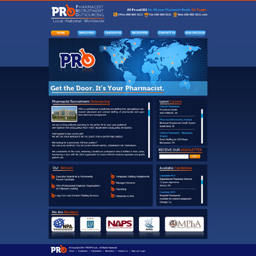
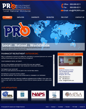
Local. National. Nationwide.
|
Contest Holder
PharmacistRecruitmentOutsourcing
?
Last Logged in : 3674days11hrs ago |
Concepts Submitted
120 |
Guaranteed Prize
451
|
Winner(s) | Web Design |
|
Live Project
Deciding
Project Finalized

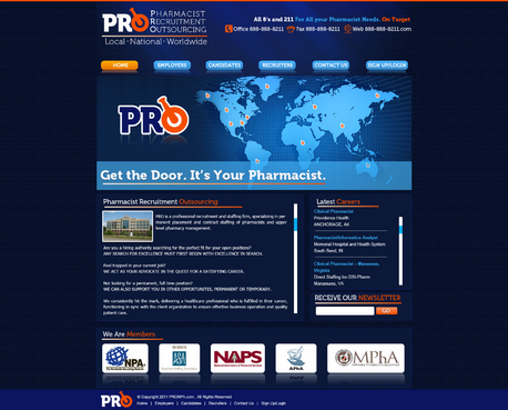
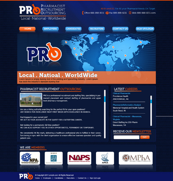
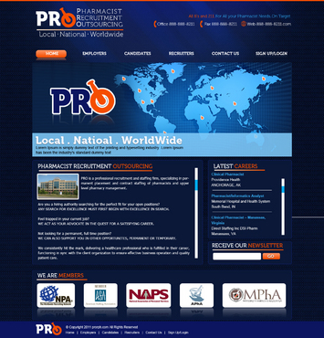
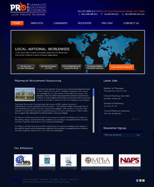
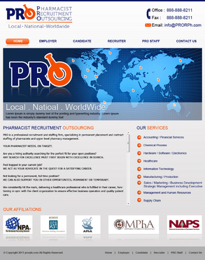
Pharmacist Recruitment Outsourcing, LLC
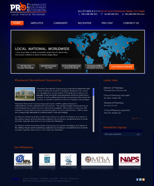
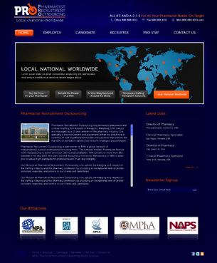
Local. National. Nationwide.
www.PRORPh.com or 888-888-8211.com
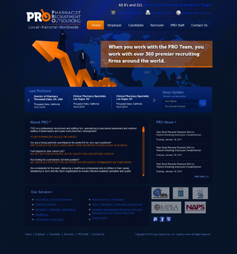
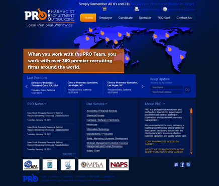
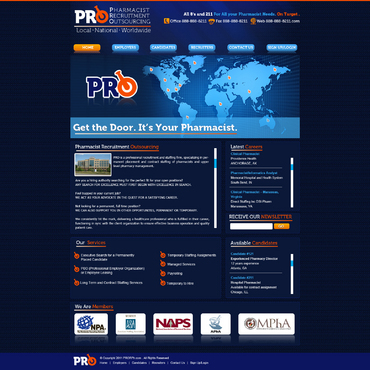
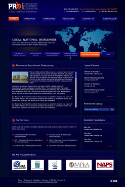
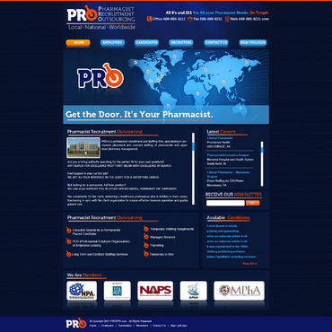
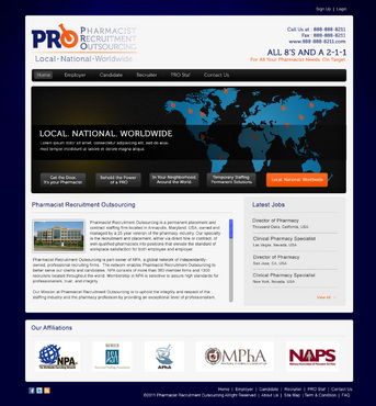
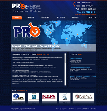
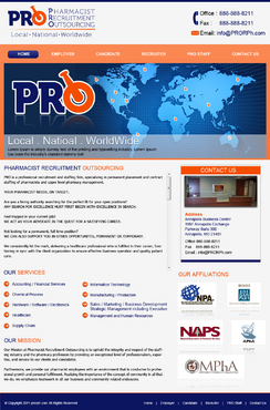
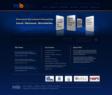
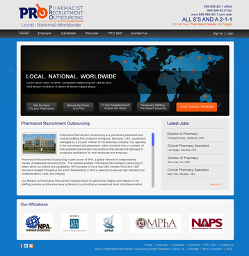
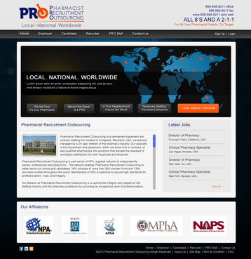
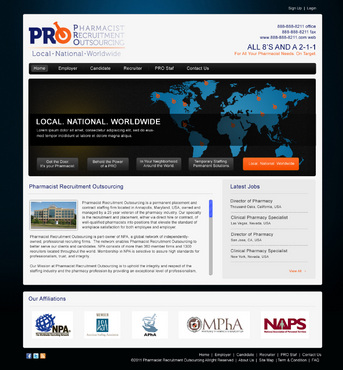
About Pharmacist Recruitment Outsourcing: PRO is a professional recruitment and staffing firm, specializing in permanent placement and contract staffing of pharmacists and upper level pharmacy management. YOUR PHARMACIST NEEDS. ON TARGET. Are you a hiring authority searching for the perfect fit for your open positions? ANY SEARCH FOR EXCELLENCE MUST FIRST BEGIN WITH EXCELLENCE IN SEARCH. Feel trapped in your current job? WE ACT AS YOUR ADVOCATE IN THE QUEST FOR A SATISFYING CAREER. Not looking for a permanent, full time position? WE CAN ALSO SUPPORT YOU IN OTHER OPPORTUNITES, PERMANENT OR TEMPORARY. We consistently hit the mark, delivering a healthcare professional who is fulfilled in their career, functioning in sync with the client organization to ensure effective business operation and quality patient care. Our Mission Our Mission at Pharmacist Recruitment Outsourcing is to uphold the integrity and respect of the staffing industry and the pharmacy profession by providing an exceptional level of professionalism, expertise, and service to our clients and candidates. Furthermore, we provide our pharmacist employees with an environment that is conducive to professional growth and personal fulfillment. Realizing the importance of the concept of community in all that we do, we emphasize teamwork in all our business and community related endeavors. Our History Pharmacist Recruitment Outsourcing is a permanent placement and contract staffing firm located in Annapolis, Maryland, USA, owned and managed by a 25 year veteran of the pharmacy industry. Our specialty is the recruitment and placement, either via direct hire or contract, of well-qualified pharmacists into positions that elevate the standard of workplace satisfaction for both employee and employer. Our Worldwide Reach Pharmacist Recruitment Outsourcing is part-owner of NPA, a global network of independently-owned, professional recruiting firms. The network enables Pharmacist Recruitment Outsourcing to better serve our clients and candidates. NPA consists of more than 360 member firms and 1300 recruiters located throughout the world. Membership in NPA is selective to assure high standards for professionalism, trust, and integrity. Because of PRO’s relationship with NPA, our clients enjoy a larger selection of qualified candidates in less time than nonmember recruiters. Clients also enjoy our expanded geographic reach. No need to shop through other recruiters to fill your positions in your sister companies abroad. One-third of NPA’s member firms are located outside of North America. Clients on continents around the world who wish to recruit from the United States also have a one stop shop for their needs. Simply put, we serve our clients with improved speed, reach, and capacity. Our SOP Division for Expanded Industry and Specialization Relocating pharmacists to take advantage of exceptional career opportunities frequently also mean the relocation of a family or significant other with experience in other fields. Through our “Significant Other Placement” division, PRO is able to offer access to national and international specialists in niche markets and select occupational fields. Because of our longevity in the field and relationships with industry leaders, we are also able to place candidates in the following fields: § Accounting / Financial Services § Chemical Process § Hardware / Software / Electronics § Healthcare § Information Technology § Manufacturing / Production § Sales / Marketing / Business Development § Strategic Management including Executive Management and Human Resources § Supply Chain Our Commitment Pharmacist Recruitment Outsourcing recognizes the need to stay informed and be active in our communities. We hold active membership in the following organizations: Include Logos for: PRO, Pharmacist Recruitment Outsourcing NPA, The Worldwide Recruiting Network ASA, American Staffing Association APhA, American Pharmacists Association MPhA, The Maryland Pharmacists Association NAPS, National Association of Personnel Services Our Ethics: Being Held to the Highest Standard Through our affiliation with the American Staffing Association, we pledge our support of, and adherence to, a Code of Ethics and Good Practices (link), which specifies standards of fair dealings with employees, customers, and competitors.
Comments on what I like/want/ideas to use: I LOVE the project that was done for The Lynoxx Group by XtremeCreative 2. The Black, Gold, and Silver colors are awesome. It is classy, strong, bold, and confident. It sends a message of competence and financial strength. Love the colors and the appearance of reflections in the lines. Love the fading in and out of the colors. Like that the lines are not squared off, but flowing and still simple. Definately want a Dark Background - Dark Blue or Black is a good choice. Definately want rich, bold colors offsetting the dark background. Want webpage to cover entire monitor area. Want an uncluttered, clean feel. Want a refreshing layout. Not the same as other recruiting websites, that seem to be all squared off in its presentation. An example of a website that I like is www.crsrefrigerants.com .I like that the web page takes up the entire screen, and especially the simplicity. I like that it remains uncluttered, and if you want to read more you can scroll. I have a flash logo already that Logo Design Guru has created. Is it possible to have an intro page like the one in this website that leads you into the homepage? My contact info is "All 8's and a 2-1-1", meaning office # is 888-888-8211, fax is 888-888-8211, website can be accessed thru www.888-888-8211.com . Want to emphasize this on the hompage somehow because it is easy to remember. Catchphrase could be “All 8’s and a 2-1-1 For All Your Pharmacist Needs. On Target." Logo Design Guru has completed projects for me for the logo, including flash logo. Please include the flash logo somehow. Catch Phrases you may consider: Get the Door. It's your Pharmacist. Behold the Power of a PRO. In Your Neighborhood. Around the World. Temporary Staffing. Permanent Solutions. Local. National. Worldwide. I have purchased a particular font that I would like to use throughout my website. (It is the font in my logo- Museo). Logo Design Guru has the files already from work you did on my logo. Please use this font as well to make the site look uniform. I plan on having second and third level pages on the website. Would like the ability to make different pages have a different look and feel to them, without having to change the template drastically. The Home Page: Should contain links to the following second level pages: Employer Page, Candidate Page, Recruiter Page, PRO Staff Page, Contact Us Page. Should have our affiliations and their logos on the home page. They are: NPA, The Worldwide Recruiting Network ASA, American Staffing Association APhA, American Pharmacists Association MPhA, The Maryland Pharmacists Association NAPS, National Association of Personnel Services FYI: I use Bullhorn as my contact management system (bullhorn.com). They said that they can provide an API Code for use with the website. Comments on what I Do Not want: Stay away from: Pictures of people shaking hands Images of shaking hands Goofy pictures of employees No pictures of smiling people on home page. Too ordinary. Most recruiting websites have this.
Cutting-Edge
Unique/Creative
Clean/Simple
Professional
Sophisticated
Modern
Elegant
Progressive
Service Oriented
Masculine
Navy Blue/Orange
Black/Gold/Silver
below header
Logo Design Guru created my logo, stationery, flash logo, etc. You should have access to the files. You should also have my fonts, the Museo font family. Please use these. Thanks! PS. Use your judgement for the Nav placement. My old login does not seem to work. Creating a new account.

Comments
Project Holder
Project Holder
Project Holder
Project Holder
Project Holder
Project Holder
Project Holder
Project Holder
Project Holder