SALES / SUPPORT : +1-877-525-5646 |
Login
Pediatric Practice
|
Contest Holder
genka28
?
Last Logged in : 5026days5hrs ago |
Concepts Submitted
18 |
Guaranteed Prize
100
|
Winner(s) | Business Cards and Stationery |
|
Live Project
Deciding
Project Finalized

Pediatric Practice
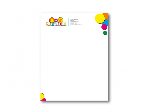
Pediatric Practice
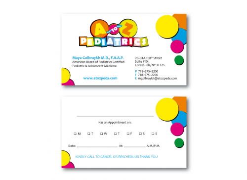
I need double sided standard sized Business Card [3.5" x 2"]
Use same font as used in my logo
Cutting-Edge
Modern
Professional
Bright & Fun-filled
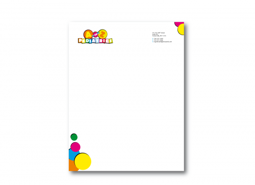
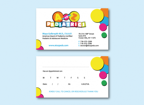
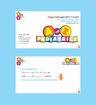
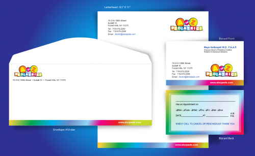
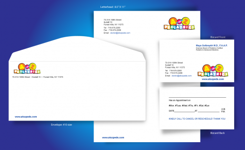
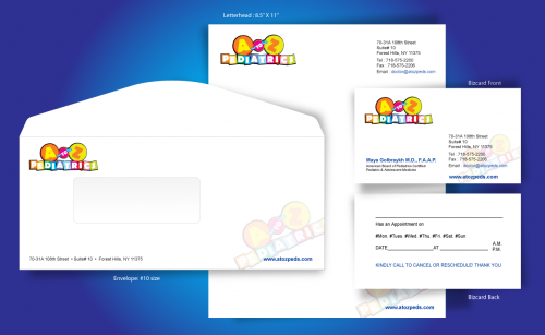
Maya Golbraykh M.D., F.A.A.P.
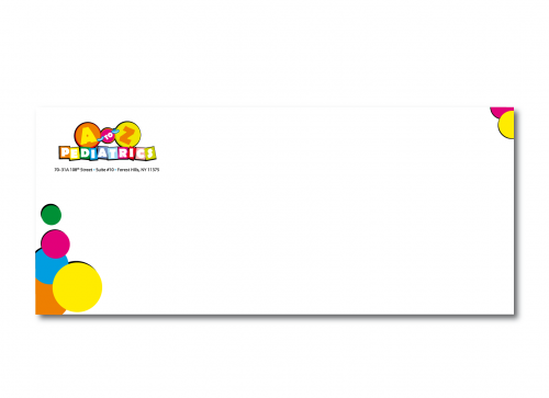
70-31A 108th Street Suite# 10 Forest Hills, NY 11375
718-575-2200
718-575-2206
doctor@atozpeds.com
www.atozpeds.com
Below the name please add the following; American Board of Pediatrics Certified Pediatric & Adolescent Medicine
__________________________________ Has an Appointment on #Mon. #Tues. #Wed. #Thu. #Fri. #Sat. #Sun DATE_________AT ______________A.M. P.M. KINDLY CALL TO CANCEL OR RESCHEDULE! THANK YOU


Comments
Project Holder
Project Holder
Project Holder
Project Holder
Project Holder
Project Holder
Project Holder
Project Holder
Project Holder
Project Holder
Project Holder
Project Holder
Project Holder
Project Holder
Project Holder