SALES / SUPPORT : +1-877-525-5646 |
Login
Developing for the Future
|
Contest Holder
NCSoftware
?
Last Logged in : 4494days2hrs ago |
Concepts Submitted
82 |
Guaranteed Prize
500
|
Winner(s) | Web Design |
|
Live Project
Deciding
Project Finalized

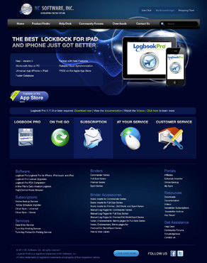
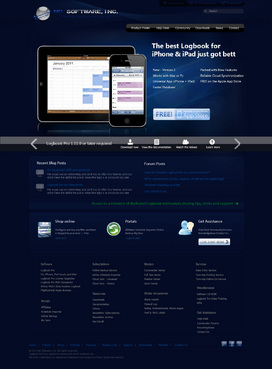
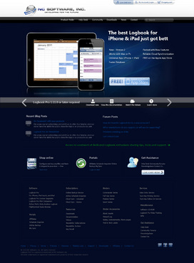
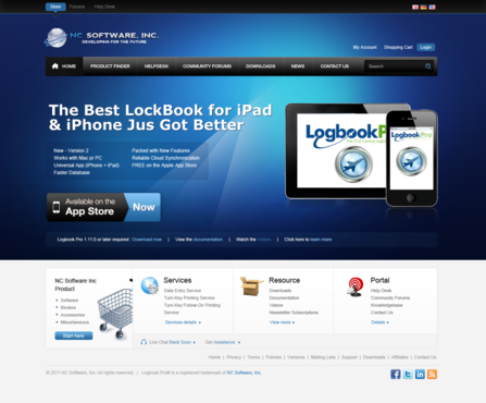
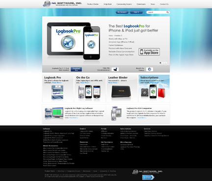
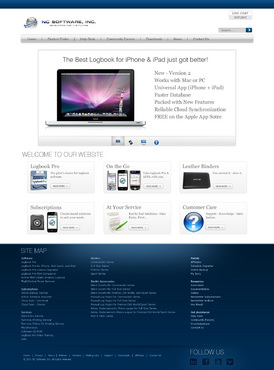
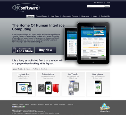
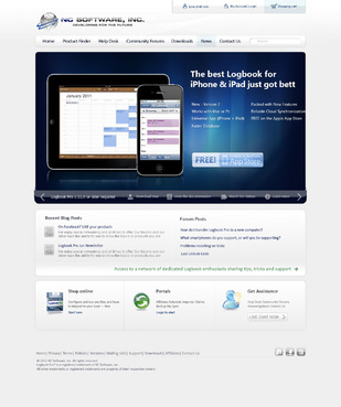
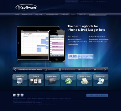
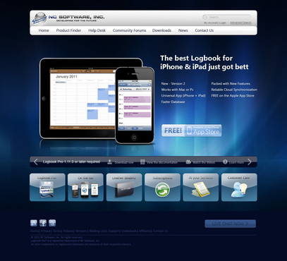
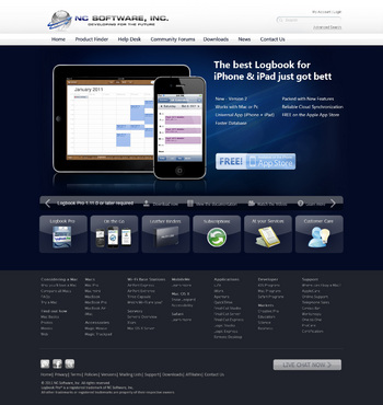
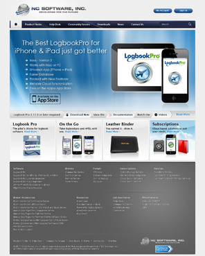
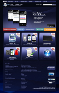
NC Software Web Site
Developing for the Future
http://www.nc-software.com
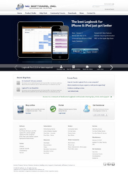
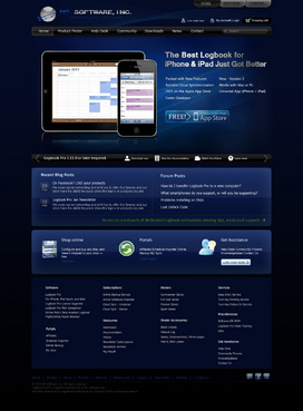
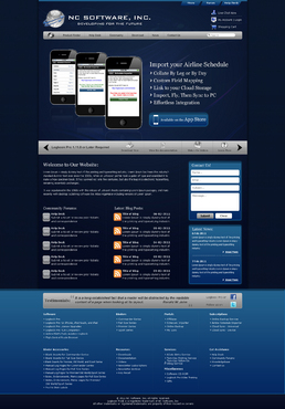
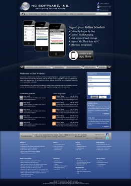
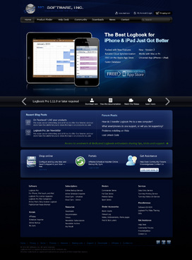
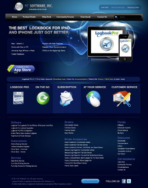
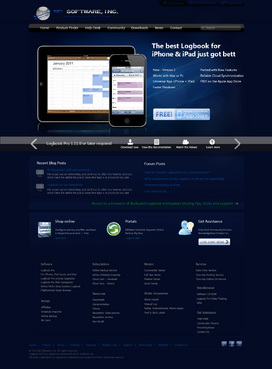
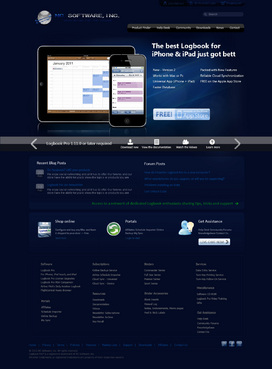
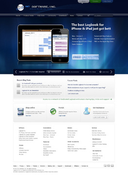
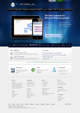
We are a software company that specializes in aviation software such as pilot logbooks for windows, web, iPhone, iPad, etc. We are futuristic, cutting edge, and innovative.
The design should be simple yet allow for organizing a lot of data and areas. We don't want to make it hard for our customers to find what they're looking for. We also want to integrate our community forums and help desk, however, the main focus should be a design for our e-commerce system, our home page that allows for a top section for a product focus such as a flash movie area, navigation areas, site map, etc. I like the Apple web site, devexpress.com, smartertools.com, i.e. web sites that are simple, centered (not full screen width) and designed for 1024x768 or higher resolutions. I like the glossy/aqua effects, I like the warp/mesh themes for backgrounds, etc. I like things to be easy to read, not fatiguing. The theme can either be like Apple where it's predominately white and open, or it could be a dark theme such as a deep blue (almost black) and "outer space" trendy looking. I don't want boxy, rectangles, I prefer more artistic such as curves and good blending.
Cutting-Edge
Unique/Creative
Clean/Simple
Professional
Futuristic
Trendy
Corporate
Modern
Elegant
Service Oriented
High Tech
White/Gray/Black theme
Dark/Deep Blue theme
Up to you..
top
apple.com
devexpress.com
smartertools.com
I don't want to sway your creative ideas with my brief so feel free to suggest a theme as you see fit. We are a software company, innovation, stylish, we want to have a great first impression for our visitors. The "image" sets the tone for the success of the business. This web theme will be carried forward into product boxes, packaging, etc.


Comments
Project Holder
Project Holder
Project Holder
Project Holder
Project Holder
Project Holder
Project Holder
Project Holder
Project Holder
Project Holder
Project Holder
Project Holder
Project Holder
Project Holder
Project Holder
Project Holder
Project Holder
Project Holder
Project Holder