SALES / SUPPORT : +1-877-525-5646 |
Login
Display Ad
|
Contest Holder
Daniel
?
Last Logged in : 3828days20hrs ago |
Concepts Submitted
69 |
Guaranteed Prize
200
|
Winner(s) | Static/Animated Display Ads |
|
Live Project
Deciding
Project Finalized

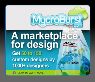
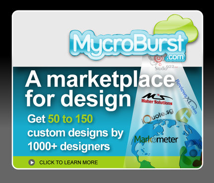
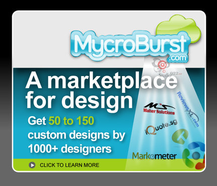
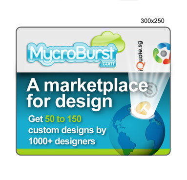
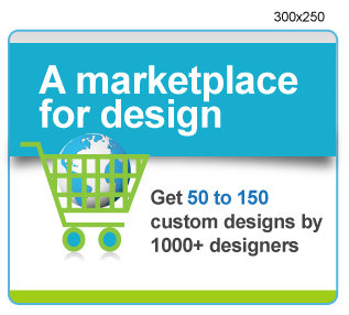
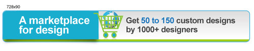
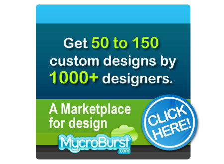
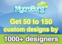
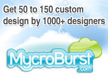
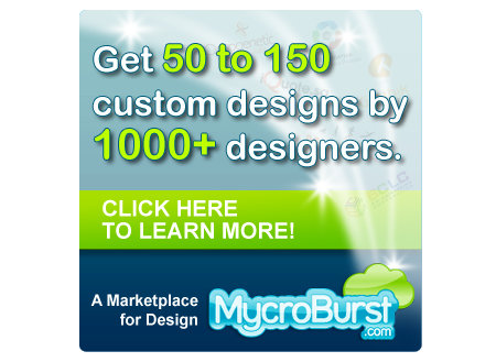
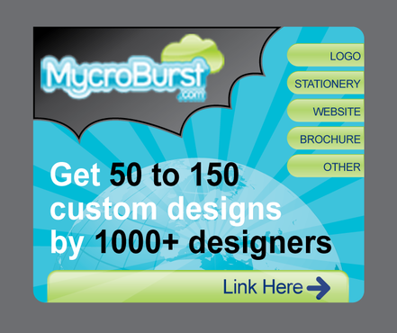
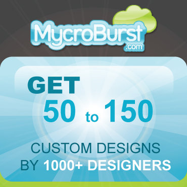
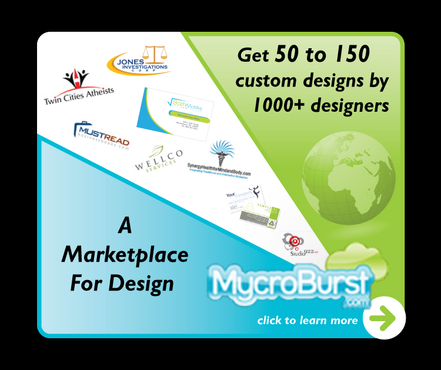
Mycroburst.com Display Ads
Display Ad
Get 50 to 150 custom designs by 1000+ designers
Internet Services
www.Mycroburst.com
YES
MycroBurst.com, is the web’s leading marketplace for design. MycroBurst helps connect designers and clients from around the globe MycroBurst bridges the gap between the client and designer with an interactive format, providing logo design, web design, stationery and display banner design.
Banner should be Web 2.0, clean, and similar in design to Mycroburst.com please see sample banners/sites for inspiration.
Clean/Simple
Professional
Modern
Soft
High Tech
Light Blue
Blue
Green
http://s3.buysellads.com/1500/5890-1251390804.jpg
http://s3.buysellads.com/1234836/9103-1256847068.jpg
http://www.rightbanners.com/images/ad44.jpg
Standard Package (300x250, 728x90, 160x600)
Arial


Comments
Project Holder
Project Holder
Project Holder
Project Holder
Project Holder
Project Holder
Project Holder
Project Holder