Minnesota Water
Minnesota Water
|
Contest Holder
snorenberg
?
Last Logged in : 4552days20hrs ago |
Concepts Submitted
386 |
Guaranteed Prize
400 |
Winner(s) | A Logo, Monogram, or Icon |
|
Live Project
Deciding
Project Finalized
Concept
Awarded as a winner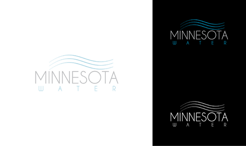


Creative Brief
Minnesota Water
Minnesota Water
No
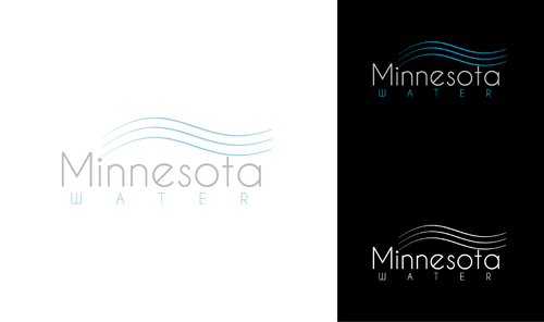
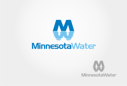
Minnesota Water is a company that provides water purification systems for homes and businesses. The logo should be clean and modern without excessive embellishment.
We really need something other than the stereotypical water company logo (Please, no water drops like this: http://www.drinkpuravida.com/wp-content/themes/Aurelius/images/logo-white.png )
Beverages
Logo Type
![]()
Abstract Mark
![]()
Modern
Simple
Professional
We are open to ideas. While blue is the go-to color for water logos, we'd like to see some other options. Using black or gray (or your choice) as the prominent color and blue as a secondary color may work well for this.
not sure
The logo for the corporate company is here: http://purewatertechnology.com/index.html.
We are really looking for something much different from that logo. We don't like the thick block text or the water drop that goes with it -it just looks so generic and outdated. We really want something modern. Here are some logos that we like:
http://images1.hellotrade.com/data2/QM/FU/HELLOTD-1180910/predesign-atlast-solutions-250x250.gif
http://www.waldendesign.com/logo-design/consumer-services-logos/images/the-water-company-logo.jpg
http://web3mantra.com/wp-content/uploads/2011/01/the-water-front.jpg
http://www.lynnegrainger.com/blog/wp-content/uploads/2011/05/AuNaturelSoapCompany1-300x191.jpg
http://media02.hongkiat.com/fonts-used-by-logos/shutterfly.jpg
http://www.d1102070-5.cp.blacknight.com/uploads//portfolio/square_big.png
Related Contests