Logo Re-Design for Consulting Company
Agents of Efficiency
|
Contest Holder
JECrawford
?
Last Logged in : 3924days15hrs ago |
Concepts Submitted
212 |
Guaranteed Prize
399 |
Winner(s) | A Logo, Monogram, or Icon |
|
Live Project
Deciding
Project Finalized

Creative Brief
Logo Re-Design for Consulting Company
Agents of Efficiency
We do the boring business stuff. You do the happy dance.
No
TurnKey set-it-and-forget-it simplicity and efficiency. ... Small business clients come to us because they are feeling overwhelmed with all the "boring business stuff" they have to do (IT, payroll, HR, accounting/bookkeeping, legal compliance, etc.) just to keep their business afloat - stuff they aren't good at, and that takes them away from their businesses' core competency - the reason they started the business in the first place (to be a lawyer, or a psychologist, or a contractor, or to sell pizza). By hiring us, we take care of running all of the "boring business stuff" for their business so they can focus on their core competency... saving both time (because we do it for them) and money (because we do it more efficiently then they will) in the process. This logo should convey that one-stop TurnKey Efficiency peace of mind we seek to give our clients.
Consulting
Modern
Professional
Not sure.
not sure
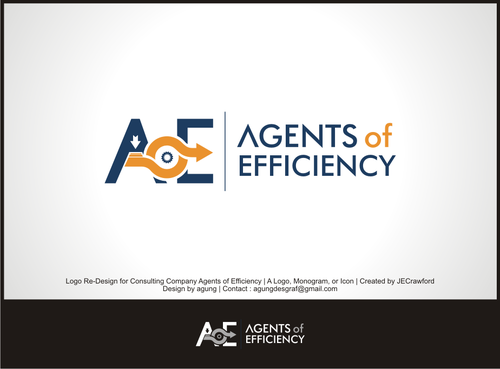
I've uploaded our most recent effort at this logo. For the most part, this logo does a very good job of conveying the things describe in this job - the things I want this logo to convey. One criticism I'm receiving about this logo, however, is that it felt a little too much like a contractor logo. I'm wondering if it's possible to maybe replace some of the constructiony-looking symbols, like pipes and a conveyor belt, with something more abstract or something that looks more like data/computer stuff to try and fix this concern. Any efforts you can make to fix that concern about this logo and make it better would be appreciated.
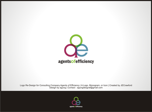
ALSO, SEPARATELY, I would like to see efforts at an entirely different logo concept that incorporates the letters AoE or AOE. If I really like a new logo that incorporates our initials, I may be willing to move completely away from the current logo entirely.
Related Contests


