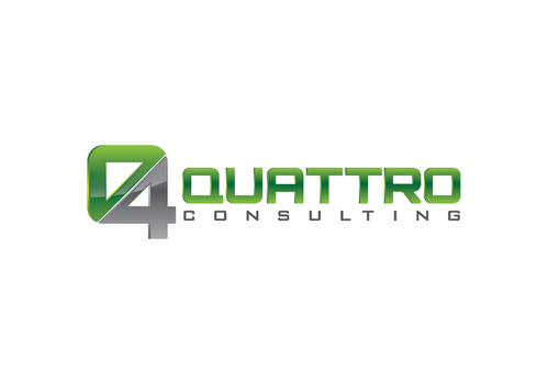
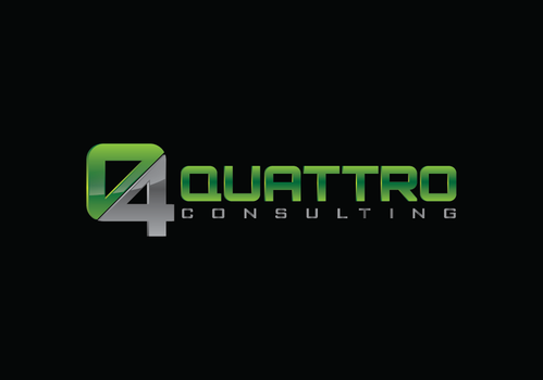
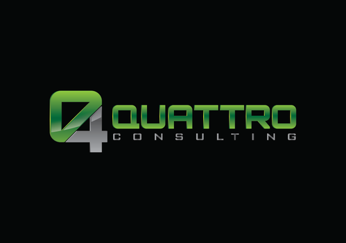
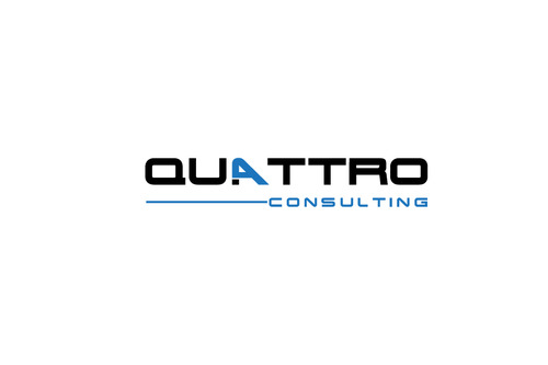
Logo for IT Consulting Company
Quattro Consulting
|
Contest Holder
tqmanderson
?
Last Logged in : 3702days21hrs ago |
Concepts Submitted
396 |
Guaranteed Prize
200 |
Winner(s) | A Logo, Monogram, or Icon |
|
Live Project
Deciding
Project Finalized


Creative Brief
Logo for IT Consulting Company
Quattro Consulting
No
Bold, professional, innovative, forward thinking, industry expertise, intelligent, high end
www.qttro.com
We are in the process of updating the text in the website, as well as the logo/company name listed in this URL.
Consulting
Logo Type
![]()
Abstract Mark
![]()
Web 2.0
![]()
Modern
Cutting-edge
Youthful
Sophisticated
Professional
High Tech
Open to suggestions, but open to a navy or charcoal with a pop of some brighter color
2
Interested in having Quattro stand out more than consulting.
Related Contests


