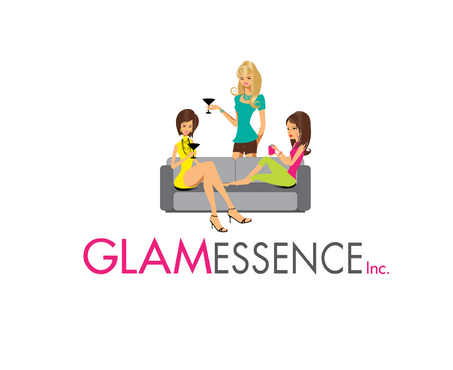
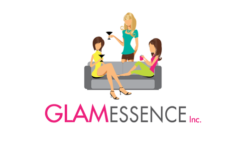
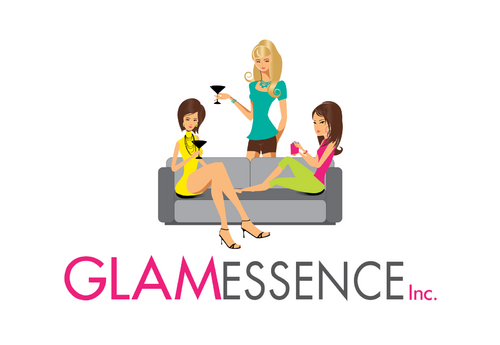
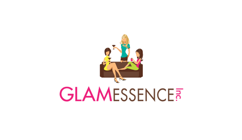
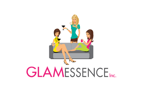
Logo for Glamessence
glamessence Inc.
|
Contest Holder
glamessence
?
Last Logged in : 1695days12hrs ago |
Concepts Submitted
19 |
Prize Money
199
|
Winner(s) | A Logo, Monogram, or Icon |
|
Live Project
Deciding
Project Finalized
Creative Brief
Logo for Glamessence
glamessence Inc.
No
What Do We Do: Glamessence Inc. is an internet retailer selling gift items that are geared towards Woman. The theme for the products we will be selling will be around wine and entertaining gifts and beach related gifts. I have enclosed some pictures of products we may carry to give you a better Idea.
Who We Are: Glamessence means recognizing your inner beauty and Glaming it up to celebrate it. It's girlfriends supporting girlfriends. Celebrating together the love and support that only girlfriends can offer.
Logo Design Direction: I have included some logo examples that I ran across and liked. Overall I like a picture that describes what the company does and a very easy to read logo.
Fonts: I like the fonts on the getwiredlogo and LullabyStudioLogo they are very simple and easy to read. I like how part of the logo on the getwiredlogo is bold and the other part is not. I also like on the skinnygirllogo how the two parts of the name are in different colors.
Design: I would like a picture that shows what we do and what we sell. An initial thought I had was a group together hanging out, having fun, similar to the skinnygirllogo. I am however open to your interpretation and welcome creative thinking.
Color: I really love the colors in the LauraRauchlogo and the Lullaby logo. I would like it to appeal to females.
Retailers
Logo Type
![]()
Feminine
Modern
Sophisticated
Simple
Color: I really love the colors in the LauraRauchlogo and the Lullaby logo. I would like it to appeal to females.
3
Logo Design Direction: I have included some logo examples that I ran across and liked. Overall I like a picture that describes what the company does and a very easy to read logo.
Fonts: I like the fonts on the getwiredlogo and LullabyStudioLogo they are very simple and easy to read. I like how part of the logo on the getwiredlogo is bold and the other part is not. I also like on the skinnygirllogo how the two parts of the name are in different colors.
Design: I would like a picture that shows what we do and what we sell. An initial thought I had was a group together hanging out, having fun, similar to the skinnygirllogo. I am however open to your interpretation and welcome creative thinking.
Color: I really love the colors in the LauraRauchlogo and the Lullaby logo. I would like it to appeal to females.
Related Contests