Logo for a Lodging Industry Template Design Company
LodginnDesign
|
Contest Holder
AtomicZen
?
Last Logged in : 2908days21hrs ago |
Concepts Submitted
95 |
Prize Money
200
|
Winner(s) | A Logo, Monogram, or Icon |
|
Live Project
Deciding
Project Finalized


Creative Brief
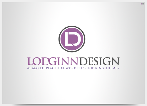
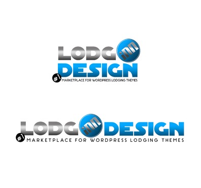
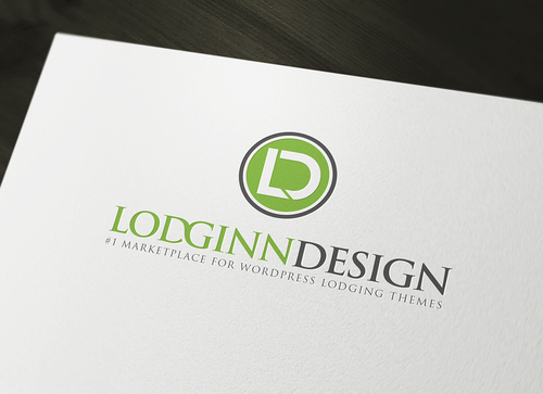
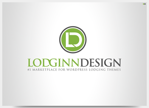
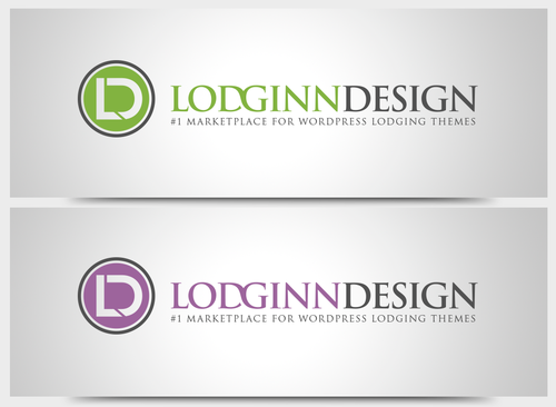
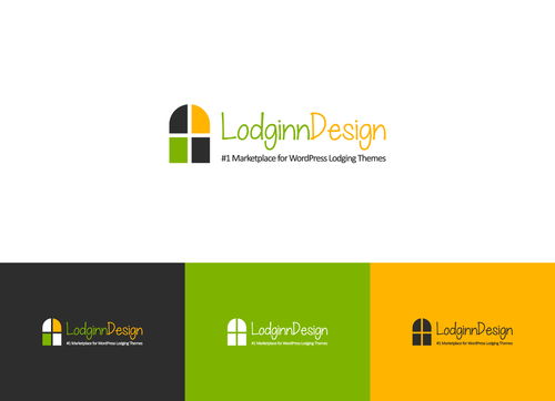
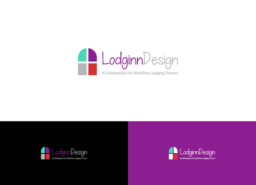
Logo for a Lodging Industry Template Design Company
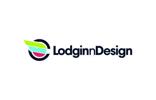
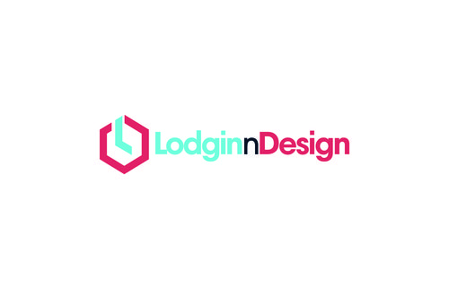
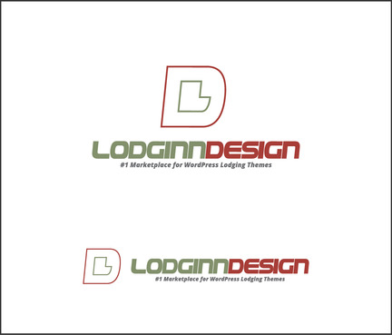
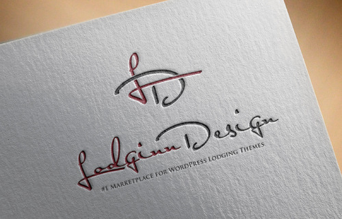
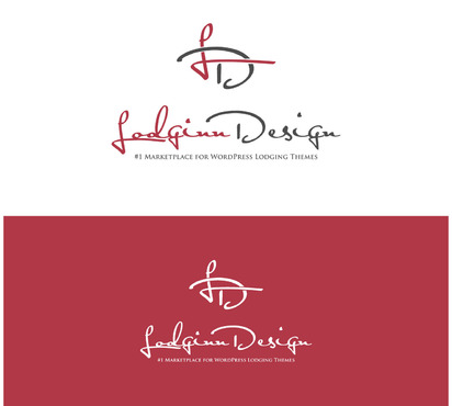
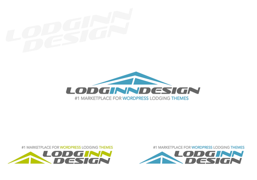
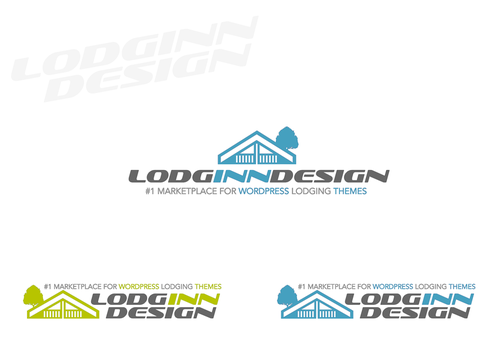
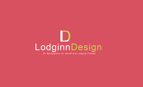
LodginnDesign
#1 Marketplace for WordPress Lodging Themes
Yes
We create lodging industry WordPress theme templates.
Our customers are anyone who has lodging accommodations and needs either a new or to replace an existing website. Including (not limed to); developers, B&B’s, Vacation Rentals, Boutique Hotels, Inns, Hotels, Lodges, Homestays, Resorts, Dude Ranches…
We want to convey professionalism, luxury and a cool, modern, aesthetic feel. Our templates will be sleek and modern and highly specialized to the lodging industry.
We will probably need the Logo on the left – text on the right but feel free to experiment. We also need to have it stacked so we can use it both ways. We are looking for a unique creation whereas the logo has a visual focus on the fact that we are 'lodging industry' specific. Generic looking logos won't be helpful. Think 'cutting edge' look and feel..
As far as the font....sans serif, dynamic, cool, modern, simple, elegant, powerful
Travel
Logo Type
![]()
Symbolic
![]()
Abstract Mark
![]()
Masculine
Modern
Cutting-edge
Youthful
Sophisticated
Simple
Professional
High Tech
Modern muted colors.... We like dark grey, lime green, light blue/aqua, orange (not that awful orange but a modern muted orange) but feel free to experiment
not sure
Not sure but perhaps some sort of simple yet powerful/elegant drawing of part of an inn/b&b etc that works into the name (whether its to the side or above or similar) Something that conveys that we specialize in the lodging industry.
Related Contests