SALES / SUPPORT : +1-877-525-5646 |
Login
Osborne & Sharpless
|
Contest Holder
OsborneSharpless
?
Last Logged in : 4788days4hrs ago |
Concepts Submitted
45 |
Prize Money
300
|
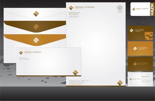
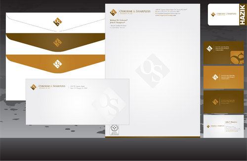
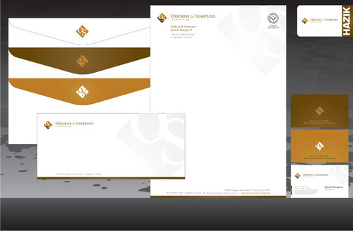
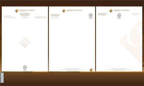
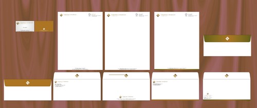
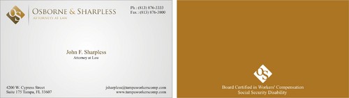
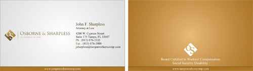
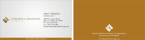
Winner(s) | Business Cards and Stationery |
|
Live Project
Deciding
Project Finalized
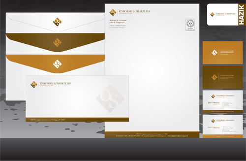
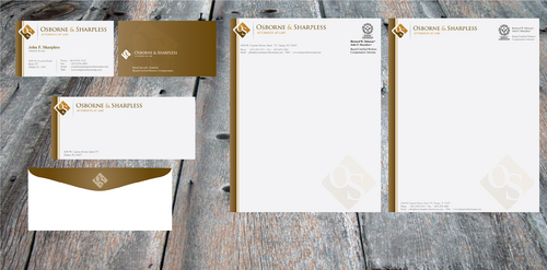
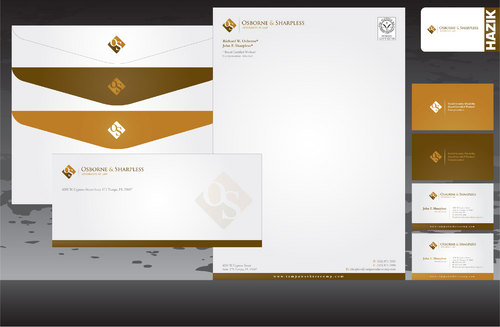
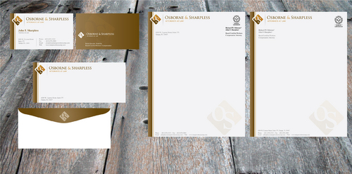
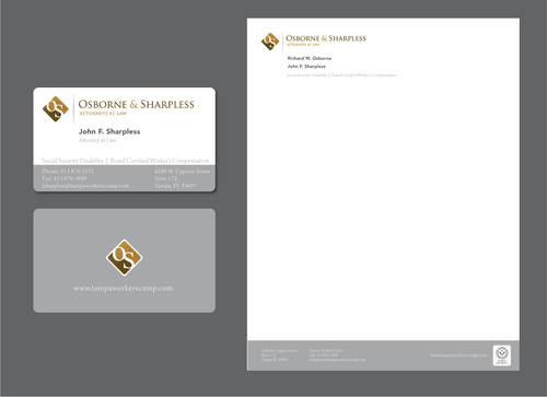
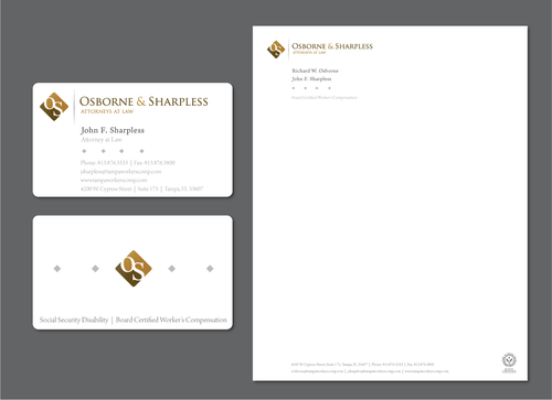
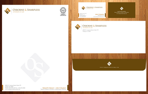
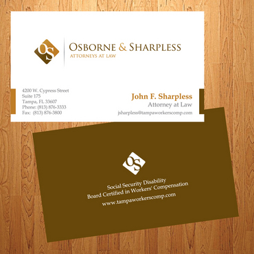
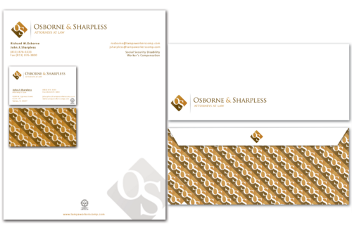
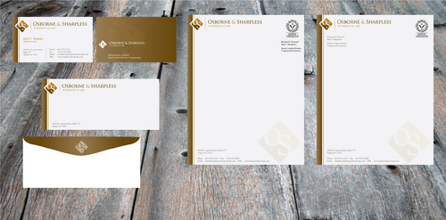
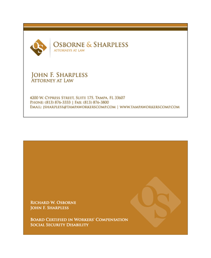
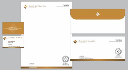
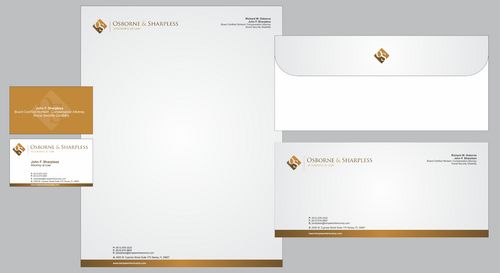
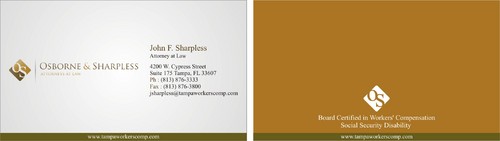
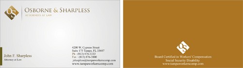
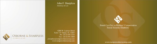
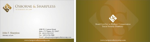
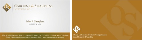
Law Firm Stationery/Cards
Osborne & Sharpless
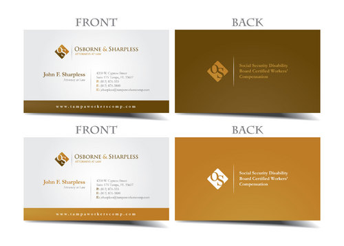
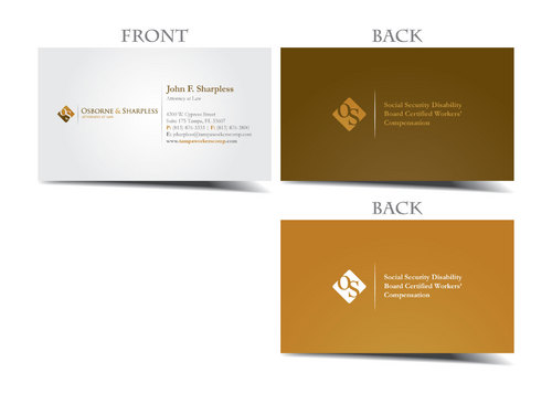
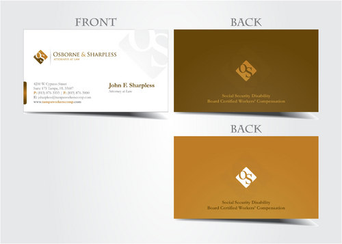
I need double sided standard sized Business Card [3.5" x 2"]
Use specific fonts
Use whatever fonts look best
Corporate
Professional
John F. Sharpless
Attorney at Law
4200 W. Cypress Street Suite 175 Tampa, FL 33607
(813) 876-3333
(813) 876-3800
jsharpless@tampaworkerscomp.com
www.tampaworkerscomp.com
Include in business card: Social Security Disability Board Certified in Workers' Compensation Stationery/Letterhead should include Attorney names: Richard W. Osborne* John F. Sharpless* * Board Certified in Workers' Compensation Attorney include the practice areas "Social Security Disability" and "Workers' Compensation" on the letterhead We'd like it to be flexible for adding additional office locations or additional attorneys in the future. I'll upload our current letterhead for informational purposes only - not design.
Designer's choice

Comments
Project Holder
Project Holder
Project Holder