SALES / SUPPORT : +1-877-525-5646 |
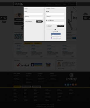
Login
with drawings
|
Contest Holder
dcgwaves
?
Last Logged in : 4471days14hrs ago |
Concepts Submitted
54 |
Guaranteed Prize
350
|
Winner(s) | Web Design |
|
Live Project
Deciding
Project Finalized

Kadidy.com Website Design
with drawings
Employment
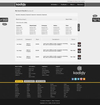
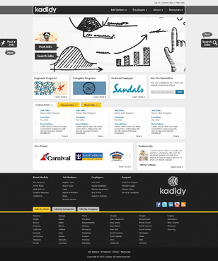
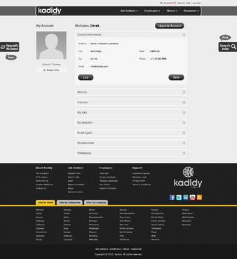
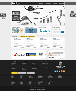
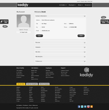
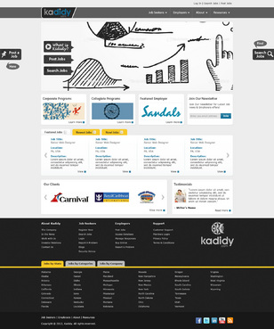
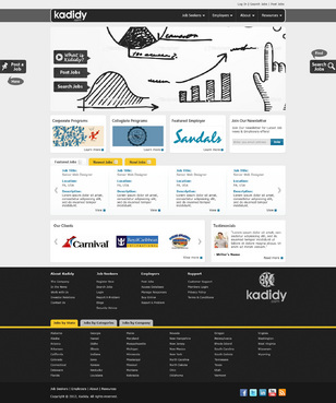
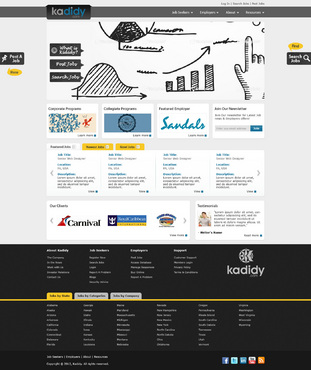
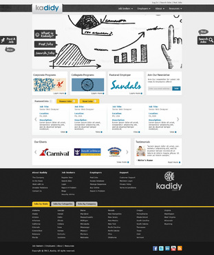
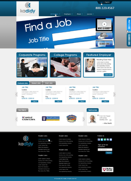
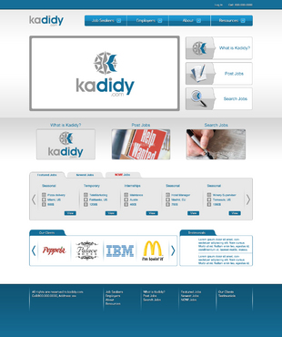
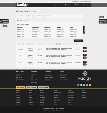
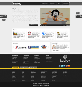
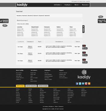
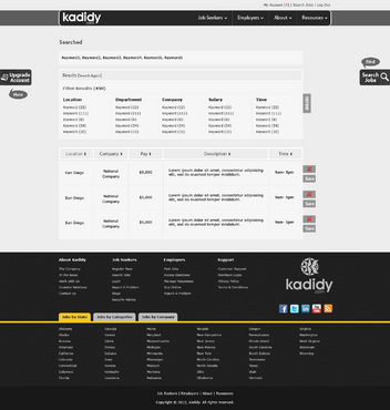
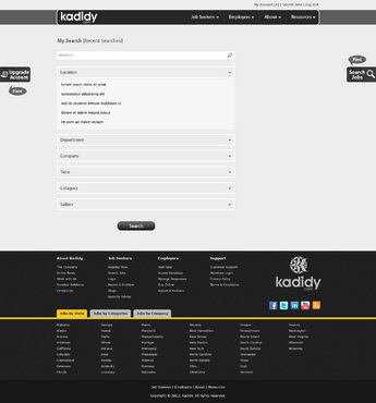
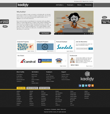
kadidy.com (all lower case) will be the hub for seasonal jobs in vacation destinations such as the tropics, winter resorts, camps, cruise lines, etc.. This website will be visited by two main groups of people, college-aged (18-26 yrs) looking for jobs all over the world in vacation-type destinations, and the employers looking to hire this demographic. The website will be modern, and the layout could be comparable to radian6.com (although I hate the colors of that site and the sketchy type of creative, but that's their thing) - so just the layout. I come from lynda.com, so the smart but hip feel of that site could be used an example as well. This company is to come across to an employer as a smart business solution for their human resources, but should also come across as hip for the demographic looking for a job. There are aspects of both radian6.com and lynda.com that I like, so those two sites can be used as good examples of what I am looking for. Users of my company will create profiles and search for jobs.
What I do not like, although my drawings will kind of show this, is too-boxy of a design. The design should have a creative aspect to it (like lynda.com uses rounded-edged boxes). I do not want an "out-the-box_ type design, as I like the custom look. There will not be a rotating banner at the top area of the homepage, it will be static.
Cutting-Edge
Unique/Creative
Clean/Simple
Professional
Modern
Soft
blue (from logo)
dark and light grey (from logo)
white
top
lynda.com
radian6.com
Although I have uploaded my drawings, there is some room for creative interpretation. I would like to see different ideas of using the complete logo in the header, or just the "kadidy.com" (like lynda.com does). I would like to see different ideas for the call-out tabs on the right side of the website that will be used to upgrade an account. I have made these drawings to give my creative ideas, but some variations/different ideas are acceptable.


Comments
Project Holder
Project Holder