SALES / SUPPORT : +1-877-525-5646 |
Login
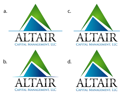
Altair Capital Management, LLC
|
Contest Holder
mr19
?
Last Logged in : 4840days13hrs ago |
Concepts Submitted
102 |
Guaranteed Prize
199
|
Winner(s) | A Logo, Monogram, or Icon |
|
Live Project
Deciding
Project Finalized
Investment Management Logo
Altair Capital Management, LLC
Yes
Investment management advisory firm in the algorithmic trading space. Research, develop & implement quantitative trading strategies for client capital.
both
![]()
Cutting-Edge
Clean/Simple
Traditional
not sure
Design must incorporate entire name but the Capital Management, LLC stuff can be secondary. (Feel free to do what you think works best).


Comments
Project Holder
Project Holder
Project Holder
Project Holder
Project Holder
Project Holder
Project Holder
Project Holder
Project Holder
Project Holder
Project Holder
Project Holder
Project Holder
Project Holder
Project Holder
Project Holder
Project Holder
Project Holder
Project Holder