SALES / SUPPORT : +1-877-525-5646 |
Login
AppointmentCare
|
Contest Holder
jasonxp
?
Last Logged in : 3355days10hrs ago |
Concepts Submitted
101 |
Prize Money
350
|
Winner(s) | Web Design |
|
Live Project
Deciding
Project Finalized
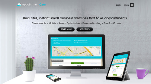
Home page redesign for online scheduling company
AppointmentCare
Internet Services
www.appointmentcare.com
AppointmentCare is a combination of About.me and Online Scheduling for small businesses. Any business that takes appointments is a potential client. For example, we serve hair salons, doctors, massage therapists, auto mechanics, and dog groomers.
Clean/Simple
Professional
Modern
Elegant
Service Oriented
top
http://www.squarespace.com/#directors
http://www.squarespace.com/#weddings
http://www.squarespace.com/#architects
We need a simple, beautiful new design for our home page. Specifically, we want a single, full-screen background with an image of an iPad or other tablet displaying a screenshot of our application. This idea is very similar to the example pages on www.squarespace.com. The background should be appropriate for various businesses like hair salons, doctors, massage therapists, auto mechanics, and dog groomers. The content for the page can be found here: https://docs.google.com/document/d/1KX5RdsnOU5PhKm5IfU_78g4uksAwWvMBnIGaiuHGeE0/edit?usp=sharing

Comments
Project Holder
Project Holder
Project Holder
Project Holder