SALES / SUPPORT : +1-877-525-5646 |
Login
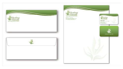
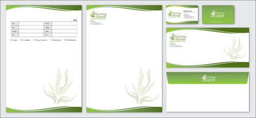
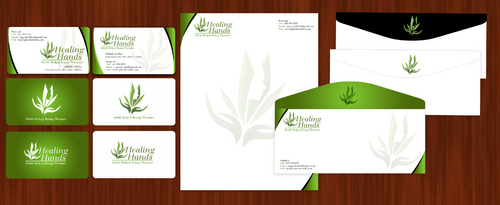
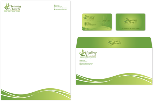
Healing Hands Body and Beauty Therapies
|
Contest Holder
Mamakilah
?
Last Logged in : 4099days7hrs ago |
Concepts Submitted
299 |
Guaranteed Prize
200
|
Winner(s) | Business Cards and Stationery |
|
Live Project
Deciding
Project Finalized
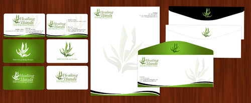
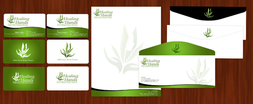
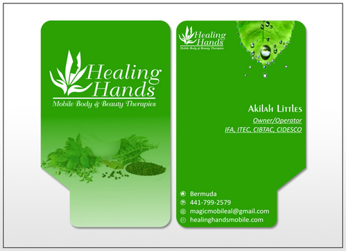
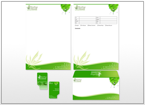
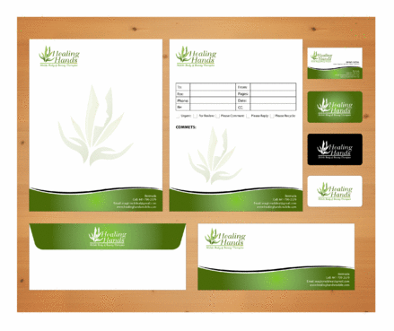
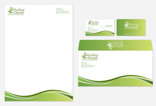
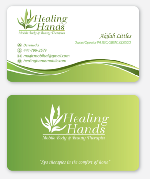
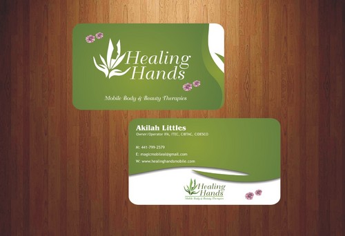
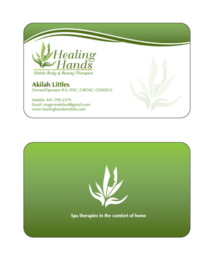
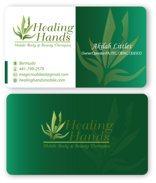
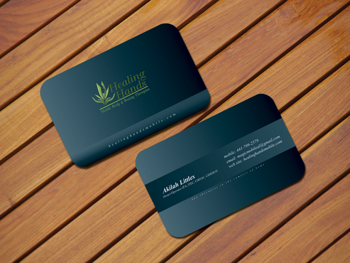
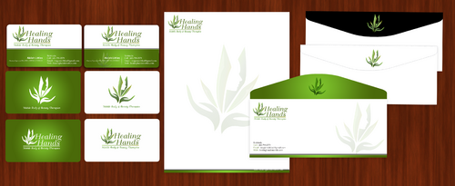
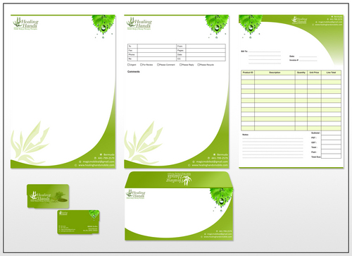
Healing Hands Business Cards
Healing Hands Body and Beauty Therapies
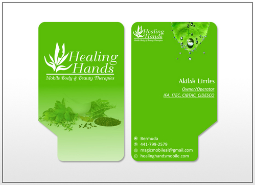
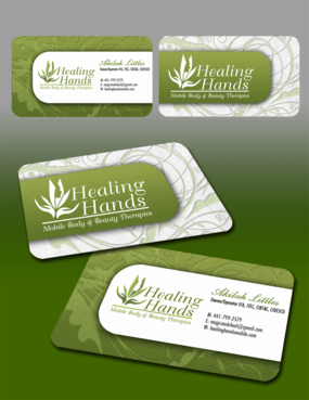
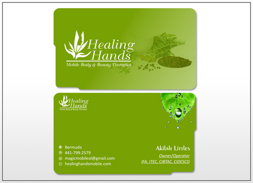
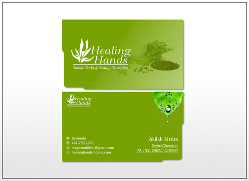
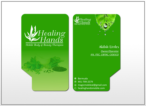
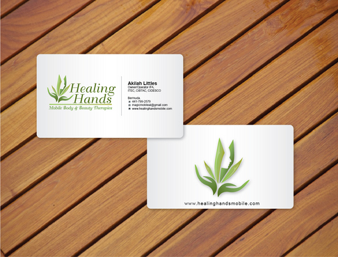
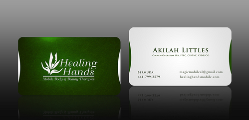
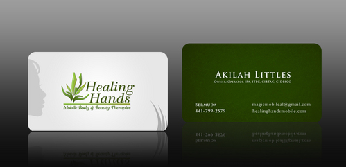
I need double sided standard sized Business Card [3.5" x 2"]
Use same font as used in my logo
Modern
Professional
Bright & Fun-filled
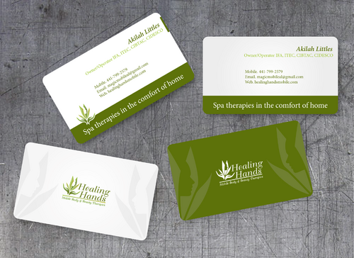
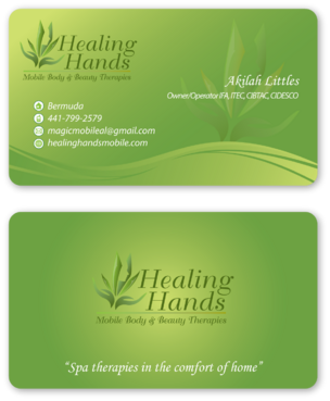
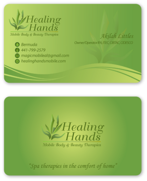
Akilah Littles
Owner/Operator IFA, ITEC, CIBTAC, CIDESCO
Bermuda
441-799-2579
magicmobileal@gmail.com
healinghandsmobile.com
Please design a business card with rounded corners Only the logo goes on the front. Name and additional info goes on the back Coloured background please
Akilah Littles (in bold print) Owner/Operator IFA, ITEC, CIBTAC, CIDESCO mobile: 441-799-2579 email: magicmobileal@gmail.com web site: healinghandsmobile.com Spa therapies in the comfort of home


Comments
Project Holder
Project Holder
Project Holder
Project Holder
Project Holder
Project Holder
Project Holder
Project Holder