SALES / SUPPORT : +1-877-525-5646 |
Login
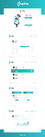
STUDY SMART. SCORE MORE.
|
Contest Holder
briangordon
?
Last Logged in : 4862days21hrs ago |
Concepts Submitted
159 |
Guaranteed Prize
500
|
Winner(s) | Web Design |
|
Live Project
Deciding
Project Finalized

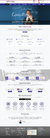
exam success website design contest
STUDY SMART. SCORE MORE.
Information Technology
http://www.examsuccess.ca/
Is an expert Educator in the Financial Services Industry. Exam Success prepares candidates to obtain the CFA, CFP, CSC, Mutual Funds designations that enable them to meet their education goals and ADVANCE IN THEIR PROFESSIONS. Exam Success offers comprehensive and convenient study materials, instruction in a choice of live classroom, online and self study formats as well as corporate training programs to suit the specific needs of groups and individuals. Demographic: ages 25- 45 Competitors: www.oliverslearning.com , www.schweser.com , http://www.schweser.com/index.php , www.allenresources.com , www.foranfinancial.com , www.stalla.com , http://www.analystnotes.com
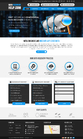
Dislikes: busy,cluttered pages Likes: 1. White background, soft shaded and / or darker colour blocks for emphasis, lots of white space, black text 2. Fonts should be san serif, easy to read i.e veranda, tahoma…. 3. Minimal graphics so as to not slow loading (we do not have photos so use stock ones if required) 4. Logo size to be approx. same width of a 1 column in a 3 column layout 5. Fluid design which will adjust to browser (minimize scrolling) 6. Menu Tree like IBM.com 7. + - Menu Tree for Navigation Bars 8. Home page main links to be rollovers 9. Our logo located at: http://www.adamrumanek.com/demo/exam_logo/logo_web1 or web2 or web 3
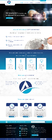
Clean/Simple
Professional
Content Driven
Corporate
Blue of logo
Grey of logo
shades of the logo
right side
http://www.templatemonster.com/website-templates/28815.html
http://www.templatemonster.com/website-templates/21995.html
http://www.allenresources.com
Other important information: • Site visitors will be able to purchase goods on line • Site visitors will need to register to access information • Site visitors will be able to download files • Site to be built in a template using a layered psd. • You will be preparing the PSD UI home page. Note: If you also have the capability of coding HTML/ Joomla integration, please advise. Logo placement: LHS top of page and approx 1/3 width of page. See size example: http://www.allenresources.com; 1st Nav Bar placement: horizontal, above header, RHS. See: http://www.templatemonster.com/website-templates/20398.html; 2nd Nav placement: horizontal, below logo e.g. http://www.templatemonster.com/website-templates/20398.html OR to the RHS of the logo see: http://www.templatemonster.com/website-templates/28815.html; Top of Home page: Logo; Navigation bar #1: About/ Contact / info@examsuccess.ca / Sign In / Search; Navigation Bar #2 (Main Menu): Designations / Study Materials / Instruction / Corporate Training/ Order - Register. Would like to have the order –register link to visually pop; Home Body: EXAM PREP & CORPORATE TRAINING (Main Feature Heading followed by a 40-45 word description on the company with some links included in the text); what we offer. (A Secondary Heading introducing the 3 main sections (see below) that needs to stand out visually. Each section will have 50 word description and a more link at the end of the section. The three sections are: Guides & Workbooks, Practice Questions, Intensive Reviews; credentials. (A Secondary heading followed by a 2 paragraph, 40 word ea. Description on faculty and their experience); capabilities. (A Secondary heading followed by 6 bullet pts of up to 4 words ea.); ad space (small, untitled space for news/correction, offers to be located above the footer); Footer: C 2010 Exam Success info@examsucces.ca About/ Contact/ Privacy Policies / Terms of Use/ Site Map. The CFA® Institute does not endorse, promote or warrant the accuracy or quality of the products and services offered by Exam Success. CFA® and Chartered Financial Analyst are registered Trademarks owned by CFA Institute; Menu Links: About: - Overview - Faculty - Alumni & Clients - Feedback - Links; Contact; Sign In; Search; Designations: - CFA level 1, level 2, level 3, - CFP, -CSC, - Mutual Funds; Study Materials:- Study Guides, - Workbooks, - Practice Questions, Instruction; Corporate Training; Order -Register.


Comments
Project Holder
Project Holder
Project Holder
Project Holder
Project Holder
Project Holder
Project Holder
Project Holder
Project Holder
Project Holder
Project Holder
Project Holder
Project Holder