Dynamic and young internetmarketing company needs a logo!
Get Clients Online
|
Contest Holder
GetClientsOnline
?
Last Logged in : 4003days16hrs ago |
Concepts Submitted
255 |
Guaranteed Prize
200 |
Winner(s) | A Logo, Monogram, or Icon |
|
Live Project
Deciding
Project Finalized


Creative Brief
Dynamic and young internetmarketing company needs a logo!
Get Clients Online
No
Hi everyone,
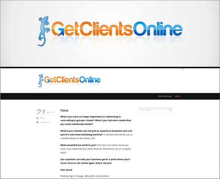
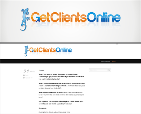
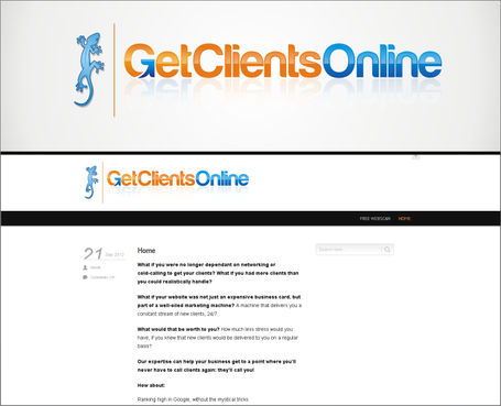
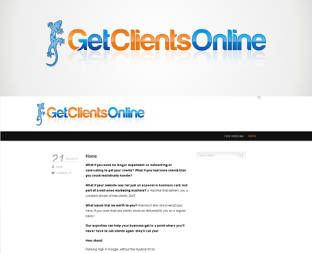
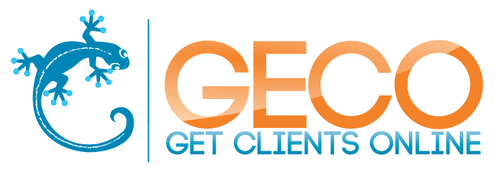
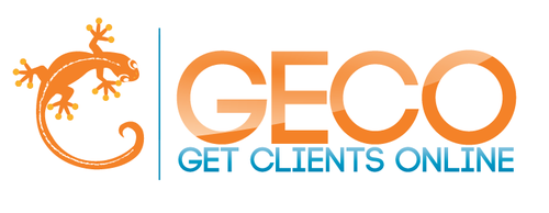
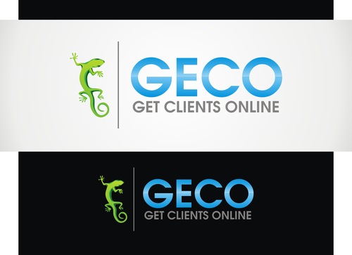
We're looking for a logo for our new company "Get Clients Online". We're a Dutch online marketing agency that helps businesses get (more) clients online. That means we do online advertising, copywriting and conversion optimisation.
What defines us should define the logo. We strive to be a fresh wind through a company. We're young, energetic, but we're still experts and we know what we're talking about. That means the design should be a mix of professionalism and youthful energy.
We're looking for a design that will appeal to our target audience: business owners, but also marketeers that want to bring us in. They've got to think: "Hey, those guys look like they know what they're talking about" but they should also be thinking: "that's a fresh approach to marketing".
Central to this theme is that we'd like to use a mascot on our website. The prime example of this can be found on a website we admire a lot: http://www.conversion-rate-experts.com. They've got a small beaver that's cartoony, but not too funny. Another good example is the professor over at http://www.ppcgenius.com. Both are good examples of a subtle, but cool mascot that adds to the fresh image we would like to have.
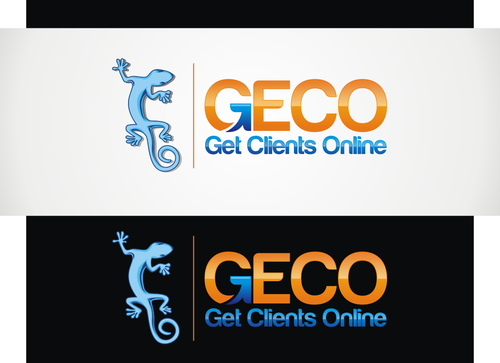
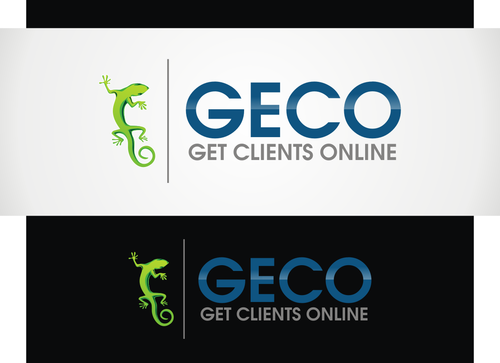
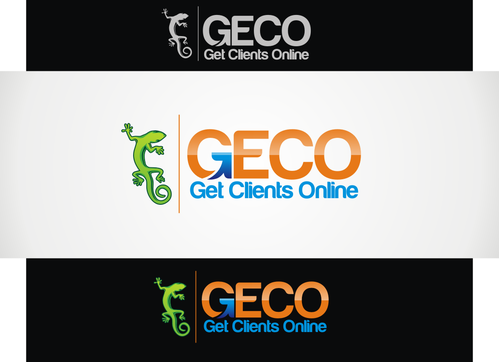
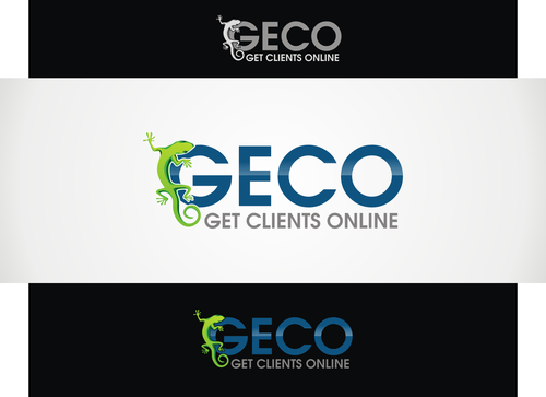
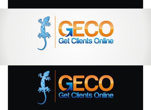
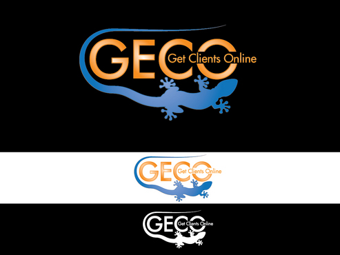
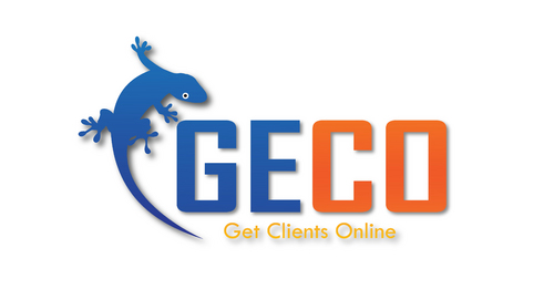
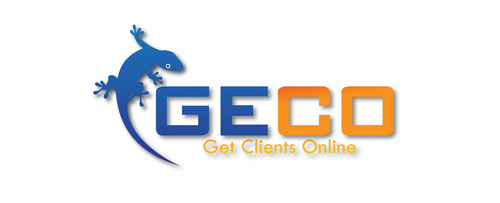
We've considered the fact that our company name can be shortened to "GECO" and as such we'd like a small gecko to be our mascot. A think to consider when using geckos is that they have very distinct hands and feet: spread out with suckers at the of its fingers.
We would like this gecko to interact with the logo in text somehow. He could be holding it, he could be going through it, he could be presenting it from either side of it. Be creative!
Marketing
Logo Type
![]()
Character
![]()
Modern
Youthful
Sophisticated
Professional
The colours in our logo should stand for what we are: fresh, young and vibrant. Bright colours, eye-catching, but still professional. I think there's a fine line between "vibrant" and "happy" and we don't want to cross that line, in order to remain recognizable as a professional business that can appeal to corporations if needed. The colours should not be too corporate. We're not sure about the amount of colours we want to use, but 3+ is probably preferable for what we want to convey. If you can come up with a 2-color design you really think is good, then it's welcome as well!
not sure
Some websites and styles we like:
http://www.conversion-rate-experts.com (love the mascot and use of colours)
http://www.ppcgenius.com (the professor and also the colors. Logo is simple but effective.
The Firefox logo (vibrant, nice colours and a mascot! example: http://static.mozilla.com/mozeu/images/firefox-wordmark-horizontal.png). Same goes for the Thunderbird logo.
Another good example of a logo with a mascot (though the colours are too dull): http://a1designer.files.wordpress.com/2010/04/logo-baru-website.jpg
And this version of the Apple logo, as an alternative taste: smooth, embossed, classy… nice. (http://www.weersnel.nl/attachments/Image/apple_logo.png)
Sites and designs we don't like too much:
Anything corporate or "elite"
http://www.omnigroup.com/products/omnifocus/ (very ugly type of purple, boring logo)
http://www.modation.nl/ (some may think this an application of fresh colours: we think this is boring, it's not alive!)
Related Contests