SALES / SUPPORT : +1-877-525-5646 |
Login
Stationery Designs for Agricultural Consulting company
|
Contest Holder
Area35
?
Last Logged in : 5026days18hrs ago |
Concepts Submitted
79 |
Guaranteed Prize
100
|
Winner(s) | Business Cards and Stationery |
|
Live Project
Deciding
Project Finalized

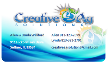
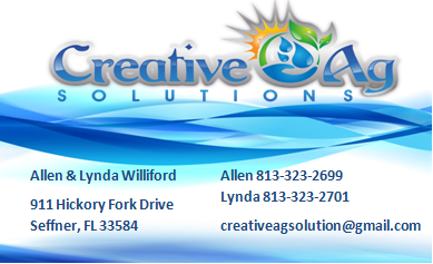
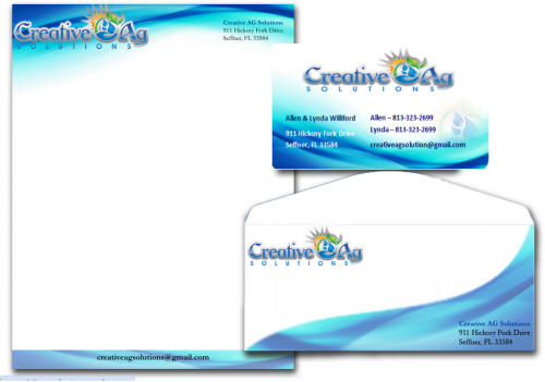
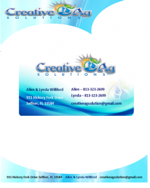
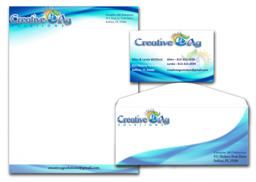
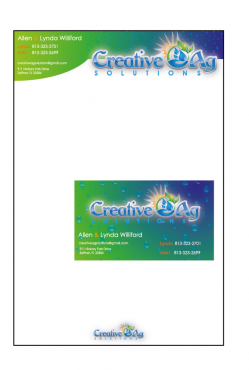
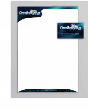
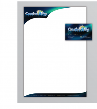
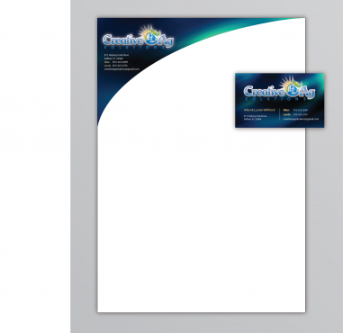
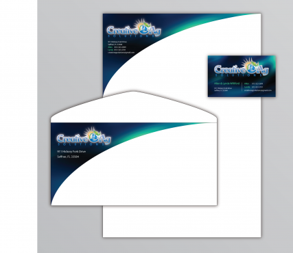
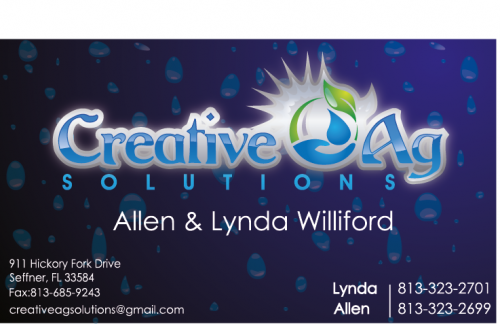
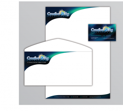
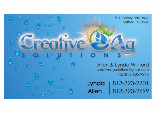
Creative Ag Stationery & Business Card
Stationery Designs for Agricultural Consulting company
I need single sided standard sized Business Card [3.5" x 2"]
Use specific fonts
Cutting-Edge
Modern
Bright & Fun-filled
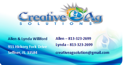
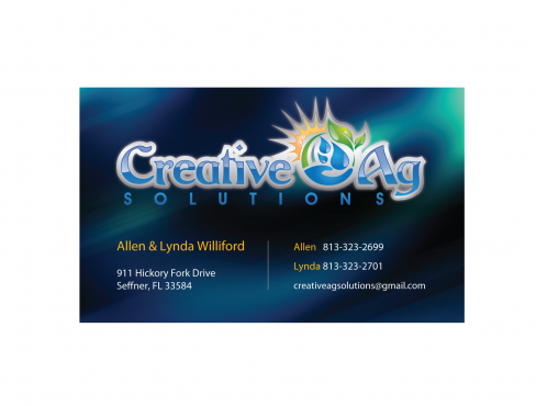
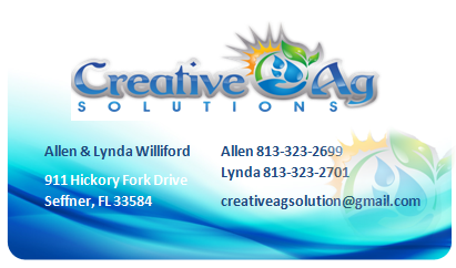
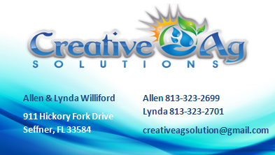
Allen & Lynda Williford
911 Hickory Fork Drive Seffner, FL 33584
Allen 813-323-2699
Lynda 813-323-2701
813-685-9243
creativeagsolutions@gmail.com
Final design will need to have cards for 2 other salesmen info - name, cell & email would be different than above


Comments
Project Holder
Project Holder
Project Holder
Project Holder
Project Holder
Project Holder
Project Holder
Project Holder
Project Holder
Project Holder
Project Holder
Project Holder
Project Holder
Project Holder
Project Holder
Project Holder
Project Holder
Project Holder
Project Holder
Project Holder
Project Holder
Project Holder
Project Holder
Project Holder