SALES / SUPPORT : +1-877-525-5646 |
Login
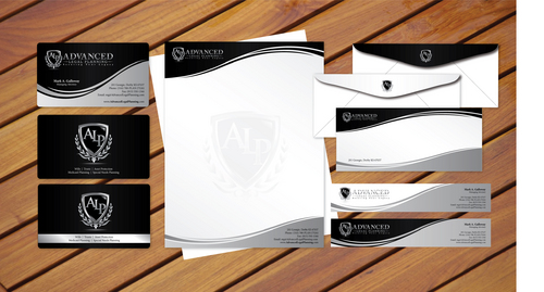
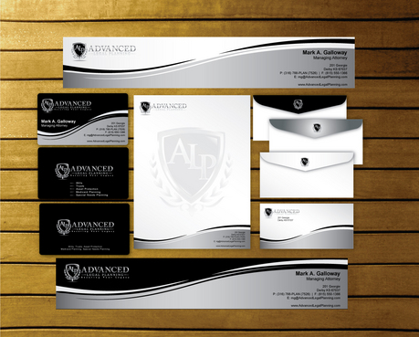
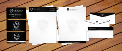
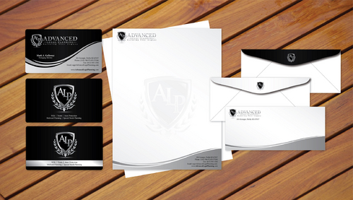
Business Card, Envelope, Post Card, Letterhead, Email Signature
|
Contest Holder
execconsult
?
Last Logged in : 4266days15hrs ago |
Concepts Submitted
92 |
Guaranteed Prize
97
|
Winner(s) | Business Cards and Stationery |
|
Live Project
Deciding
Project Finalized


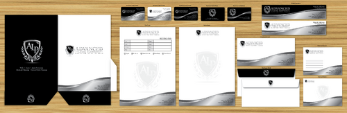
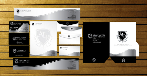
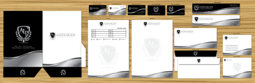
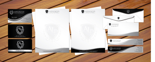
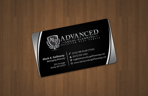
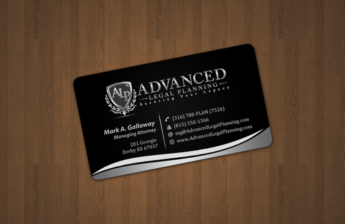
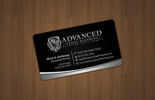
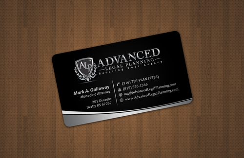
Corporate Image - Advanced Legal Planning
Business Card, Envelope, Post Card, Letterhead, Email Signature
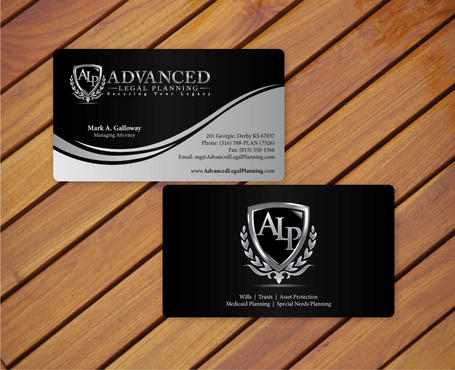
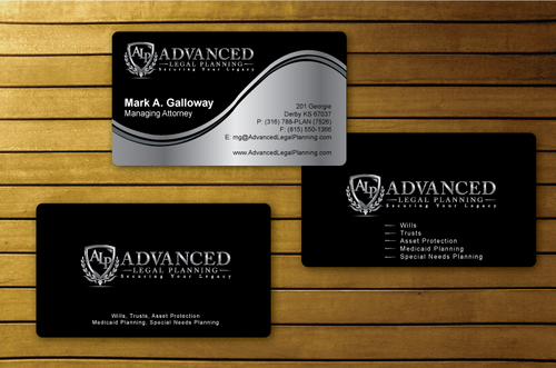
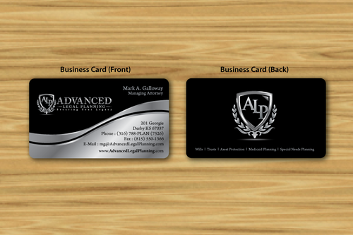
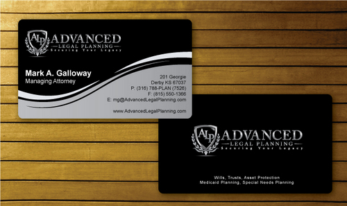
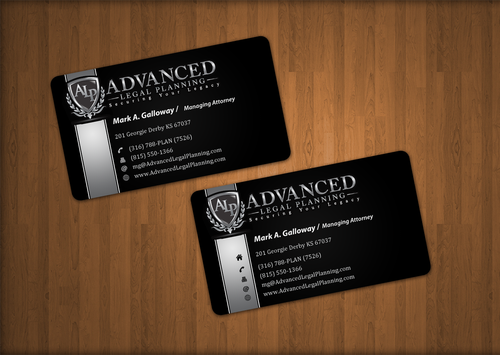
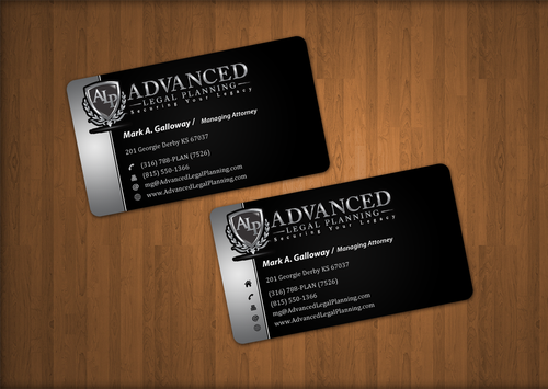
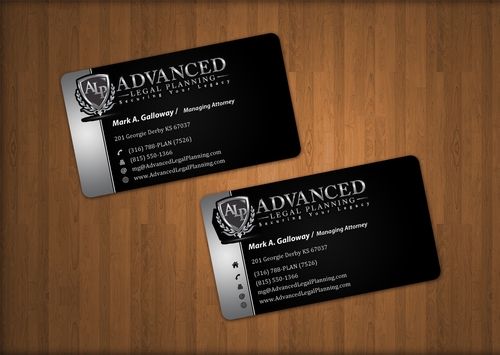
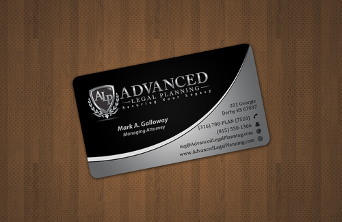
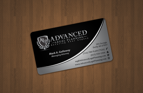
I need double sided standard sized Business Card [3.5" x 2"]
Use same font as used in my logo
Corporate
Professional
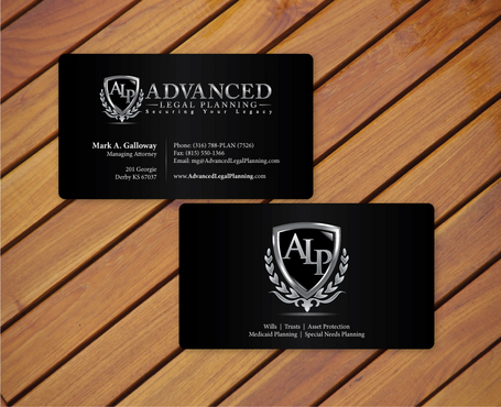
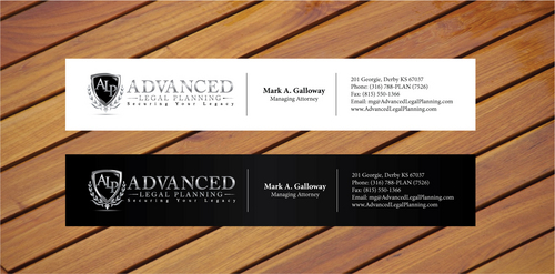
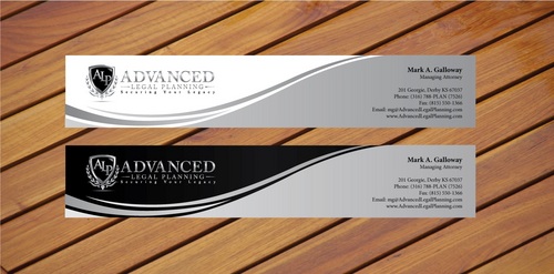
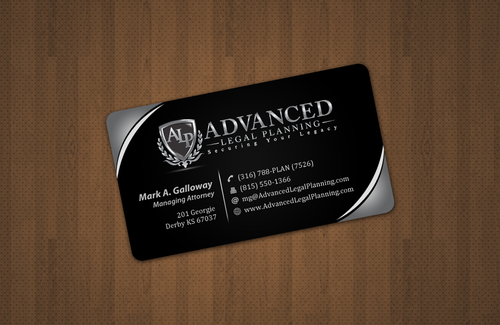
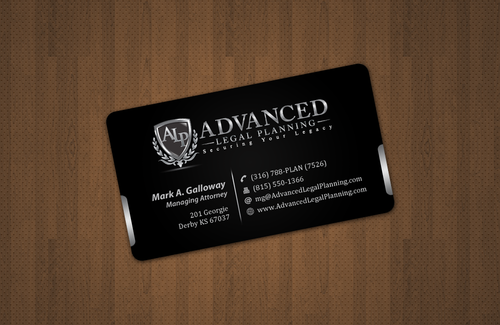
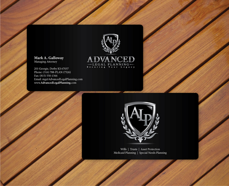
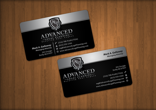
Mark A. Galloway
Managing Attorney
201 Georgie Derby KS 67037
(316) 788-PLAN (7526)
(815) 550-1366
mg@AdvancedLegalPlanning.com
www.AdvancedLegalPlanning.com
I am planning to go with a black glossy business card so the Logo looks more striking. In my business, judgments about how good I am are often based on how fancy my "packaging" is. The documents produced are a very important part of that "packaging."
I envision the back of the card as one large logo and then somewhere on the back (in small print) the words: Wills, Trusts, Asset Protection, Medicaid Planning, Special Needs Planning
Comments
Project Holder
Project Holder
Project Holder
Project Holder
Project Holder
Project Holder
Project Holder
Project Holder
Project Holder
Project Holder
Project Holder
Project Holder