SALES / SUPPORT : +1-877-525-5646 |
Login
Concept Construction & Remodeling, Inc.
|
Contest Holder
slockyer
?
Last Logged in : 4843days19hrs ago |
Concepts Submitted
19 |
Prize Money
149
|
Winner(s) | A Logo, Monogram, or Icon |
|
Live Project
Deciding
Project Finalized

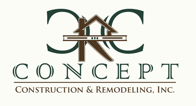
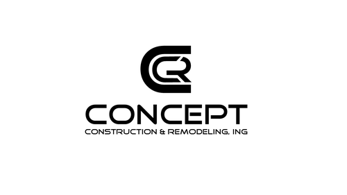
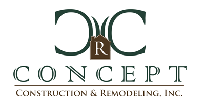
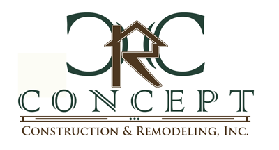
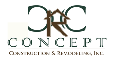
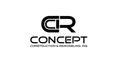
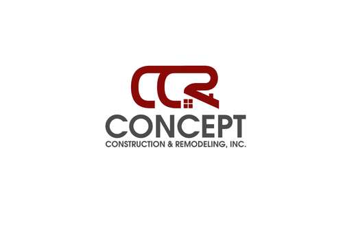
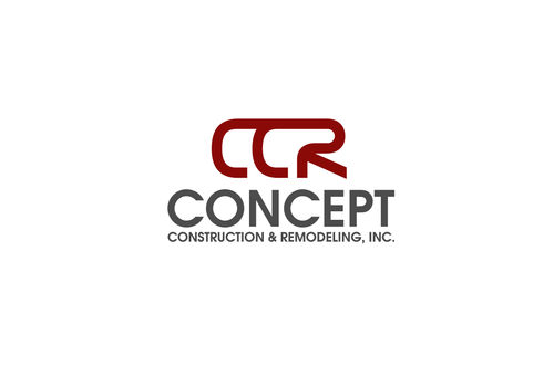
Concept Construction Logo
Concept Construction & Remodeling, Inc.
No
This is a general contractor's construction company who specializes in residential remodels and construction. The GC, Joe, is an expert at custom carpentry and framing, but can perform and/or manage all aspects of the project from concept to completion. He excels at custom beam and wood work in high-end custom homes, but will treat each project, no matter how small, with exceptional skill and professionalism.
Construction
Logo Type
![]()
Initials
![]()
Industry Oriented
Serious
Illustrative
For simplicity, 2-3 colors or even just 1 should be used. I would focus on wood tones - brown, maybe forest green, or just black.
2
He created a logo for his company years ago that features a level floating above and integrated into the word "Concept" with Construction & Remodeling, Inc. below in smaller font. Here are some examples:
http://picasaweb.google.com/lh/photo/DoRQKYzymtrT2_nCzcnT3Q?feat=directlink


Comments
Project Holder
Project Holder
Project Holder
Project Holder
Project Holder
Project Holder
Project Holder