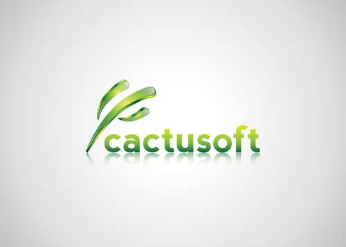
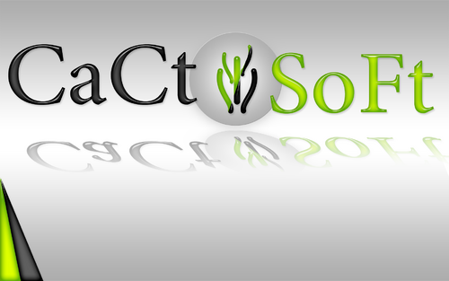
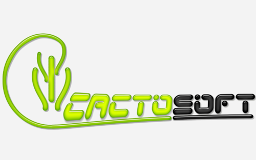
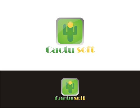
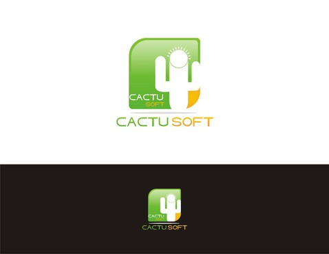
Cactusoft company logo
cactusoft
|
Contest Holder
cactusoft
?
Last Logged in : 4000days7hrs ago |
Concepts Submitted
116 |
Guaranteed Prize
240 |
Winner(s) | A Logo, Monogram, or Icon |
|
Live Project
Deciding
Project Finalized


Creative Brief
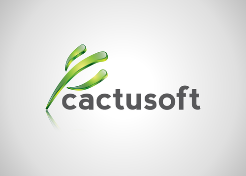
Cactusoft company logo
cactusoft
No
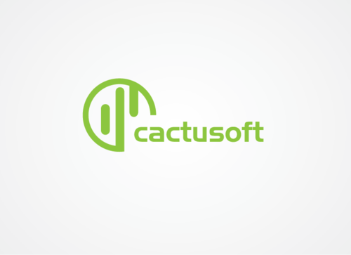
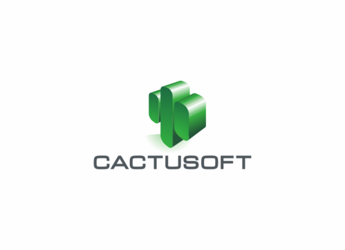
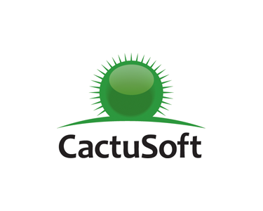
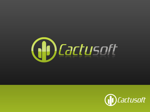
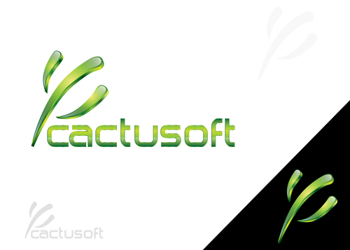
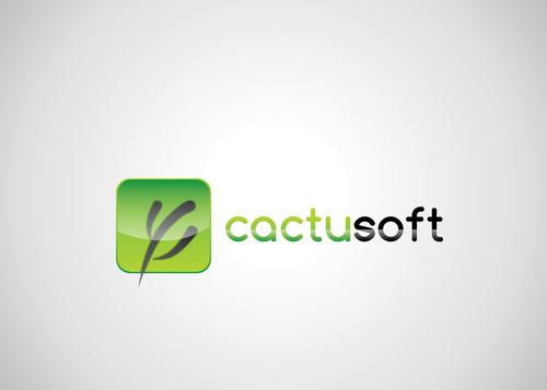
We're a small e-commerce software producer. Our name is derived from 'cactus' and 'software'. Our software is sold across the world, though our largest market is the UK, second largest is the USA.
Computers
Symbolic
![]()
Abstract Mark
![]()
Cutting-Edge
Unique/Creative
Sophisticated
Modern
We have tended to use green (due to the cactus!) and a sandy or yellow colour (the desert!). Our web site just has the name in green. But don't feel bound by either of these. We'd probably prefer the name not in black, as we feel it contrasts better on headed paper, to distinguish the company name/logo from other black text on the page. But don't feel this is obligatory.
not sure
A few things we have tried which were encouraging so might trigger some further ideas:
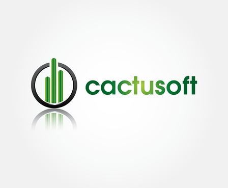
1. Very minimalist stylized cactus shape, e.g. three fat vertical parallel lines next to each other, rounded ends, centre one slightly longer than outer ones.
2. Maybe consider cactus texture (spikes or newsprint dots) rather than shape to indicate the 'cactus' element of our company.
Again, don't feel restricted by this, they're things we tried which were encouraging, but you may have better ideas.
Related Contests


