Business Logo, FitFamilyFundraising.org
FitFamilyFundraising.org
|
Contest Holder
michaellowry
?
Last Logged in : 5152days17hrs ago |
Concepts Submitted
42 |
Guaranteed Prize
200 |
Winner(s) | A Logo, Monogram, or Icon |
|
Live Project
Deciding
Project Finalized


Creative Brief
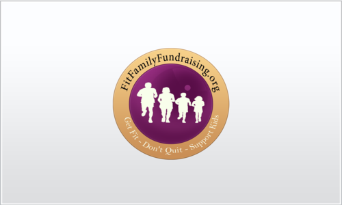
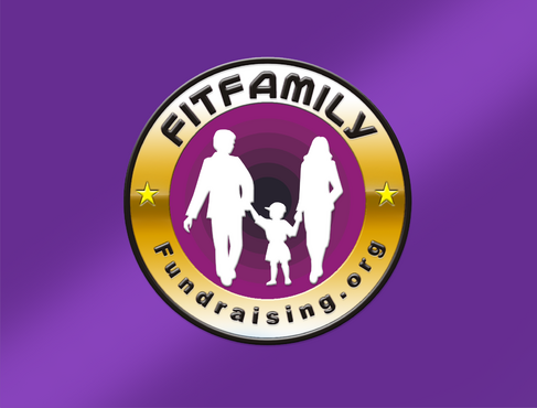
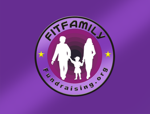
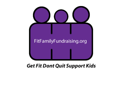
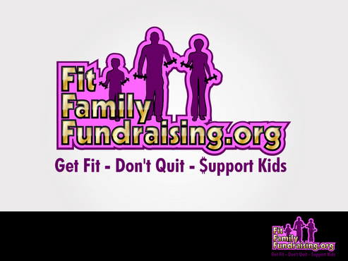
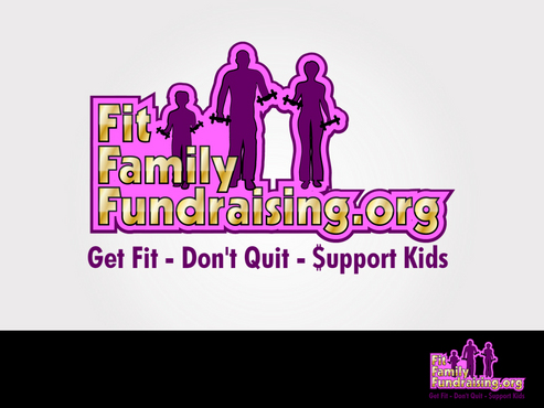
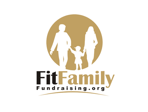
Business Logo, FitFamilyFundraising.org
FitFamilyFundraising.org
Get Fit - Don't Quit - Support Kids
Yes
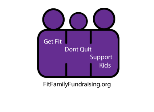
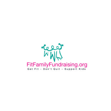
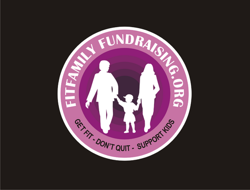
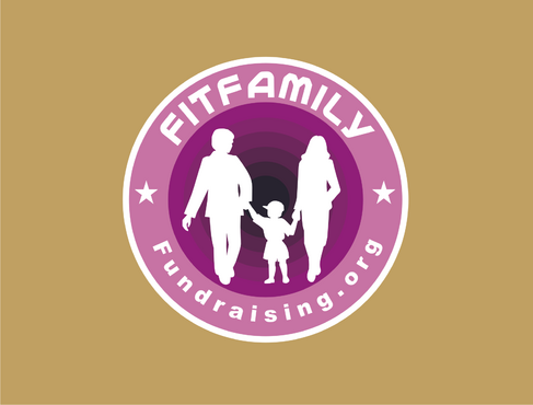
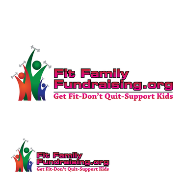
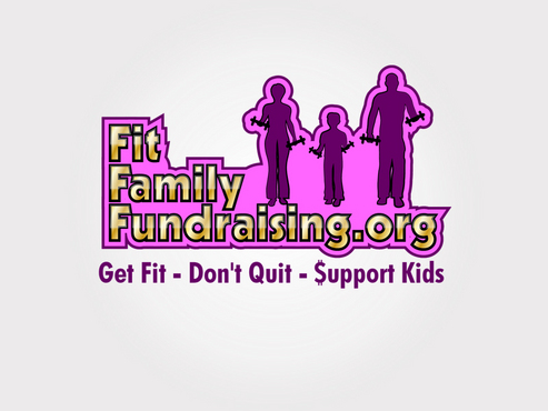
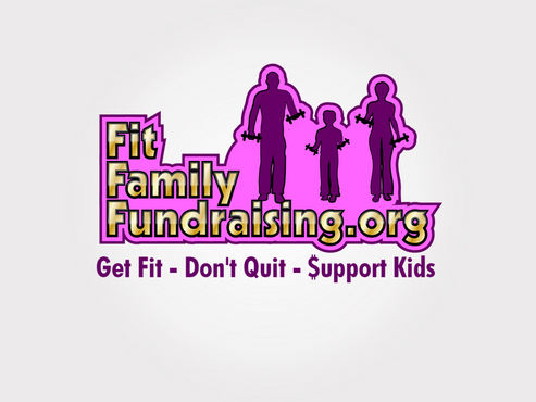
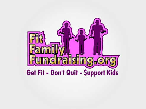
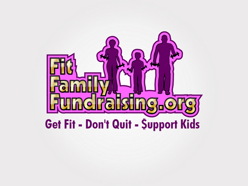
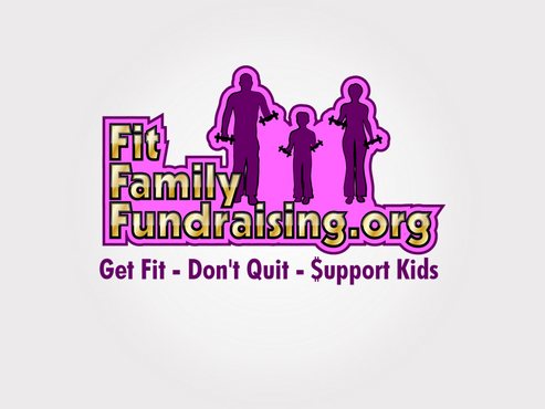
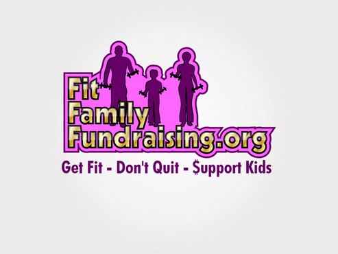
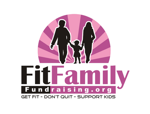
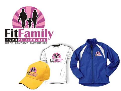
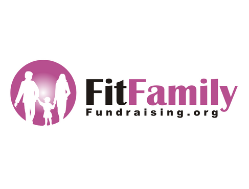
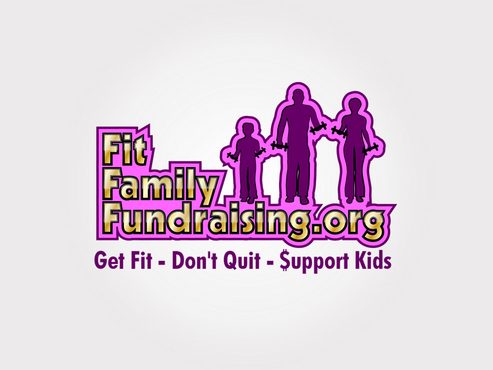
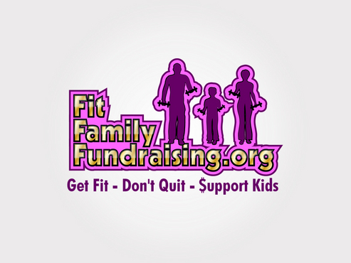
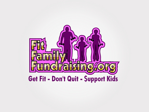
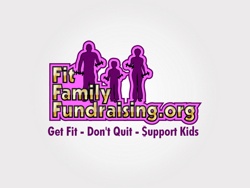
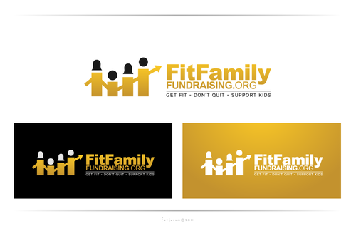
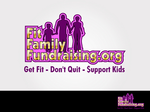
FitFamilyFundraising.org is a company helping non-profit organizations raise money for their worthy causes by helping them sell Beachbody products, ie P90X, TurboFire, Insanity, Body Gospel, Hip Hop Abs, Brazil Butt Lift. The monthly continuity product is Shakeology which is a meal replacement shake, which Beachbody has branded the healthiest meal of the day. The vision of FitFamilyFundraising.org is the help the School, PTA, Church, Youth Sports Teams or Youth Organizations have their group and Family members Get Fit, Lose Weight, Feel Great, Workout together as a Family and the proceeds will go to their organization & kids. This will be presented as The Most Powerful Never-Ending Lucrative Fundraiser on the Planet they have ever participated in. The logo design is to be part of a presentation submitted to PTA Presidents, Church Fundraising Committees & Youth Sport Team Associations etc. I would like it to be professional. For the logo, I envision that there are 3 people, stick figures representing a family, sized so that when you look at the logo, the parent is in the middle, a 8-10 year old sized child is on the right of the parent and an older child is on the left of the parent (the sizing should be that if you are looking at the left child and parent size, that you could also interpret it to mean a mom & dad & child) or it could represent a parent & 2 children. I would like it to be gender neutral so the audience can put themselves into the picture where their mind takes them. My initial thought is that all 3 of the figures are holding up dumbbells which represent working out together. I am open to other ideas to represent working out together as a Fit Family. I am also open to figures different than stick figures. I didn't know if I wanted fun or playful or cartoonish elements but I would be open to that idea as well. My original doodles have the Family on top of the name & tag line but that doesn't need to be that way. I will be putting this logo on polo shirts, jackets, biz cards & letterhead. I believe that the clothing colors will be bright colors or dark background.
Sports
Symbolic
![]()
Abstract Mark
![]()
Web 2.0
![]()
Clean/Simple
Modern
(Purple, Pink & Gold), (Purple & Pink), (Black heavy outlines & Light Purple), (Dark Purple heavy outlines Pink & white, or the paper/shirt color would show through could be the white.) I like the shading effect. I like the light reflection effect.
3
I like thicker lines as the outlines.
The name FitFamilyFundraising.org can be all together or separated Fit Family Fundraising.org. I am trying to brand the website. So I was thinking all together with the Capital letters distinguishing each word.
Related Contests


