Business Logo
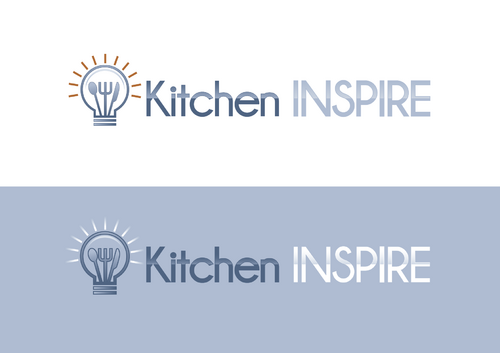
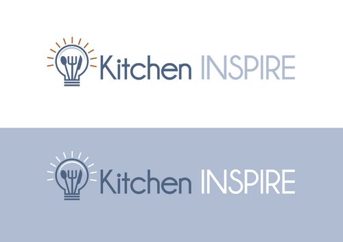
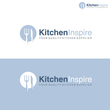
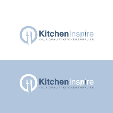
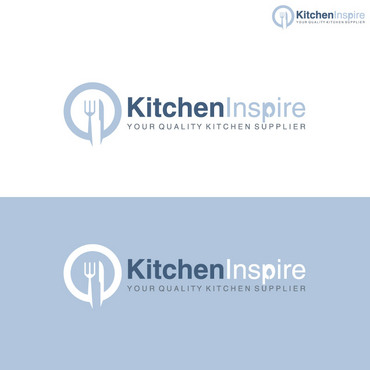
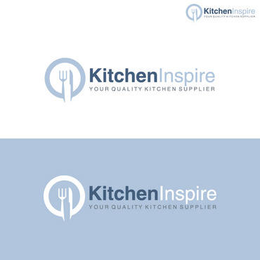
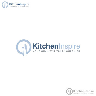
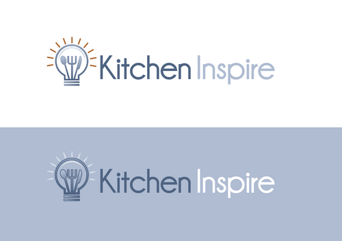
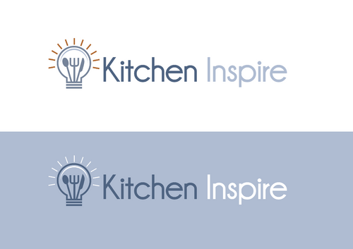
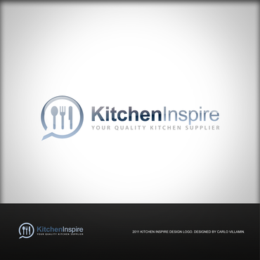
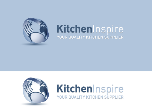
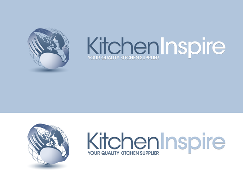
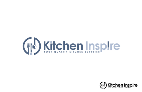
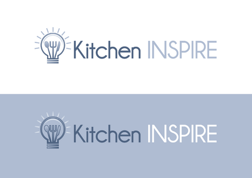
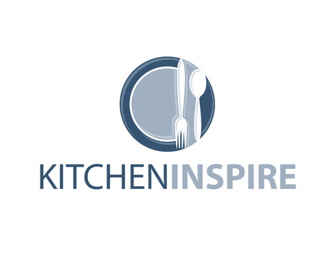
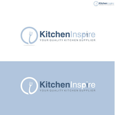
Kitchen Inspire
|
Contest Holder
kitchen
?
Last Logged in : 3708days19hrs ago |
Concepts Submitted
106 |
Guaranteed Prize
500 |
Winner(s) | A Logo, Monogram, or Icon |
|
Live Project
Deciding
Project Finalized


Creative Brief
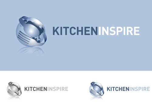
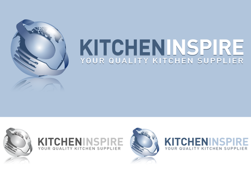
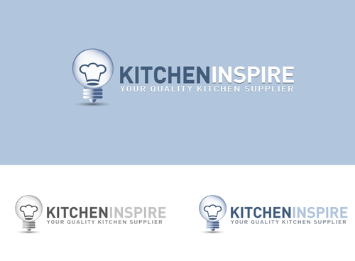
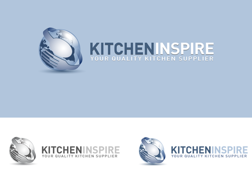
Business Logo
Kitchen Inspire
Yes
This is a business that sells restaurant equipment and supplies. Basically everything a restaurant would need. We sell to restaurant owners, caterers, home users, and chefs.
Retailers
Abstract Mark
![]()
Character
![]()
Web 2.0
![]()
Unique/Creative
Clean/Simple
Modern
Industry Oriented
Serious
Abstract
Our website that's currently in development consists of the following color codes: #b0c5dc, #435e7d, #4b628c, #6c7783, #6a7d93, and #ad7630
not sure
We like the logo from www.instawares.com
It's a very simple and clean logo.
Related Contests