SALES / SUPPORT : +1-877-525-5646 |
Login
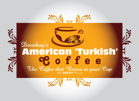
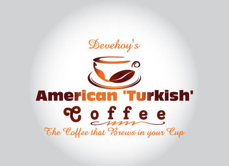
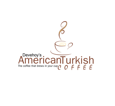
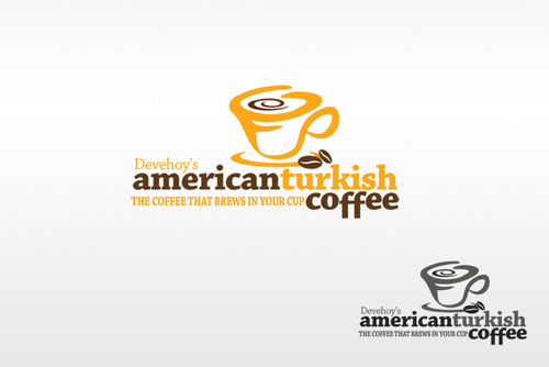
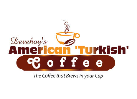
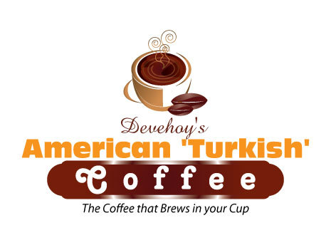
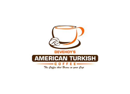
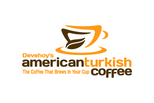
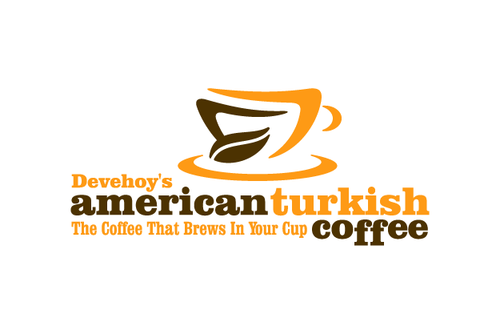
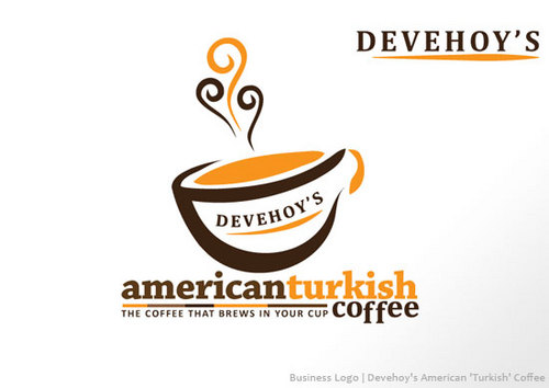
Devehoy's American 'Turkish' Coffee
|
Contest Holder
binyamin18
?
Last Logged in : 4719days14hrs ago |
Concepts Submitted
43 |
Guaranteed Prize
149
|
Winner(s) | A Logo, Monogram, or Icon |
|
Business Logo
Devehoy's American 'Turkish' Coffee
The Coffee that Brews in your Cup
Yes
The design should somehow convey that this is good coffee that brews in your cup
Food
Logo Type
![]()
Symbolic
![]()
Abstract Mark
![]()
Clean/Simple
Modern
Traditional
Retro
Fun
Youthful
Abstract
maybe creamy brown. you decide
not sure


Comments
Project Holder
Project Holder
Project Holder
Project Holder
Project Holder