Business Logo
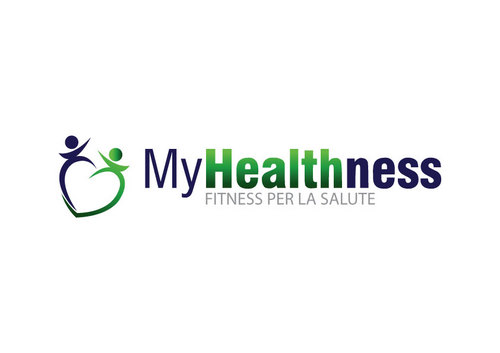
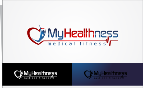
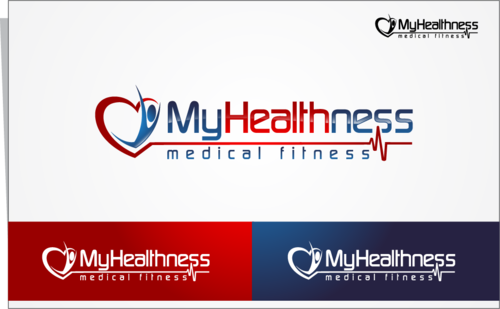
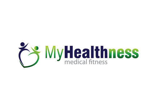
MyHealthness
|
Contest Holder
Umbi
?
Last Logged in : 4628days17hrs ago |
Concepts Submitted
84 |
Guaranteed Prize
205 |
Winner(s) | A Logo, Monogram, or Icon |
|
Live Project
Deciding
Project Finalized

Creative Brief
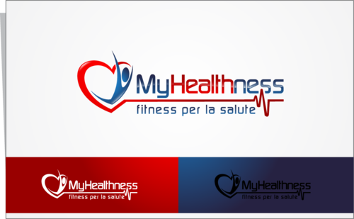
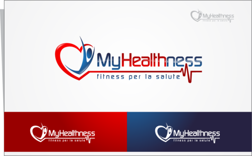
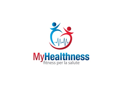
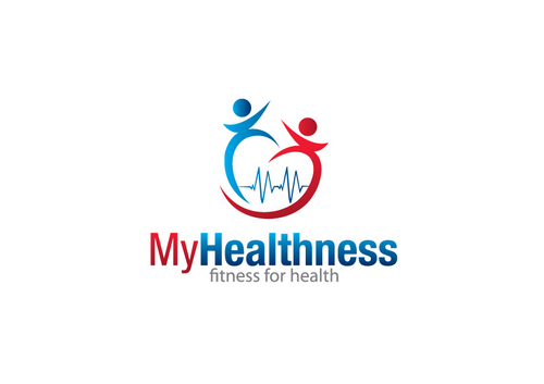
Business Logo
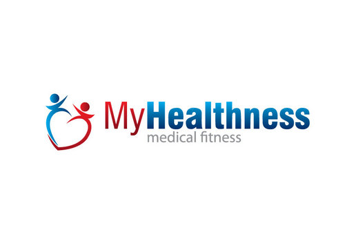
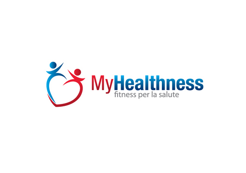
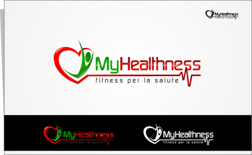
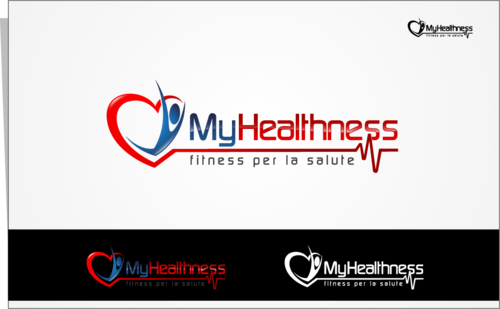
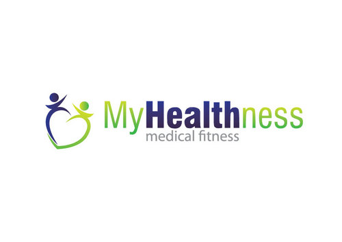
MyHealthness
Fitness per la salute
No
MyHealthness is a web-based service which provides clients with an individualized physical exercise training plan.
It is specifically targeted to people 50 years old and over, whether they are healthy or suffering from a chronic condition. Healthy subjects receive a training program they can carry out in the gym/facility they prefer. However, if the computer-based assessment determines that a clinical condition is present or suspected, the client is referred to a clinician for further medical evaluation, physical exercise prescription and clearance. The individualized exercise plan is then developed according to proprietary Adapted Physical Exercise Protocols which incorporate the most recent and rigorous scientific evidence. At any time, the client can rely on online distance follow-up.
MyHealthness is based on the evidence that physical exercise - carried out in the correct manner (type, frequency, duration, intensity) and on a regular basis - is effective in improving quality of life, physical performance and health status.
It is founded on the concept of “healthness”, i.e. the natural evolution of the concept of “fitness”. In early 70’s, fitness substantially meant physical training aimed to better performance and physical appearance; then, during the 80’s and 90’s, the word wellness was introduced to include also the mental and psychological components of wellbeing. Eventually, in these days, healthness is referred to physical exercise done to improve the health status and counteracts the effects of ageing (i.e. exercise for health).
Health
Logo Type
![]()
Symbolic
![]()
Abstract Mark
![]()
Web 2.0
![]()
Cutting-edge
Traditional
Simple
Professional
High Tech
Use your imagination. I am open to colours.
not sure
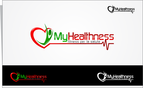
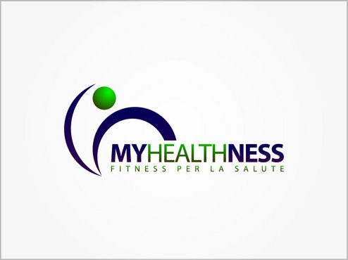
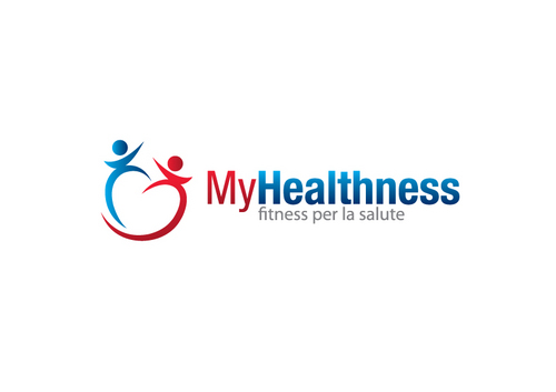
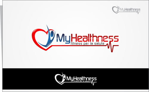
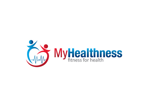
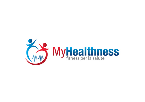
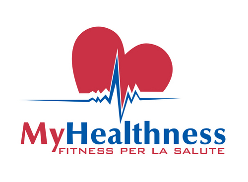
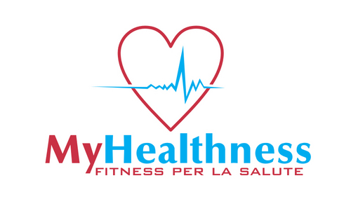
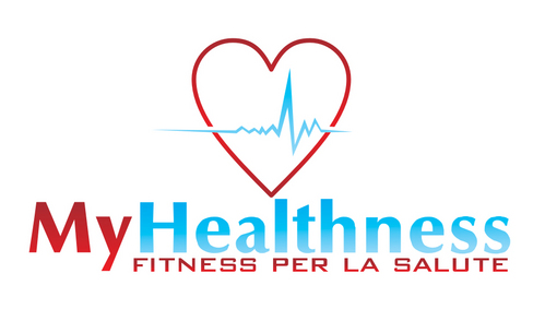
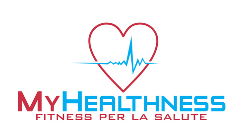
The logo should be based on the word MyHealthness.
A pay-off with the words “Fitness for Health” (“Fitness per la Salute” in Italian), “Medical Fitness”, “Health & Fitness”, may be considered.
Also, symbols which strengthen the relationship with the medical environment, such as a heart, an outlined electrocardiogram, may be included.
The logo should:
- underpin the aim of healthness, i.e. HEALTH, in a positive, pro-active approach
- put emphasis on the scientific approach
- call to mind a sensation of protection and security (due to the confidence in the medical advice and supervision)
- understate the idea of fatigue associated with physical exercise
evoke a positive feeling of strength and energy
Related Contests


