SALES / SUPPORT : +1-877-525-5646   |  


Bradyl Storage Solutions

Your residential property self storage partner

Contest Holder linzsteiner ?

Last Logged in : 2029days12hrs ago

Concepts Submitted

114

Guaranteed Prize
500
Winner(s)

1

Web Design veildAll design entries can be viewed by other designers.
tick_gray

Live Project

tick_gray

Deciding

tick_blue

Project Finalized


Project: Bradyl Storage Solutions
Industry: Storage Logo
Contest Launched: Jul 12, 2011
Selected: 1 winning design from 114 concepts
Winning Design by: MeGaMax3Ds2Dio
Close Date: Jul 19, 2011


Bradyl Storage Solutions - Storage


Awarded as a winner
Project Report    

Sort by:


#16


Creative Brief


Bradyl Storage Solutions

Your residential property self storage partner

Storage

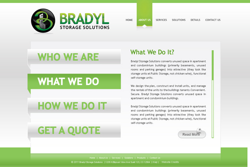
Bradyl Storage Solutions converts unused space in apartment and condominium buildings (primarily basements, unused rooms and parking garages) into attractive (they look like storage units at Public Storage, not chicken wire), functional self-storage units. We design the plan, construct and install units, and manage the rentals of the units to the buildings tenants. Convenient. Secure. Practical. Innovative. Audience is apartment and condo building managers and their residents. Residents will be Middle to Upper Class Socioecenomic range, Metropolitan. 20-75 years. equally men + women.

Like: clean and simple are a must. Want some green to tie logo in but do not want a predominantly green website. No red, orange or yellow. "tabs" are too generic looking- would like something more unique. Dislike: text heavy

Clean/Simple

Professional

Friendly

Corporate

Modern

Service Oriented

gray and/ or white

blue

black and green

top

http://www22.verizon.com/content/verizonglobalhome/ghp_business.aspx

hillstone.com

http://www.rockvilletownsquare.com/shopping/

Another website we like is www.whirlpool.com Our Logo is in Trebuchet MS. We are not sure if we like all the same font for website or use of a different font that complements the logo font. Will leave that to designer. Please use logo. Please use an image of storage units as well as other stock images as appropriate. I have photos of our units that I would like to use but Im not sure if they will integrate well. The focus of those images is how the storage units fir into a parking garage Site should be clean and minimalist. we help minimize clutter in condos/apts and offer a clean, attractive solution, want to be sure that the site sends the same message in look and feel.


Discussion


Comments

  • July 23, 2011 5:59 PM
    linzsteiner linzsteiner
      Project Holder
    Thank you all for your hard work and creative thinking. we had 3 people making the decision, all with different favorites. You all did a great job.

    Like Icon 0   DislikeIcon 0
  • July 18, 2011 12:44 PM
    linzsteiner linzsteiner
      Project Holder
    57 and 58- can you try without the layer behind the logo?

    Like Icon 0   DislikeIcon 0
  • July 18, 2011 11:10 AM
    linzsteiner linzsteiner
      Project Holder
    Im really liking these. Another site for inspiration: www.9one3.com please be sure to have an inside page along with you landing page, or refer to a previous draft as the coordinating page.

    Like Icon 0   DislikeIcon 0
  • July 18, 2011 11:03 AM
    starfinch starfinch
     
    plz provide some feedback on #48 and #55. regards

    Like Icon 0   DislikeIcon 0
  • July 17, 2011 9:40 AM
    linzsteiner linzsteiner
      Project Holder
    Really like the use of circles on this site: http://www.touchtech.co.nz/#!/

    Like Icon 0   DislikeIcon 0
  • July 17, 2011 9:30 AM
    linzsteiner linzsteiner
      Project Holder
    Im learning what I probably should have asked for is a landing page and interior pages. Early designs that have not been eliminated- please design a landing page that coordinates.

    Like Icon 0   DislikeIcon 0
  • July 17, 2011 8:17 AM
    linzsteiner linzsteiner
      Project Holder
    REALLY liking the new style. #45- can you change"enter your site here" to be a functioning menu bar and add the tag like "Your residential building self storage partner" If home page is really minimalist as in #45, please also show interior pages. #46 looks like it would not need an interior page, but Im not sure.

    Like Icon 0   DislikeIcon 0
  • July 17, 2011 7:50 AM
    linzsteiner linzsteiner
      Project Holder
    ATTN ALL DESIGNERS: I would like to see some TYPOGRAPHY concepts (thanks MisterBee for telling what it is called!)

    Like Icon 0   DislikeIcon 0
  • July 17, 2011 7:24 AM
    linzsteiner linzsteiner
      Project Holder
    #26 like the color gradient, arc in main box, repeated use of logo. nice job #31 like the little icons with the call to action box. Can you get rid of news and events? 33- really repeated use of logo elements. The swirl is supoed to look like a B around the buildings. can you reverse it? or try the buildings with the swirl? 42- really innovative. would like to see more like this. Please change green to the other shade in the logo and put shadow under menu selection. ALso, make tag line into prominent text. 43- like menu bar and bottom, but the entire middle doesnt work. try 0-1 pic. Dont need get a quote. 1-3 text areas.

    Like Icon 0   DislikeIcon 0
  • July 16, 2011 9:15 PM
    linzsteiner linzsteiner
      Project Holder
    menu bar effect i like: Just words, no visible tabs. When you hover over the selection, the background becomes a colored shape and there is a shadow beneath the selection from the shape.

    Like Icon 0   DislikeIcon 0
  • July 16, 2011 8:28 PM
    linzsteiner linzsteiner
      Project Holder
    All designers: We have some nice options with the current general format of large rectangular space above with 3 sections below. Everyone seems to be stuck in that format. Please try something completely different. See previous comments for requests and reference to other websites. Please read all comments before submitting new designs. Be sure to include tagline. Please try NO pic of storage unit with focus on logo or incorporating logo into stock images that evoke "solutions" imagery: perhaps puzzle pieces or a chart like the ones I have uploaded. Would like to see an example of what the circular chart would look with the circle of our logo in the center. If not photo of storage unit, Alternative Featured Text: only text: Welcome to Bradyl Storage Solutions Pages: About Solutions Details Image Gallery Contact

    Like Icon 0   DislikeIcon 0
  • July 16, 2011 7:08 AM
    linzsteiner linzsteiner
      Project Holder
    #28 way too much contrast between call to action boxes and background. #29- THANK YOU for obviously reading all my comments. Trying something totally different and using logo as main feature, circular call to action. How would you change it if I said do not use any photos of storage units?

    Like Icon 0   DislikeIcon 0
  • July 15, 2011 11:53 PM
    linzsteiner linzsteiner
      Project Holder
    Featured Text: Welcome to Bradyl Storage Solutions Why Bradyl Storage Solutions Pages: About Solutions Details Contact

    Like Icon 0   DislikeIcon 0
  • July 15, 2011 11:31 PM
    linzsteiner linzsteiner
      Project Holder
    other things to try: 1. very strong focus on logo/ large logo image with minimal text or other pics (see http://orders.logodesignguru.com/drafts/display/contest/30718/draft/370459) 2. some sort of muted watermark/ background picture/ pattern

    Like Icon 0   DislikeIcon 0
  • July 15, 2011 10:49 PM
    linzsteiner linzsteiner
      Project Holder
    I am uploading alternative logos that can be used. Thank you for your patience- Specific feedback on current drafts: 11: too much focus on pics. 12: Really like how you incorporated the shading of the greens and the little squares from the windows on the logo. Dont like the menu buttons- color green or rectangular shape. What can you do with that? Dont forget "Your residential property self storage partner" is a tag line that should be prominently displayed. 13: very fresh navigation bar that I really like, but the white bar over the pics at the bottom with are outdated feeling to me 14: Like the layout of the page, but not the text over images. 15: Like the texture in the background but the colors makes my eyes hurt. 16. Great update of #6. thank you. 17: Looks nice 18: A bit too much happening. 19: like the use of the gray shading. ALso like the little icons for the 3 different sections at the bottom. Not loving the top bar. Can you work with that? 20/21/22: Didnt work for me- colors too bright, off set logo angle. 23: Like that you tried to do something different (and that you changed color of storage doors). Whole site way to green (and I didnt like the shade of green) I also didnt like the shape of the menu bar buttons. We do not need a contact form on the main screen. Be sure to feature the tagline "Your residential building self storage partner" 24: We will not be using scrolling content. Same thoughts on green bar on top as in previous site. 25: The green highlights are too abraisive for me. Thoughts in general: 1. I'm worried you are all placing too much emphasis on multiple pics. 1-2 pics on home page is plenty. 2. I don't like text over images. I think it distracts from both the image and the text. 3. Be sure to prominently include "Your residential building self storage partner"

    Like Icon 0   DislikeIcon 0
  • July 15, 2011 3:32 PM
    linzsteiner linzsteiner
      Project Holder
    What about using circles rather than rectangles for the call to action boxes

    Like Icon 0   DislikeIcon 0
  • July 15, 2011 1:05 PM
    linzsteiner linzsteiner
      Project Holder
    Out of curiosity.... If I said do NOT make it clean and simple, what would you design?

    Like Icon 0   DislikeIcon 0
  • July 14, 2011 5:59 PM
    linzsteiner linzsteiner
      Project Holder
    Color: Like the shade of green of 6, 12, 13, 14. Do not like the green in 10 and 15.

    Like Icon 0   DislikeIcon 0
  • July 14, 2011 5:34 PM
    dezinerguru dezinerguru
     
    Hi PH, Please check your private message. thanks,

    Like Icon 0   DislikeIcon 0
  • July 14, 2011 5:16 PM
    starfinch starfinch
     
    hi! can u plz leave some feedback for #13, what changes would u prefer and do you want a more cleaner look? regards

    Like Icon 0   DislikeIcon 0
  • July 14, 2011 12:30 PM
    linzsteiner linzsteiner
      Project Holder
    Specific feedback 1:  Really like the navigation bar 2:  Feels really dark. 3:  A little too busy for me.  Plus, you don't need to highlight every photo - goal is to focus on the convenient service/solution you offer and use the images to demonstrate that 4/5 Like the color scheme in 4 better 6:  Would like to see it without the bottom three columns. Love how the buttons are shaded and circular shape compliments logo. Favorite so far. 7/8/9:  Thanks for trying something different but it didn't work for me. 10:  OK

    Like Icon 0   DislikeIcon 0
  • July 14, 2011 12:18 PM
    linzsteiner linzsteiner
      Project Holder
    Thanks for your submissions.I would like to see elements of the logo more integrated throughout the site. These are looking kind of generic to me.

    Like Icon 0   DislikeIcon 0
  • July 14, 2011 7:47 AM
    linzsteiner linzsteiner
      Project Holder
    Please feel free (but not obligated) to use a few additional stock images to compliment designs (without making it cluttered). The storage units are our product, but we also offer a service. Ideas are Exterior High luxury rise apartment/ condo building, service oriented people, concierge maybe? But maybe you have other ideas that would work. But don't feel obligated to use additional images either.... Haven't seen it yet so not sure if I'll like it.

    Like Icon 0   DislikeIcon 0
  • July 13, 2011 9:20 AM
    linzsteiner linzsteiner
      Project Holder
    Please include tag line: Your residential property self storage partner

    Like Icon 0   DislikeIcon 0