SALES / SUPPORT : +1-877-525-5646 |
Login
A comprehensive and clear design brief is included
|
Contest Holder
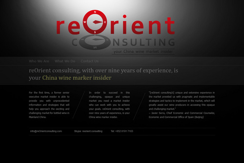
reOrientconsulting
?
Last Logged in : 3411days2hrs ago |
Concepts Submitted
183 |
Guaranteed Prize
450
|
Winner(s) | Web Design |
|
Live Project
Deciding
Project Finalized

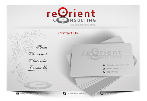
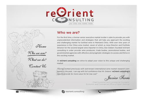
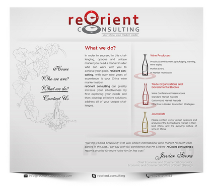
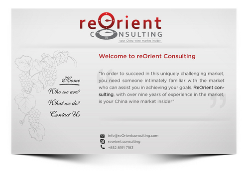
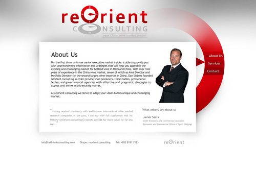
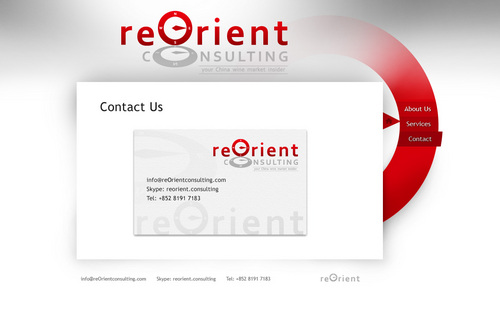
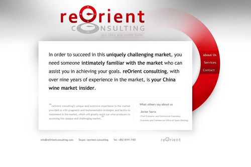
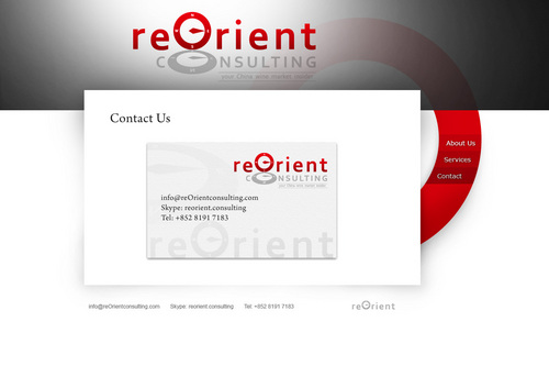
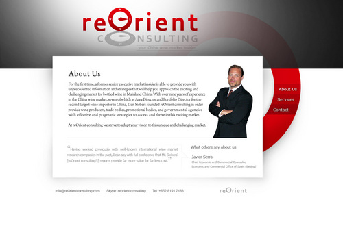
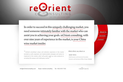
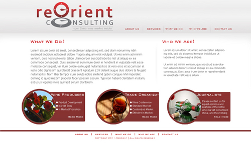
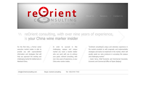
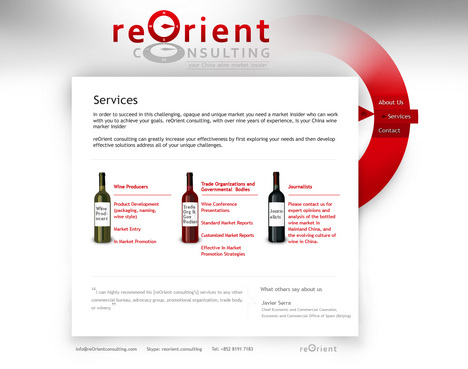
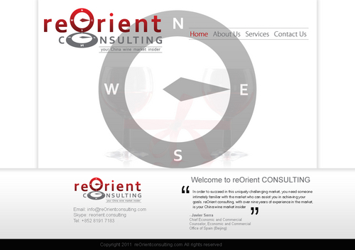
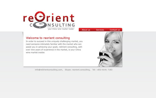
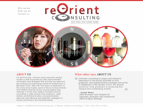
A very simple 3-4 page website, wine consluting
A comprehensive and clear design brief is included
www.reOrientconsulting.com
see brief
see brief
Cutting-Edge
Unique/Creative
Clean/Simple
Professional
Sophisticated
Modern
Elegant
red
yellow
??
left side
see brief
see brief
see brief
see brief


Comments
Project Holder
Project Holder